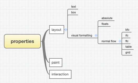
如图所示,CSS布局是可以分为几大块的:
-
- 盒子之间的布局visual formatting
-
-
- 脱离正常流normal flow的盒子的布局
- absolute布局上下文下的布局
- float布局上下文下的布局
- 正常流normal flow下的盒子的布局
- BFC布局上下文下的布局
- IFC布局上下文下的布局
- FFC布局上下文下的布局
- table布局上下文下的布局
- css grid布局上下文下的布局
所有的CSS布局其实都是围绕着这些布局模块来的,水平垂直居中也一样。
一 。文本的水平垂直居中
1?? 单行文本的水平垂直居中
height + line height + text-align:center ;
2?? 固定高度的多行文本的垂直居中
方法1: display:table;
代码如下:
.outer{
width: 200px;
height: 200px;
background-color: #ccc;
padding:5px;
display: table;
}
.middle{
display: table-cell;
vertical-align: middle;
text-align: center;
}
<div class="outer">
<div class="middle">
<div class="inner">
我是文本<br>
我是文本<br>
我是文本<br>
</div>
</div>
</div>
方法2 :div[display:table-cell + vertical-align:middle ] + span[ display:inline-block]
这种方法是把文字当成图片处理,span标签内的文字,属性设置为inline-block;
父元素设为table-cell ,vertical-align:middle;
.outer{
width: 200px;
height: 200px;
background-color: #ccc;
text-align: center;
display: table-cell;
vertical-align: middle;
}
.middle{
display: inline-block;
}
高度未知元素 的文本垂直居中
方法1: 使伪元素和父元素等高,然后使文字居中,在视觉上就是相对于容器居中了。
.outer{
background-color: #ccc;
font-size: 0;
height: 300px;/*高度可变*/
}
.outer:before{
content: "";
display: inline-block;
vertical-align: middle;
width: 0;
height: 100%;
}
.middle{
font-size: 16px;
vertical-align: middle;
display: inline-block;
}
方法2:
.outer{
line-height: 250px;
text-align: center;
}
.middle{
display: inline-block;
line-height: normal;
vertical-align: middle;
max-width: 100%;
}
二,利用盒模型的水平垂直居中
盒模型都是说的块级盒的盒模型,也只有块级盒的盒模型用得多一点,块级盒block-level box又是分别由content-box、padding-box、border-box、margin-box组成的,如下图:
任一个子盒子的水平和垂直方向的边与最外面盒子的间距都是可以控制的,因此也就有如下居中方法。
1.padding 填充
<div class="wrap">
<div class="content"></div>
.wrap {
margin-left: auto;
margin-right: auto;
width: 400px;
height: 400px;
background-color: #ccc;
}
.wrap .content {
padding: -webkit-calc((100% - 100px) / 2);
padding: calc((100% - 100px) / 2);
width: 100px;
height: 100px;
background-color: #333;
background-clip: content-box;
}
2. margin 填充
<div class="wrap">
<div class="ele"></div>
</div>
.wrap {
overflow: hidden;
width: 100%;
height: 400px;
background-color: #ccc;
}
.wrap .ele {
margin-left: auto;
margin-right: auto;
margin-top: 150px;
width: 100px;
height: 100px;
background-color: #333;
color: #fff;
}
margin填充需要知道元素的宽度,不太灵活,不过css3有个属性叫fit-content,可以动态计算元素宽度。
浏览器支持上:
Browser support is pretty bad for this one currently, but you can get Firefox, Safari and recent Chrome versions to play along. Currently no IE or Opera as far as I know.
参考链接:
三. absolute布局上下文下的水平垂直居中
这种方式做的的居中有三种方法,原理很简单,就是left:50%;然后左移元素负一半的宽度。
上面三个方法中,margin方法和relative方法都需要知道元素的宽高才行(relative方法只知道高也行),适用于固定式布局,而transform方法则可以不知道元素宽高。
2?? text-aglin:center + absolute
参考代码:
<div class="wrap">
<div class="ele"></div>
</div>
.wrap{
text-align: center;
height: 400px;
background-color: #ccc;
font-size: 0;
}
.ele{
position: absolute;
display: inline-block;
margin-left: -(100px / 2);
margin-top: (400px - 100px) / 2;
width: 100px;
height: 100px;
background-color: #333;
}
写是这么写,并不是说text-aglin:center 能影响到absolute元素,在这里,text-align属性作用的不是absolute元素,而是absolute元素之前的文字!
当absolute元素为inline- block的时候,它会受到文本的影响。
然后你可能会问这里没文本啊,其实是有的,是个匿名的文本节点。然后这个匿名文本由于受到text-align:center影响居中了,这个时候absolute盒子的左边跟父容器的中点对齐了,所以就还需要 往回拉50%,这里用的是margin-left,你也可以用其它方式拉。然后就是垂直方向的对齐,垂直方向是不能被操作文本的属性影响的,所以我这里用 的是margin-top来让它偏移下去。
3?? absolute + margin : auto
代码如下:
<div class="wrap">
<div class="ele"></div>
</div>
.wrap{
position: relative;
height: 100%;
}
.ele{
position: absolute;
left: 0;
right: 0;
top: 0;
bottom: 0;
margin: auto;
width: 100px;
height: 100px;
background-color: #333;
}
关于这种布局的原理,在标准中能找到如下解释:
w3c.org中有这样一句话:
The constraint that determines the used values for these elements is: ‘left’ + ‘margin-left’ + ‘border-left-width’ + ‘padding-left’ + ‘width’ + ‘padding-right’ + ‘border-right-width’ + ‘margin-right’ + ‘right’ = width of containing block
这句话说的是absolute性质的盒子,它的包含块的宽度等于它的盒模型的宽度 + left + right值,包含块的高度同理,盒模型包括margin-box、border-box、padding-box、content-box,而在这个居 中方法中,.ele的left + right值是0,width是定值,width所在盒子包括了除了margin-box外的那三个box,margin都是auto值,按照上面那个公 式,margin-left + margin-right的值应该等于包含块的宽度 – left的值 – right的值 – width的值,也就是说margin-left + margin-right的值等于除了width所占宽度外的剩下宽度,拥有剩下宽度后,就是平分其宽度,以让左右两边相等,达到居中,标准中给出了答 案:
If none of the three is ‘auto’: If both ‘margin-left’ and ‘margin-right’ are ‘auto’, solve the equation under the extra constraint that the two margins get equal values, unless this would make them negative, in which case when direction of the containing block is ‘ltr’ (‘rtl’), set ‘margin-left’ (‘margin-right’) to zero and solve for ‘margin-right’ (‘margin-left’)
这里的”three”指的是left, width, right。如果left、right和width都不为auto,同时margin-left和margin-right都是auto,除非特别情况, 它们俩就是相等的,而这个例子中不在特殊情况之列,因此两者平分,此时达到了水平居中。而对于垂直方向的margin的auto值的计算,标准中也有如下 两句话,跟水平方向的同理(这里的“three”指的是“top, height, bottom”):
the used values of the vertical dimensions must satisfy this constraint: ‘top’ + ‘margin-top’ + ‘border-top-width’ + ‘padding-top’ + ‘height’ + ‘padding-bottom’ + ‘border-bottom-width’ + ‘margin-bottom’ + ‘bottom’ = height of containing block
if none of the three are ‘auto’: If both ‘margin-top’ and ‘margin-bottom’ are ‘auto’, solve the equation under the extra constraint that the two margins get equal values.
这种方法能简单的做到居中,但是必须有width和height值
4??适用于图片居中的一个方法
<div class="wrap">
<p>
<img src="http://nec.netease.com/img/s/1.jpg" />
<img src="http://nec.netease.com/img/s/1.jpg" />
</p>
</div>
.wrap{
position:relative;
width: 100%;
height: 100%;
}
p{
position:absolute;
left:50%;
top:50%;
}
img:nth-child(1){
position:static;
visibility:hidden;
}
img:nth-child(2){
position:absolute;
right:50%;
bottom:50%;
}
这种方法主要是利用了一个图片进行占位,以让父容器获得高宽,从而让进行-50%偏移的图片能有一个参照容器作百分比计算。优点是可以不知道图片的 大小,随便放张尺寸不超过父容器的图片上去都能做到居中。另外,兼容性好,如果是不使用nth-child选择器的话,IE6都是能顺利兼容的.
5??
不知道起什么名字,直接上代码
html,body{
background-color: #ccc;
height: 100%;
padding:0;
margin: 0;
}
.wraper{
height: 100%;
}
.extroElement{
height: 50%;
margin-bottom: -50px;
position: relative;
}
.content{
clear:both;
height:100px;
width:100px;
position:relative;
margin:auto;
/*left: 50%;
transform: translate3d(-50%, 0, 0);*/
background-color:yellow;
}
<div class="wraper">
<div class="extroElement"></div>
<div class="content">
</div>
</div>
这种方法兼容性好,适用于所有浏览器。但是要添加一个额外的标签,用于占据50%的高度,然后居中元素的margin-bottom为 负(居中元素高度)的1/2 ,这样就实现了垂直方向的居中,水平方向就不说了。
6?? text-align:center; vertical-align:middle;
<div class="wraper">
<div class="extroElement"></div>
<div class="content"></div>
</div>
html,body{
background-color: #ccc;
height: 100%;
padding:0;
margin: 0;
}
.wraper{
height:100%;
font-size: 0;
text-align: center;
}
.extroElement,.content{
vertical-align: middle;
display: inline-block;
}
.extroElement{
height: 100%;
}
.content{
width: 100px;
height: 100px;
background-color:yellow;
}
这个方法和前面的多行文本居中的方法2类似,水平上的居中很简单,inline-block水平text-align:center 就可以了;垂直方向上,给一个参照物,高度100%,然后vertical-align:middle 就可以了。
7??,flex 居中
<div class="wraper">
<div class="content"></div>
</div>
html,body{
background-color: #ccc;
height: 100%;
padding:0;
margin: 0;
}
.wraper{
height: 100%;
display: flex;
align-items:center;
justify-content:center;
}
.content{
width: 100px;
height: 100px;
background-color:yellow;
}
或者:
.wraper{
height: 100%;
display: flex;
}
.content{
width: 100px;
height: 100px;
background-color:yellow;
margin: auto;
}
设为Flex布局以后,子元素的float、clear和vertical-align属性将失效。
更多flex 布局 ,参考:
flex 语法篇:
flex 实例篇:
未完待续。。。
关于水平垂直居中的一些整理和总结
原文:http://www.cnblogs.com/scaukk/p/4852003.html