CSS3制作404立体字体页面效果
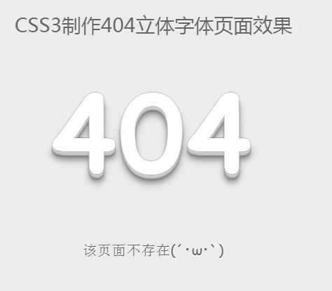
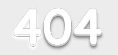
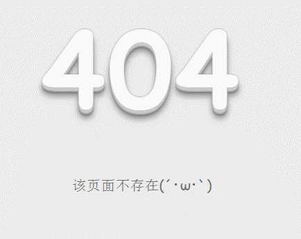
.demo p:first-child span:hover { text-shadow:0px0px2px#686868,0px1px1px#fff,0px2px1px#fff,0px3px1px#fff,0px4px1px#fff,0px5px1px#fff,0px6px1px#fff,0px7px1px#777,0px8px3px#fff,0px9px5px#fff,0px10px7px#fff,0px11px9px#fff,0px12px11px#fff,0px13px15px#fff;-webkit-transition: all .1s linear; transition: all .1s linear;}<!DOCTYPE html><html><head><meta charset=utf-8/><title>CSS3制作404立体字体页面效果</title><link rel="stylesheet" type="text/css" href="css/my.css"></head><body><h1 class="keTitle">CSS3制作404立体字体页面效果</h1><!--效果html开始--><div class="demo"><p align="center"><span>4</span><span>0</span><span>4</span></p><p align="center">该页面不存在(´?ω?`)</p></div><!--效果html结束--></body></html>@charset"utf-8";body { background-color:#ECECEC; font-family:‘Open Sans‘, sans-serif; font-size:14px; color:#3c3c3c;}.demo p:first-child { text-align: center; font-family: cursive; font-size:150px; font-weight: bold; line-height:100px; letter-spacing:5px; color:#fff;}.demo p:first-child span { cursor: pointer; text-shadow:0px0px2px#686868,0px1px1px#ddd,0px2px1px#d6d6d6,0px3px1px#ccc,0px4px1px#c5c5c5,0px5px1px#c1c1c1,0px6px1px#bbb,0px7px1px#777,0px8px3px rgba(100,100,100,0.4),0px9px5px rgba(100,100,100,0.1),0px10px7px rgba(100,100,100,0.15),0px11px9px rgba(100,100,100,0.2),0px12px11px rgba(100,100,100,0.25),0px13px15px rgba(100,100,100,0.3);-webkit-transition: all .1s linear; transition: all .1s linear;}.demo p:first-child span:hover { text-shadow:0px0px2px#686868,0px1px1px#fff,0px2px1px#fff,0px3px1px#fff,0px4px1px#fff,0px5px1px#fff,0px6px1px#fff,0px7px1px#777,0px8px3px#fff,0px9px5px#fff,0px10px7px#fff,0px11px9px#fff,0px12px11px#fff,0px13px15px#fff;-webkit-transition: all .1s linear; transition: all .1s linear;}.demo p:not(:first-child){ text-align: center; color:#666; font-family: cursive; font-size:20px; text-shadow:01px0#fff; letter-spacing:1px; line-height:2em; margin-top:-50px;}
原文:http://www.cnblogs.com/moyuling/p/4971194.html