复选框(Checkbox)在各个浏览器中的效果不一致,因此很多 Web 开发人员会自己重新设计一套界面和使用体验都更佳的复选框功能。下面就给大家分享9款超炫的复选框(Checkbox)效果,纯 CSS3 实现,未使用任何图片。
温馨提示:为保证最佳的效果,请在 IE10+、Chrome、Firefox
和 Safari 等现代浏览器中浏览。
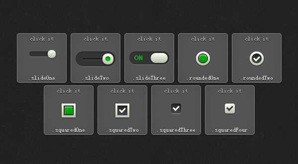
前面三款效果都是灵感来自移动应用程序的滑动选择框效果,在选择和未选择状态之间通过滑动来切换效果,非常的动感。效果的实现方面是借用了一个 DIV 标签和一个 Label 标签,下面是效果一的 HTML 代码示例:
|
1
2
3
4
5
6 |
<section title=".slideOne"> <div class="slideOne"> <input type="checkbox"
value="None"
id="slideOne"
name="check"
checked /> <label for="slideOne"></label> </div></section> |
为了实现圆角和复选框的立体感效果,这里运用了 CSS3 的圆角(border-radius)、盒阴影(box-shadow)、渐变(linear-gradient)以及 CSS3 动画技术。下面是效果一的 CSS 代码示例:
|
1
2
3
4
5
6
7
8
9
10
11
12
13
14
15
16
17
18
19
20
21
22
23
24
25
26
27
28
29
30
31
32
33
34
35
36
37
38
39
40
41
42 |
.slideOne { width: 50px; height: 10px; background: #333; margin: 20px
auto; position: relative; -moz-border-radius: 50px; -webkit-border-radius: 50px; border-radius: 50px; -moz-box-shadow: inset
0px 1px 1px rgba(0, 0, 0, 0.5), 0px
1px 0px rgba(255, 255, 255, 0.2); -webkit-box-shadow: inset
0px 1px 1px rgba(0, 0, 0, 0.5), 0px
1px 0px rgba(255, 255, 255, 0.2); box-shadow: inset
0px 1px 1px rgba(0, 0, 0, 0.5), 0px
1px 0px rgba(255, 255, 255, 0.2);}.slideOne label { display: block; width: 16px; height: 16px; position: absolute; top: -3px; left: -3px; cursor: pointer; background: #fcfff4; background: -moz-linear-gradient(top, #fcfff4
0%, #dfe5d7
40%, #b3bead
100%); background: -webkit-linear-gradient(top, #fcfff4
0%, #dfe5d7
40%, #b3bead
100%); background: linear-gradient(to bottom, #fcfff4
0%, #dfe5d7
40%, #b3bead
100%); -moz-border-radius: 50px; -webkit-border-radius: 50px; border-radius: 50px; -moz-box-shadow: 0px
2px 5px 0px rgba(0, 0, 0, 0.3); -webkit-box-shadow: 0px
2px 5px 0px rgba(0, 0, 0, 0.3); box-shadow: 0px
2px 5px 0px rgba(0, 0, 0, 0.3); -moz-transition: all
0.4s ease; -o-transition: all
0.4s ease; -webkit-transition: all
0.4s ease; transition: all
0.4s ease;}.slideOne input[type=checkbox] { visibility: hidden;}.slideOne input[type=checkbox]:checked + label { left: 37px;} |
后面六款效果的交互是我们常见的,使用 CSS3 对浏览器默认的复选框效果进行了美化,并且在各个浏览器中表现一致。HTML 代码都是类似的,这里例举效果五的代码:
|
1
2
3
4
5
6
7
8 |
<section title=".roundedTwo"> <!-- .roundedTwo --> <div class="roundedTwo"> <input type="checkbox"
value="None"
id="roundedTwo"
name="check"
checked /> <label for="roundedTwo"></label> </div> <!-- end .roundedTwo --></section> |
CSS 代码如下:
|
1
2
3
4
5
6
7
8
9
10
11
12
13
14
15
16
17
18
19
20
21
22
23
24
25
26
27
28
29
30
31
32
33
34
35
36
37
38
39
40
41
42
43
44
45
46 |
.roundedTwo label { width: 20px; height: 20px; position: absolute; top: 4px; left: 4px; cursor: pointer; background: -moz-linear-gradient(top, #222222
0%, #45484d
100%); background: -webkit-linear-gradient(top, #222222
0%, #45484d
100%); background: linear-gradient(to bottom, #222222
0%, #45484d
100%); -moz-border-radius: 50px; -webkit-border-radius: 50px; border-radius: 50px; -moz-box-shadow: inset
0px 1px 1px rgba(0, 0, 0, 0.5), 0px
1px 0px white; -webkit-box-shadow: inset
0px 1px 1px rgba(0, 0, 0, 0.5), 0px
1px 0px white; box-shadow: inset
0px 1px 1px rgba(0, 0, 0, 0.5), 0px
1px 0px white;}.roundedTwo label:after { content: ‘‘; width: 9px; height: 5px; position: absolute; top: 5px; left: 4px; border: 3px
solid #fcfff4; border-top: none; border-right: none; background: transparent; filter: progid:DXImageTransform.Microsoft.Alpha(Opacity=0); opacity: 0; -moz-transform: rotate(-45deg); -ms-transform: rotate(-45deg); -webkit-transform: rotate(-45deg); transform: rotate(-45deg);}.roundedTwo label:hover::after { filter: progid:DXImageTransform.Microsoft.Alpha(Opacity=30); opacity: 0.3;}.roundedTwo input[type=checkbox] { visibility: hidden;}.roundedTwo input[type=checkbox]:checked + label:after { filter: progid:DXImageTransform.Microsoft.Alpha(enabled=false); opacity: 1;} |
本文链接:你见过吗?9款超炫的复选框(Checkbox)效果
编译来源:梦想天空 ◆ 关注前端开发技术 ◆ 分享网页设计资源
本文来自【梦想天空(http://www.cnblogs.com/lhb25/)】
你见过吗?9款超炫的复选框(Checkbox)效果,布布扣,bubuko.com
原文:http://www.cnblogs.com/lhb25/p/9-amazing-checkbox-effect.html