1、column-width 设置列的宽度 结果就会把所有的包含在标签内的内容按照宽度分列,列的数量是自适应的
              div.text2 article{
				-webkit-column-width:100px;
			}
2.column-count 设置列的数量 内容按照设置的数量等分,宽度自适应
              div.text article{
				-webkit-column-count:10;
			}
3、column-rule 设置列与列之间的规则,有三个值:color style width 也可以分开设置:column-rule-color column-rule-style column-rule-width
4、column-gap 设置列与列之间的宽度 比如:column-gap:10px;
5、column-span 设置标签应该是需要横跨多少列,操蛋的是它就有两个值:1 and all,不是我想象的那个样子,在外标签设置了列的属性后,内标设置横跨多少列;
       div.text3 {
                -webkit-column-count:5;
                -webkit-column-gap:3px;
            }
            div.text3 header{
                -webkit-column-span:all;
            }
6、column属性是css3中的属性,所以在使用的时候要注意加前缀 -webkit- -moz- -ms-等
7、对啦,这个有点白痴的问题,我也想到了,那就是标签内都是div块,会怎么养分列?
     <div class="text0 t">
            <div class="eh">234222444444444444</div>
            <div class="eh">乱七八糟一点点的事情</div>
            <div class="eh">恶化你在哪里呀</div>
            <div class="eh">反而我姓你了</div>
            <div class="eh">我爱你古今没</div>
            <div class="eh">234222444444444444</div>
            <div class="eh">去你大爷的啊</div>
            <div class="eh">下月月你要死了啊啊 啊</div>
            <div class="eh">还好郭daye你听都比啊</div>
            <div class="eh">234222444444444444</div>
            <div class="eh">乱七八糟一点点的事情</div>
            <div class="eh">恶化你在哪里呀</div>
            <div class="eh">反而我姓你了</div>
            <div class="eh">我爱你古今没</div>
            <div class="eh">234222444444444444</div>
            <div class="eh">去你大爷的啊</div>
            <div class="eh">下月月你要死了啊啊 啊</div>
        </div>
而且设置了长宽高啊什么滴
     <style>
            div.t{
                width:900px;
                height:300px;
                margin:auto;
                background-color:#ddd;
                border-top:1px solid #f88;
                color:#111;
                font-size:14px;
            }
         div.text0{
                -webkit-column-width:100px;
            }
            div.text0 div.eh{
                border:1px solid #8f8;
                width:200px;
                height:20px;
            }
        </style>
结果呢就是这个鸟样子:
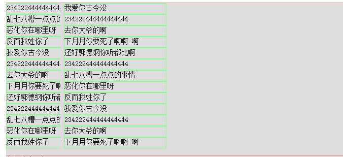
看来column属性是按照表内的内容来进行的分列,是把标签内的所有标签也看做了内容,嗯,应该是这个德行
原文:http://www.cnblogs.com/swl267/p/5249525.html