1.颜色小tip知识
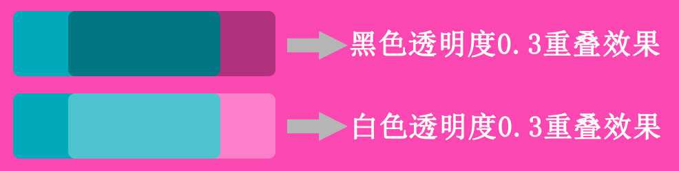
在背景色上方叠加一个黑色半透明层 rgba(0,0,0,.2) 可以得到一个更暗的颜色
在背景色上方叠加一个白色半透明层 rgba(255,255,255,.2) 可以得到一个更亮的颜色
单个颜色实现 hover 和 active 时的明暗变化效果
<!DOCTYPE html>
<html lang="en">
<head>
    <meta charset="UTF-8">
    <title>单个颜色实现 hover 和 active 时的明暗变化效果</title>
    <style type="text/css">
        a {
            text-decoration: none;
        }
        .rubby {
            position: absolute;
            left: 50%;
            top: 50%;
            transform: translate(-50%,-50%);
            width: 260px;
            text-align: center;
            padding: 40px;
            font-size: 200%;
            font-weight: bolder;
            background-color: #00aabb;
            color: #fff;
            cursor: pointer;
            border-radius: 1em;
        }

        .rubby:before {
            position: absolute;
            left: 0;
            top: 0;
            right: 0;
            bottom: 0;
            border-radius: 1em;
            background-color: rgba(255,255,255,.2);
            z-index: -1;
        }
        .rubby:hover:before {
            content: "";
        }
        .rubby:after {
            position: absolute;
            left: 0;
            top: 0;
            right: 0;
            bottom: 0;
            background-color: rgba(0,0,0,.3);
            border-radius: 1em;
            z-index: -1;
        }
        .rubby:active:after {
            content: "";
        }

    </style>
</head>
<body>
    <a href="#none" class="rubby">.Rubby</a>
</body>
</html>
文章转载
利用伪元素单个颜色实现 hover 和 active 时的明暗变化效果
原文:http://www.cnblogs.com/zjf-1992/p/5946339.html