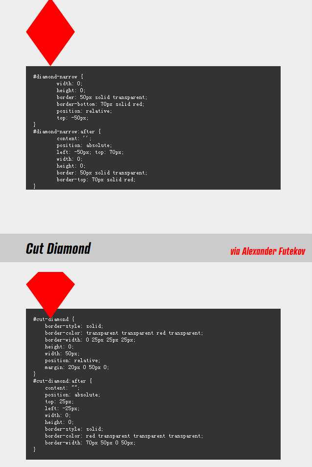
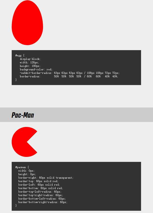
All of the below use only a single HTML element. Any kind of CSS goes, as long as it‘s supported in at least one browser.
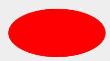
#oval { width: 200px; height: 100px; background: red; -moz-border-radius: 100px / 50px; -webkit-border-radius: 100px / 50px; border-radius: 100px / 50px; } /* Cleaner, but slightly less support: use "50%" as value */
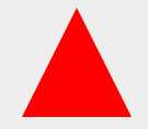
#triangle-up { width: 0; height: 0; border-left: 50px solid transparent; border-right: 50px solid transparent; border-bottom: 100px solid red; }
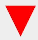
#triangle-down { width: 0; height: 0; border-left: 50px solid transparent; border-right: 50px solid transparent; border-top: 100px solid red; }
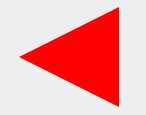
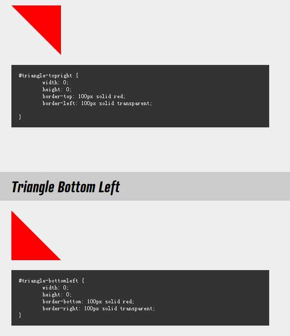
#triangle-left { width: 0; height: 0; border-top: 50px solid transparent; border-right: 100px solid red; border-bottom: 50px solid transparent; }

#triangle-right { width: 0; height: 0; border-top: 50px solid transparent; border-left: 100px solid red; border-bottom: 50px solid transparent; }
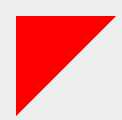
#triangle-topleft { width: 0; height: 0; border-top: 100px solid red; border-right: 100px solid transparent; }
转自:https://css-tricks.com/examples/ShapesOfCSS/
原文:http://www.cnblogs.com/wenhuan/p/6225421.html