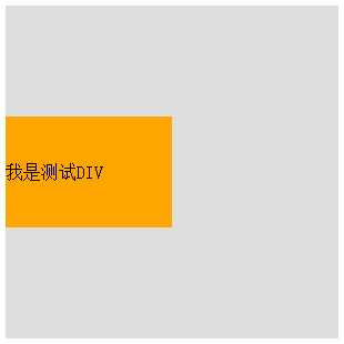
 1 <!DOCTYPE>
 2 <html lang="en">
 3
 4     <head>
 5         <meta charset="UTF-8">
 6         <meta name="viewport" content="width=device-width,initial-scale=1,user-scalable=no" />
 7         <title>Document</title>
 8     </head>
 9     <style>
10         #box {
11             width: 300px;
12             height: 300px;
13             background: #ddd;
14             position: relative;
15         }
16
17         #child {
18             width: 150px;
19             height: 100px;
20             background: orange;
21             position: absolute;
22             top: 50%;
23             margin: -50px 0 0 0;
24             line-height: 100px;
25         }
26     </style>
27
28     <body>
29
30         <div id="box">
31             <div id="child">我是测试DIV</div>
32         </div>
33
34     </body>
35
36 </html>
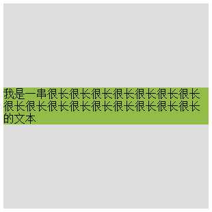
 1 <!DOCTYPE>
 2 <html lang="en">
 3
 4     <head>
 5         <meta charset="UTF-8">
 6         <meta name="viewport" content="width=device-width,initial-scale=1,user-scalable=no" />
 7         <title>Document</title>
 8     </head>
 9     <style>
10         #box {
11             width: 300px;
12             height: 300px;
13             background: #ddd;
14             position: relative;
15         }
16
17         #child {
18             background: #93BC49;
19             position: absolute;
20             top: 50%;
21             transform: translate(0, -50%);
22         }
23     </style>
24
25     <body>
26
27         <div id="child">
28             我是一串很长很长很长很长很长很长很长很长很长很长很长很长很长很长很长很长的文本
29         </div>
30
31     </body>
32
33 </html>
 1 <!DOCTYPE>
 2 <html lang="en">
 3
 4     <head>
 5         <meta charset="UTF-8">
 6         <meta name="viewport" content="width=device-width,initial-scale=1,user-scalable=no" />
 7         <title>Document</title>
 8     </head>
 9     <style>
10         #box {
11             width: 300px;
12             height: 300px;
13             background: #ddd;
14             position: relative;
15         }
16
17         #child {
18             width: 50%;
19             height: 30%;
20             background: pink;
21             position: absolute;
22             top: 50%;
23             margin: -15% 0 0 0;
24         }
25     </style>
26
27     <body>
28
29         <div id="box">
30             <div id="child">我也是个测试DIV</div>
31         </div>
32
33     </body>
34
35 </html>

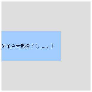
 1 <!DOCTYPE>
 2 <html lang="en">
 3
 4     <head>
 5         <meta charset="UTF-8">
 6         <meta name="viewport" content="width=device-width,initial-scale=1,user-scalable=no" />
 7         <title>Document</title>
 8     </head>
 9     <style>
10         #box {
11             width: 300px;
12             height: 300px;
13             background: #ddd;
14             position: relative;
15         }
16
17         #child {
18             width: 200px;
19             height: 100px;
20             background: #A1CCFE;
21             position: absolute;
22             top: 0;
23             bottom: 0;
24             margin: auto;
25             line-height: 100px;
26         }
27     </style>
28
29     <body>
30
31         <div id="box">
32             <div id="child">呆呆今天退役了(。﹏。)</div>
33         </div>
34
35     </body>
36
37 </html>
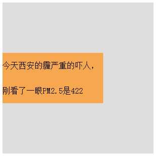
 1 <!DOCTYPE>
 2 <html lang="en">
 3
 4     <head>
 5         <meta charset="UTF-8">
 6         <meta name="viewport" content="width=device-width,initial-scale=1,user-scalable=no" />
 7         <title>Document</title>
 8     </head>
 9     <style>
10         #box {
11             width: 300px;
12             background: #ddd;
13             padding: 100px 0;
14         }
15
16         #child {
17             width: 200px;
18             height: 100px;
19             background: #F7A750;
20             line-height: 50px;
21         }
22     </style>
23
24     <body>
25
26         <div id="box">
27             <div id="child">今天西安的霾严重的吓人,刚看了一眼PM2.5是422</div>
28         </div>
29
30     </body>
31
32 </html>
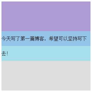
 1 <!DOCTYPE>
 2 <html lang="en">
 3
 4     <head>
 5         <meta charset="UTF-8">
 6         <meta name="viewport" content="width=device-width,initial-scale=1,user-scalable=no" />
 7         <title>Document</title>
 8     </head>
 9     <style>
10         #box {
11             width: 300px;
12             height: 300px;
13             background: #ddd;
14         }
15
16         #base {
17             height: 50%;
18             background: #AF9BD3;
19         }
20
21         #child {
22             height: 100px;
23             background: rgba(131, 224, 245, 0.6);
24             line-height: 50px;
25             margin-top: -50px;
26         }
27     </style>
28
29     <body>
30
31         <div id="box">
32             <div id="base"></div>
33             <div id="child">今天写了第一篇博客,希望可以坚持写下去!</div>
34         </div>
35
36     </body>
37
38 </html>
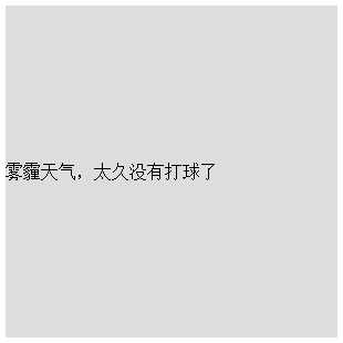
 1 <!DOCTYPE>
 2 <html lang="en">
 3
 4     <head>
 5         <meta charset="UTF-8">
 6         <meta name="viewport" content="width=device-width,initial-scale=1,user-scalable=no" />
 7         <title>Document</title>
 8     </head>
 9     <style>
10         #box {
11             width: 300px;
12             height: 300px;
13             background: #ddd;
14             display: flex;
15             align-items: center;
16         }
17     </style>
18
19     <body>
20
21         <div id="box">雾霾天气,太久没有打球了</div>
22
23     </body>
24
25 </html>
 1 <!DOCTYPE>
 2 <html lang="en">
 3
 4     <head>
 5         <meta charset="UTF-8">
 6         <meta name="viewport" content="width=device-width,initial-scale=1,user-scalable=no" />
 7         <title>Document</title>
 8     </head>
 9     <style>
10         #box {
11             width: 300px;
12             height: 300px;
13             background: #ddd;
14             display: flex;
15             flex-direction: column;
16             justify-content: center;
17         }
18
19         #child {
20             width: 300px;
21             height: 100px;
22             background: #08BC67;
23             line-height: 100px;
24         }
25     </style>
26
27     <body>
28
29         <div id="box">
30             <div id="child">
31                 答案当然是多用绿色的背景哈哈
32             </div>
33         </div>
34
35     </body>
36
37 </html>

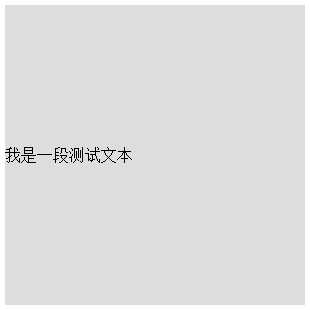
 1 <!DOCTYPE>
 2 <html lang="en">
 3
 4     <head>
 5         <meta charset="UTF-8">
 6         <meta name="viewport" content="width=device-width,initial-scale=1,user-scalable=no" />
 7         <title>Document</title>
 8     </head>
 9     <style>
10         #box {
11             width: 300px;
12             height: 300px;
13             background: #ddd;
14             line-height: 300px;
15         }
16     </style>
17
18     <body>
19
20         <div id="box">
21             我是一段测试文本
22         </div>
23     </body>
24
25 </html>
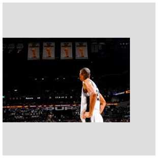
 1 <!DOCTYPE>
 2 <html lang="en">
 3
 4     <head>
 5         <meta charset="UTF-8">
 6         <meta name="viewport" content="width=device-width,initial-scale=1,user-scalable=no" />
 7         <title>Document</title>
 8     </head>
 9     <style>
10         #box {
11             width: 300px;
12             height: 300px;
13             background: #ddd;
14             line-height: 300px;
15         }
16
17         #box img {
18             vertical-align: middle;
19         }
20     </style>
21
22     <body>
23
24         <div id="box">
25             <img src="duncan.jpeg">
26         </div>
27     </body>
28
29 </html>
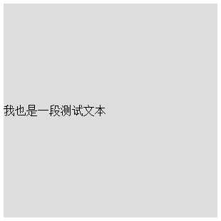
 1 <!DOCTYPE>
 2 <html lang="en">
 3
 4     <head>
 5         <meta charset="UTF-8">
 6         <meta name="viewport" content="width=device-width,initial-scale=1,user-scalable=no" />
 7         <title>Document</title>
 8     </head>
 9     <style>
10         #box {
11             width: 300px;
12             height: 300px;
13             background: #ddd;
14             display: table;
15         }
16
17         #child {
18             display: table-cell;
19             vertical-align: middle;
20         }
21     </style>
22
23     <body>
24
25         <div id="box">
26             <div id="child">我也是一段测试文本</div>
27         </div>
28     </body>
29
30 </html>
原文:http://www.cnblogs.com/panda-ling/p/6323535.html