<!DOCTYPE html>
<html>
<head>
<meta charset="UTF-8">
<title></title>
<style>
div.circle {
height: 100px;
width: 100px;
background: #9da;
border-radius: 50px;
}
div.left-circle {
height: 100px;
width: 50px;
background: #9da;
border-radius: 50px 0px 0px 50px;
}
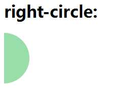
div.right-circle {
height: 100px;
width: 50px;
background: #9da;
border-radius: 0px 50px 50px 0px;
}
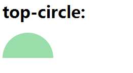
div.top-circle {
height: 50px;
width: 100px;
background: #9da;
border-radius: 50px 50px 0px 0px;
}
div.bottom-circle {
height: 50px;
width: 100px;
background: #9da;
border-radius: 0px 0px 50px 50px;
}
</style>
</head>
<body>
<h1>circle:</h1>
<div class="circle"></div>
<br/>
<h1>left-circle:</h1>
<div class="left-circle"></div>
<br />
<h1>right-circle:</h1>
<div class="right-circle"></div>
<br />
<h1>top-circle:</h1>
<div class="top-circle"></div>
<br />
<h1>bottom-circle:</h1>
<div class="bottom-circle"></div>
</body>
</html>


原文:http://www.cnblogs.com/qianqianyixiao/p/6442628.html