html代码
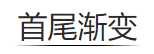
<span>首尾渐变</span>
css代码
.index-yinhang h2 span{
    position: relative;
    display: inline-block;
    padding: 6px 4px;
    color: #2a2a2a;
}
span::after{
    content: "";
    position: absolute;
    left: 0;
    bottom: 0;
    width: 100%;
    height: 1px;
    background: #000;
    background: linear-gradient(left,rgba(255,0,0,0),rgba(0,0,0,1) 30%,rgba(0,0,0,1) 70%,rgba(255,0,0,0));
    background: -webkit-linear-gradient(left,rgba(255,0,0,0),rgba(0,0,0,1) 30%,rgba(0,0,0,1) 70%,rgba(255,0,0,0));
    background: -moz-gradient(left,rgba(255,0,0,0),rgba(0,0,0,1) 30%,rgba(0,0,0,1) 70%,rgba(255,0,0,0));
    background: -ms-linear-gradient(left,rgba(255,0,0,0),rgba(0,0,0,1) 30%,rgba(0,0,0,1) 70%,rgba(255,0,0,0));
}
*, :after, :before {
    box-sizing: border-box;
    -webkit-box-sizing: border-box;
    -moz-box-sizing: border-box;
    -webkit-tap-highlight-color: rgba(0,0,0,0);
}
效果如下:
备注:
background: linear-gradient(left,rgba(255,0,0,0),rgba(0,0,0,1) 30%,rgba(0,0,0,1) 70%,rgba(255,0,0,0));
rgba(0,0,0,1) 30%,rgba(0,0,0,1) 70% 为黑色可自定义颜色,首尾是透明的不用换
原文:http://www.cnblogs.com/mmzuo-798/p/6674947.html