之前很早的一个项目中使用过highcharts,感觉挺方便的,图表类型也比较丰富,而且还支持数据的下钻,但是如果投入商业使用的话还会有一些版权的问题,所以后来就使用了EChart,这是百度开发的一个开源的图表插件,图表类型也很丰富,而且还有交互,对地图的支持也很好,可以免费的使用。在之前的一篇文章里,已经总结过了,今天主要跟大家分享一下,之前总结的Highcharts的一些使用心得,希望能够对大家有所帮助。
跟ECharts一样,HighCharts也需要下载相应的插件,不过HightCharts的插件很简单,只有一个highcharts.js文件。可以从HighCharts官网上下载,具体地址如下:http://www.highcharts.com/download
另注:
如果需要导出图表,则需要exporting.js文件
如果需要一些特殊的图形呈现,则还需要下载highcharts-more.js
在这个过程中,我会逐步的跟大家讲解如何使用highcharts.js进行图表展示。
另注:
一般情况下如果不需要导出图片、且只使用常规的图形,exportting.js和highchart-more.js可以不要,只留一个highcharts.js文件即可。
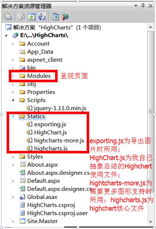
其中的HighCharts.js文件为我自己总结的使用帮助文件,主要用来配置图表类型、图表数据的处理、格式化等操作,下边会进一步讲解。
此外需要注意的是这里引用的Jquery文件版本为最近版本,VS里边默认的为1.4.1的版本太低,最新的highcharts需要高版本的jQuery文件。
在2.1中对此文件有一个初步的介绍,这一小节里专门来介绍这个文件。该文件的主要功能是用来配置各种图表类型的配置项,同时对用户提供的参数进行格式化、图表的呈现等功能。
文件的目录结构如下:
|
1
2
3
4
5
6
7
8
9
10
11
12
13
14
15
16
17
18
19
20
21
22
23
24
25
26
27
28
29
30
31
32
33
34
35
36
37
38
39
40
41
42
43
44
45
46
47
48
49
50
51
52
53
54
55 |
var
HighChart = { ChartDataFormate: {//数据格式化 FormateNOGroupData: function (data) {//处理不分组的数据 var
categories = []; var
datas = []; for
(var
i = 0; i < data.length; i++) { categories.push(data[i].name || ""); datas.push([data[i].name, data[i].value || 0]); } return
{ category: categories, data: datas }; },………… }, ChartOptionTemplates: {//图表配置项 Pie: function (data, name, title) { var
pie_datas = HighChart.ChartDataFormate.FormateNOGroupData(data); var
option = { chart: { plotBackgroundColor: null, plotBorderWidth: null, plotShadow: false }, ……. }; return
option; }, RenderChart: function (option, container) {//页面渲染 container.highcharts(option); } |
完整代码:
|
1
2
3
4
5
6
7
8
9
10
11
12
13
14
15
16
17
18
19
20
21
22
23
24
25
26
27
28
29
30
31
32
33
34
35
36
37
38
39
40
41
42
43
44
45
46
47
48
49
50
51
52
53
54
55
56
57
58
59
60
61
62
63
64
65
66
67
68
69
70
71
72
73
74
75
76
77
78
79
80
81
82
83
84
85
86
87
88
89
90
91
92
93
94
95
96
97
98
99
100
101
102
103
104
105
106
107
108
109
110
111
112
113
114
115
116
117
118
119
120
121
122
123
124
125
126
127
128
129
130
131
132
133
134
135
136
137
138
139
140
141
142
143
144
145
146
147
148
149
150
151
152
153
154
155
156
157
158
159
160
161
162
163
164
165
166
167
168
169
170
171
172
173
174
175
176
177
178
179
180
181
182
183
184
185
186
187
188
189
190
191
192
193
194
195
196
197
198
199
200
201
202
203
204
205
206
207
208
209
210
211
212
213
214
215
216
217
218
219
220
221
222
223
224
225
226
227
228
229
230
231
232
233
234
235
236
237
238
239
240
241
242
243
244
245
246
247
248
249
250
251
252
253
254
255
256
257
258
259
260
261
262
263
264
265
266
267
268
269
270
271
272
273
274
275
276
277
278
279
280
281
282
283
284
285
286
287
288
289
290
291
292
293
294
295
296
297
298
299
300
301
302
303
304
305
306
307
308
309
310
311
312
313
314
315
316
317
318
319
320
321
322
323
324
325
326
327
328
329
330
331
332
333
334
335
336
337
338
339
340
341
342
343
344
345
346
347
348
349
350
351
352
353
354
355
356
357
358
359
360
361
362
363 |
//document.write("<script language=‘javascript‘ src=‘/Scripts/jquery-1.11.0.min.js‘></script>");//引入Jquery(1.8.0以上版本)//document.write("<script language=‘javascript‘ src=‘/Statics/highcharts.js‘></script>"); //引入hightcharts引擎//document.write("<script language=‘javascript‘ src=‘/Statics/exporting.js‘></script>"); //引入导出图片js//判断数组中是否包含某个元素Array.prototype.contains = function (obj) { var
i = this.length; while
(i--) { if
(this[i] === obj) { return
true; } } return
false;}var
HighChart = { ChartDataFormate: { FormateNOGroupData: function (data) { var
categories = []; var
datas = []; for
(var
i = 0; i < data.length; i++) { categories.push(data[i].name || ""); datas.push([data[i].name, data[i].value || 0]); } return
{ category: categories, data: datas }; }, FormatGroupData: function (data) {//处理分组数据,数据格式:name:XXX,group:XXX,value:XXX用于折线图、柱形图(分组,堆积) var
names = new
Array(); var
groups = new
Array(); var
series = new
Array(); for
(var
i = 0; i < data.length; i++) { if
(!names.contains(data[i].name)) names.push(data[i].name); if
(!groups.contains(data[i].group)) groups.push(data[i].group); } for
(var
i = 0; i < groups.length; i++) { var
temp_series = {}; var
temp_data = new
Array(); for
(var
j = 0; j < data.length; j++) { for
(var
k = 0; k < names.length; k++) if
(groups[i] == data[j].group
&& data[j].name == names[k]) temp_data.push(data[j].value); } temp_series = { name: groups[i], data: temp_data }; series.push(temp_series); } return
{ category: names, series: series }; }, FormatBarLineData: function (data, name, name1) {//数据类型:name:XXX,value:XXX,处理结果主要用来展示X轴为日期的具有增幅的趋势的图 var
category = []; var
series = []; var
s1 = []; var
s2 = []; for
(var
i = 1; i < data.length; i++) { if
(!category.contains(data[i].name)) category.push(data[i].name); s1.push(data[i].value); var
growth = 0; if
(data[i].value != data[i - 1].value) if
(data[i - 1].value != 0) growth = Math.round((data[i].value / data[i - 1].value - 1) * 100); else growth = 100; s2.push(growth); } series.push({ name: name, color: ‘#4572A7‘, type: ‘column‘, yAxis: 1, data: s1, tooltip: { valueStuffix: ‘‘} }); series.push({ name: name1, color: ‘#89A54E‘, type: ‘spline‘, yAxis: 1, data: s2, tooltip: { valueStuffix: ‘%‘} }); return
{ series: series }; } }, ChartOptionTemplates: { Pie: function (data, name, title) { var
pie_datas = HighChart.ChartDataFormate.FormateNOGroupData(data); var
option = { chart: { plotBackgroundColor: null, plotBorderWidth: null, plotShadow: false }, title: { text: title || ‘‘ }, tooltip: { pointFormat: ‘{series.name}: <b>{point.percentage:.1f}%</b>‘ }, plotOptions: { pie: { allowPointSelect: true, cursor: ‘pointer‘, dataLabels: { enabled: false }, showInLegend: true } }, series: [{ type: ‘pie‘, name: name || ‘‘, data: pie_datas.data }] }; return
option; }, DrillDownPie: function (data, name, title) { var
drilldownpie_datas; var
option = { chart: { type: ‘pie‘ }, title: { text: title || ‘‘ }, subtitle: { text: ‘请点击饼图项看详细占比‘ }, plotOptions: { series: { dataLabels: { enabled: true, format: ‘{point.name}: {point.y:.1f}%‘ } } }, tooltip: { headerFormat: ‘<span style="font-size:11px">{series.name}</span><br>‘, pointFormat: ‘<span style="color:{point.color}">{point.name}</span>: <b>{point.y:.2f}%</b> of total<br/>‘ }, series: [{ name: name || ‘‘, colorByPoint: true, data: drilldownpie_datas.fir_data }], drilldown: { series: drilldownpie_datas.series } }; return
option; }, Line: function (data, name, title) { var
line_datas = HighChart.ChartDataFormate.FormatGroupData(data); var
option = { title: { text: title || ‘‘, x: -20 }, subtitle: { text: ‘‘, x: -20 }, xAxis: { categories: line_datas.category }, yAxis: { title: { text: name || ‘‘ }, plotLines: [{ value: 0, width: 1, color: ‘#808080‘ }] }, tooltip: { valueSuffix: ‘‘ }, legend: { layout: ‘horizontal‘, align: ‘center‘, verticalAlign: ‘bottom‘ }, series: line_datas.series }; return
option; }, Bars: function (data, is_stack, is_stack_percent, name, title) { var
bars_datas = HighChart.ChartDataFormate.FormatGroupData(data); var
option = { chart: { type: ‘column‘ }, title: { text: title || ‘‘ }, subtitle: { text: ‘‘ }, credits: { enabled: false }, xAxis: { categories: bars_datas.category }, yAxis: { //min: 0, title: { text: name } }, tooltip: { headerFormat: ‘<span style="font-size:10px">{point.key}</span><table>‘, pointFormat: ‘<tr><td style="color:{series.color};padding:0">{series.name};</td>‘
+ ‘<td style="padding:0"><b>{point.y:.1f}</b></td></tr>‘, footerFormat: ‘</table>‘, shared: true, useHTML: true }, plotOptions: { column: { pointPadding: 0.2, borderWidth: 0 } }, series: bars_datas.series }; var
stack_option = {}; if
(is_stack && !is_stack_percent) { stack_option = { tooltip: { formatter: function () { return
‘<b>‘ + this.x + ‘</b><br/>‘
+ this.series.name + ‘: ‘
+ this.y + ‘<br/>‘
+ ‘Total: ‘
+ this.point.stackTotal; } }, plotOptions: { column: { stacking: ‘normal‘, dataLabels: { enabled: true, color: (Highcharts.theme && Highcharts.theme.dataLabelsColor) || ‘white‘ } } } }; } if
(!is_stack && is_stack_percent) { stack_option = { tooltip: { pointFormat: ‘<span style="color:{series.color}">{series.name}</span>: <b>{point.y}</b> ({point.percentage:.0f}%)<br/>‘, shared: true }, plotOptions: { column: { stacking: ‘percent‘ } } }; } return
$.extend({}, option, stack_option); }, Pyramid: function (data, name, title) { var
pyramid_datas = HighChart.ChartDataFormate.FormateNOGroupData(data); var
option = { chart: { type: ‘pyramid‘, marginRight: 100 }, title: { text: title || ‘‘, x: -50 }, plotOptions: { series: { dataLabels: { enabled: true, format: ‘<b>{point.name}</b> ({point.y:,.0f})‘, color: ‘black‘, softConnector: true } } }, legend: { enabled: false }, series: [{ name: name || ‘‘, data: pyramid_datas.data }] }; return
option; }, BarLine: function (data, name, name1, title) { var
barline_datas = HighChart.ChartDataFormate.FormatBarLineData(data); var
option = { chart: { zoomType: ‘xy‘ }, title: { text: title || ‘‘ }, subtitle: { text: ‘‘ }, xAxis: [{ categories: barline_datas.category }], yAxis: [{ // Primary yAxis labels: { format: ‘{value}‘, style: { color: ‘#89A54E‘ } }, title: { text: name || ‘‘, style: { color: ‘#89A54E‘ } } }, { // Secondary yAxis title: { text: name1 || ‘‘, style: { color: ‘#4572A7‘ } }, labels: { format: ‘{value}‘, style: { color: ‘#4572A7‘ } }, opposite: true }], tooltip: { shared: true }, legend: { layout: ‘horizontal‘, align: ‘center‘, verticalAlign: ‘bottom‘ }, series: [{ name: ‘Rainfall‘, color: ‘#4572A7‘, type: ‘column‘, yAxis: 1, data: [49.9, 71.5, 106.4, 129.2, 144.0, 176.0, 135.6, 148.5, 216.4, 194.1, 95.6, 54.4], tooltip: { valueSuffix: ‘ mm‘ } }, { name: ‘Temperature‘, color: ‘#89A54E‘, type: ‘spline‘, data: [7.0, 6.9, 9.5, 14.5, 18.2, 21.5, 25.2, 26.5, 23.3, 18.3, 13.9, 9.6], tooltip: { valueSuffix: ‘°C‘ } }] }; } }, RenderChart: function (option, container) { container.highcharts(option); }}; |
l 页面引用
|
1
2
3
4
5
6
7
8
9
10
11
12
13
14
15
16
17
18
19
20
21
22
23 |
<script src="../Scripts/jquery-1.11.0.min.js"
type="text/javascript"></script><script src="../Statics/highcharts.js"
type="text/javascript"></script><script src="../Statics/exporting.js"
type="text/javascript"></script><script src="../Statics/HighChart.js"
type="text/javascript"></script><script type="text/javascript"> $(function () { var
data = [{ name: ‘olive‘, value: 116 }, { name: ‘momo‘, value: 115 }, { name: ‘only‘, value: 222 }, { name: ‘for‘, value: 324}]; var
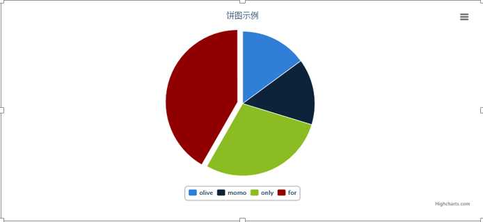
opt = HighChart.ChartOptionTemplates.Pie(data,‘Love-Rate‘,"饼图示例"); var
container = $("#container"); HighChart.RenderChart(opt, container); });</script> |
l 效果展示
l 页面引用
|
1
2
3
4
5
6
7
8
9
10
11
12
13
14
15
16
17
18
19
20
21
22
23
24
25
26
27
28
29
30
31
32
33
34
35
36
37
38
39
40
41
42
43
44
45
46
47
48
49
50
51 |
<script src="../Scripts/jquery-1.11.0.min.js"
type="text/javascript"></script> <script src="../Statics/highcharts.js"
type="text/javascript"></script> <script src="../Statics/exporting.js"
type="text/javascript"></script> <script src="../Statics/HighChart.js"
type="text/javascript"></script> <script type="text/javascript"> $(function () { var
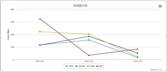
data = [ { name: ‘2013-01‘, group: ‘olive‘, value: 116 }, { name: ‘2013-01‘, group: ‘momo‘, value: 115 }, { name: ‘2013-01‘, group: ‘only‘, value: 222 }, { name: ‘2013-01‘, group: ‘for‘, value: 324 }, { name: ‘2013-02‘, group: ‘olive‘, value: 156 }, { name: ‘2013-02‘, group: ‘momo‘, value: 185 }, { name: ‘2013-02‘, group: ‘only‘, value: 202 }, { name: ‘2013-02‘, group: ‘for‘, value: 34 }, { name: ‘2013-03‘, group: ‘olive‘, value: 16 }, { name: ‘2013-03‘, group: ‘momo‘, value: 51 }, { name: ‘2013-03‘, group: ‘only‘, value: 22 }, { name: ‘2013-03‘, group: ‘for‘, value: 84 } ]; var
opt = HighChart.ChartOptionTemplates.Line(data, ‘Love-Rate‘, "折线图示例"); var
container = $("#container"); HighChart.RenderChart(opt, container); }); </script> |
l 效果展示
l 页面引用
|
1
2
3
4
5
6
7
8
9
10
11
12
13
14
15
16
17
18
19
20
21
22
23
24
25
26
27
28
29
30
31
32
33
34
35
36
37 |
<script src="../Scripts/jquery-1.11.0.min.js"
type="text/javascript"></script> <script src="../Statics/highcharts.js"
type="text/javascript"></script> <script src="../Statics/exporting.js"
type="text/javascript"></script> <script src="../Statics/HighChart.js"
type="text/javascript"></script> <script type="text/javascript"> $(function () { var
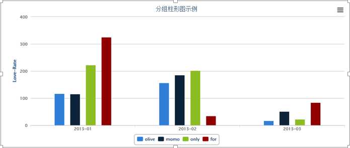
data = [ { name: ‘2013-01‘, group: ‘olive‘, value: 116 }, { name: ‘2013-01‘, group: ‘momo‘, value: 115 }, { name: ‘2013-01‘, group: ‘only‘, value: 222 }, { name: ‘2013-01‘, group: ‘for‘, value: 324 }, { name: ‘2013-02‘, group: ‘olive‘, value: 156 }, { name: ‘2013-02‘, group: ‘momo‘, value: 185 }, { name: ‘2013-02‘, group: ‘only‘, value: 202 }, { name: ‘2013-02‘, group: ‘for‘, value: 34 }, { name: ‘2013-03‘, group: ‘olive‘, value: 16 }, { name: ‘2013-03‘, group: ‘momo‘, value: 51 }, { name: ‘2013-03‘, group: ‘only‘, value: 22 }, { name: ‘2013-03‘, group: ‘for‘, value: 84 } ]; var
opt = HighChart.ChartOptionTemplates.Bars(data, ‘‘,‘‘,‘Love-Rate‘, "分组柱形图示例"); var
container = $("#container"); HighChart.RenderChart(opt, container); var
opt1 = HighChart.ChartOptionTemplates.Bars(data, true,‘‘,‘Love-Rate‘, "堆积柱形图示例"); var
container1 = $("#container1"); HighChart.RenderChart(opt1, container1); var
opt2 = HighChart.ChartOptionTemplates.Bars(data, ‘‘,true
,‘Love-Rate‘, "堆积百分比柱形图示例"); var
container2 = $("#container2"); HighChart.RenderChart(opt2, container2); }); </script> |
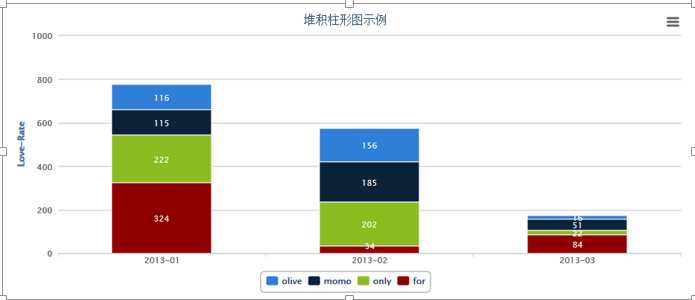
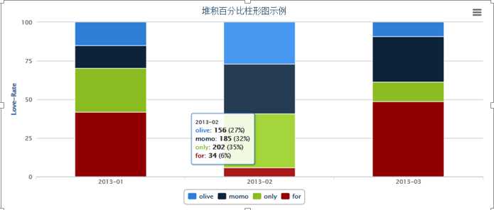
l 展示效果
分组柱形图
堆积图
堆积百分比图
后记:
这里只是列出了常用的一些图表类型,如果有特殊需要的话还可以进行自主的去抽象扩展。后续有时间的话,我也会对新的图表类型进行扩展,还有,关于HighChart里边的数据下钻的功能,这里也没有列出来,个人觉得这种图表的交互,抽象出来意义不是很大,后续再看看吧,有时间的话就再试着弄弄。
原文:http://www.cnblogs.com/Olive116/p/3777021.html