展示效果:
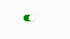
首先是html
<div class="container">
    <div class="bg_con">
        <input id="checked_1" type="checkbox" class="switch" />
        <label for="checked_1"></label>
    </div>
</div>
然后是css
.bg_con .switch{
    display:none;
}
.bg_con label{
    position:relative;
    display: block;
    padding: 1px;
    border-radius: 24px;
    height: 22px;
    margin-bottom: 15px;
    background-color: #eee;
    cursor: pointer;
    vertical-align: top;
    -webkit-user-select: none;
    width: 40px;
}
.bg_con label:before{
    content: ‘‘;
    display: block;
    border-radius: 24px;
    height: 22px;
    background-color: white;
    -webkit-transform: scale(1, 1);
    -webkit-transition: all 0.3s ease;
}
.bg_con label:after{
    content: ‘‘;
    position: absolute;
    top: 50%;
    left: 50%;
    margin-top: -11px;
    margin-left: -11px;
    width: 22px;
    height: 22px;
    border-radius: 22px;
    background-color: white;
    box-shadow: 1px 1px 1px 1px rgba(0,0,0,0.08);
    -webkit-transform: translateX(-9px);
    -webkit-transition: all 0.3s ease;
}
.bg_con .switch:checked~label:after{
    -webkit-transform: translateX(9px);
}

.bg_con .switch:checked~label:before{
    background-color:green;
}
原文:http://www.cnblogs.com/wuhairui/p/7516362.html