pandas是Python中开源的,高性能的用于数据分析的库。其中包含了很多可用的数据结构及功能,各种结构支持相互转换,并且支持读取、保存数据。结合matplotlib库,可以将数据已图表的形式可视化,反映出数据的各项特征。
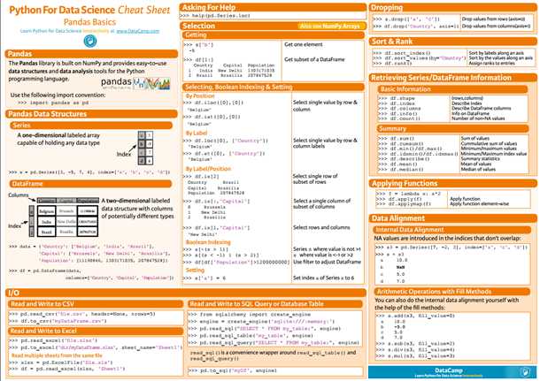
先借用一张图来描述一下pandas的一些基本使用方法,下面会通过一些实例对这些知识点进行应用。
一、安装pandas库
pandas库不属于Python自带的库,所以需要单独下载,如果已经安装了Python,可以使用pip工具下载pandas:
pip install pandas
如果还未安装Python的话,推荐使用Anaconda,一款集成了Python及其一系列用于数据分析、科学计算的专用包的平台,省去了单独安装各个库的麻烦(内置Python版本为3.6)。

二、pandas的基本数据结构
1.Seris
Seris是一维的,带索引的数组,支持多种数据类型。可以使用列表进行转换:
s = pd.Series([3, -5, 7, 4], index=[‘a‘, ‘b‘, ‘c‘, ‘d‘])
print(s)

# result
a    3
b   -5
c    7
d    4
dtype: int64
也可以重新指定索引:
s.index = [‘A‘, ‘B‘, ‘C‘, ‘D‘]
print(s)

# result
A    3
B   -5
C    7
D    4
dtype: int64
2.DataFrame
一种二维的,类似于Excel表格的数据结构,可以为其指定列名、索引名。
将字典结构转换为DataFrame:
data = {
    ‘Country‘: [‘Belgium‘, ‘India‘, ‘Brazil‘],
    ‘Capital‘: [‘Brussels‘, ‘New Delhi‘, ‘Brasília‘],
    ‘Population‘: [11190846, 1303171035, 207847528]
}
df = pd.DataFrame(data, columns=[‘Country‘, ‘Capital‘, ‘Population‘])
print(df)

# result
   Country    Capital  Population
0  Belgium   Brussels    11190846
1    India  New Delhi  1303171035
2   Brazil   Brasília   207847528
三、基本操作
1.查看DataFrame数据的基本信息:
对已一个刚接触的数据集,最好的了解它的方式就是先通过一些简单的命令查看他的基本结构,比如有多少行、多少列,列名是什么,是否有索引等等。pandas提供了这样的一系列命令让我们能够轻松的进行查询(以下部分实例使用此数据集)。
1) 查看行列信息:
print(df.shape)

# result
(260, 218)
说明df包含260行,218列数据。
2) 查看列名及索引名:
print(df.columns)
print(df.index)

# result
Index([‘Life expectancy‘, ‘1800‘, ‘1801‘, ‘1802‘, ‘1803‘, ‘1804‘, ‘1805‘,
       ‘1806‘, ‘1807‘, ‘1808‘,
       ...
       ‘2007‘, ‘2008‘, ‘2009‘, ‘2010‘, ‘2011‘, ‘2012‘, ‘2013‘, ‘2014‘, ‘2015‘,
       ‘2016‘],
      dtype=‘object‘, length=218)

Int64Index([  0,   1,   2,   3,   4,   5,   6,   7,   8,   9,
            ...
            250, 251, 252, 253, 254, 255, 256, 257, 258, 259],
           dtype=‘int64‘, length=260)
3) 查看描述该DataFrame的基本信息:
print(df.info())

# result
<class ‘pandas.core.frame.DataFrame‘>
Int64Index: 260 entries, 0 to 259
Columns: 218 entries, Life expectancy to 2016
dtypes: float64(217), object(1)
memory usage: 444.8+ KB
可以看出df.info()显示的信息较全面,对索引、列、数据类型都做出了描述。
4) 查看开头/结尾几行的数据:
对数据的基本情况了解后,有时候我们可能还想看一下具体的数据,从而有一个更加全面的认识,可以使用head(), tail()方法查看DataFrame的前几行/后几行数据。
print(df.head())

# result
         Life expectancy   1800   1801   1802   1803   1804   1805   1806  0               Abkhazia    NaN    NaN    NaN    NaN    NaN    NaN    NaN
1            Afghanistan  28.21  28.20  28.19  28.18  28.17  28.16  28.15
2  Akrotiri and Dhekelia    NaN    NaN    NaN    NaN    NaN    NaN    NaN
3                Albania  35.40  35.40  35.40  35.40  35.40  35.40  35.40
4                Algeria  28.82  28.82  28.82  28.82  28.82  28.82  28.82

    1807   1808  ...        2016
0    NaN    NaN  ...    0    NaN
1  28.14  28.13  ...    1  52.72
2    NaN    NaN  ...    2    NaN
3  35.40  35.40  ...    3  78.10
4  28.82  28.82  ...    4  76.50

[5 rows x 218 columns]
print(df.tail())

# result
    Life expectancy   1800   1801   1802   1803   1804   1805   1806   1807  255      Yugoslavia    NaN    NaN    NaN    NaN    NaN    NaN    NaN    NaN
256          Zambia  32.60  32.60  32.60  32.60  32.60  32.60  32.60  32.60
257        Zimbabwe  33.70  33.70  33.70  33.70  33.70  33.70  33.70  33.70
258           ?land    NaN    NaN    NaN    NaN    NaN    NaN    NaN    NaN
259     South Sudan  26.67  26.67  26.67  26.67  26.67  26.67  26.67  26.67

      1808  ...     2016
255    NaN  ...      NaN
256  32.60  ...    57.10
257  33.70  ...    61.69
258    NaN  ...      NaN
259  26.67  ...    56.10

[5 rows x 218 columns]
我使用的这个数据集的列有点多,所以python使用了"\"进行换行,并使用省略号省去了大部分的列数据,使其不必显示所有的列。
2.从DataFrame中选择子集:
对于一个较庞大的数据集,我们有时候只想对其中的一部分数据进行分析,那么我们就需要用合适的方法从中取出。pandas支持使用多种方式对数据进行选取:
1) 根据列名选择:
selected_cols = [‘2010‘, ‘2011‘, ‘2012‘]
date_df = df[selected_cols]
print(date_df.head())

# result
   2010  2011  2012
0   NaN   NaN   NaN
1  53.6  54.0  54.4
2   NaN   NaN   NaN
3  77.2  77.4  77.5
4  76.0  76.1  76.2
2) 根据标签选择:
使用loc[]方法通过指定列名、索引名来获得相应的数据集。以我上面使用的df数据为例,取第250行的‘Life expectancy‘列的数据:
print(df.loc[250, ‘Life expectancy‘])

# result
250                  Vietnam

Name: Life expectancy, dtype: object
3) 根据位置选择:
使用iloc[]通过指定列名、索引名对应的索引位置(从0到n-1)获取数据(可以使用slice分片方式表示)。如果我想取前十行中最后两列的数据,应该这样表示:
df.iloc[:10, -2:]

# result
   2015   2016
0   NaN    NaN
1  53.8  52.72
2   NaN    NaN
3  78.0  78.10
4  76.4  76.50
5  72.9  73.00
6  84.8  84.80
7  59.6  60.00
8   NaN    NaN
9  76.4  76.50
注:iloc[]中的slice分片方式与列表的分片方式相同,都不包含最后一位。例如上面的df.iloc[:10, -2:]值包含0~9行,而不包含第10行数据。
4) 布尔索引(Boolean Indexing)
也叫做布尔掩码(Boolean mask),是指先根据条件对DataFrame进行运算,生成一个值为True/False的DataFrame,再通过此DF与原DF进行匹配,得到符合条件的DF。
mask = df > 50
print(df[mask].head())

#result
         Life expectancy  1800  1801  1802  1803  1804  1805  1806  1807  0               Abkhazia   NaN   NaN   NaN   NaN   NaN   NaN   NaN   NaN
1            Afghanistan   NaN   NaN   NaN   NaN   NaN   NaN   NaN   NaN
2  Akrotiri and Dhekelia   NaN   NaN   NaN   NaN   NaN   NaN   NaN   NaN
3                Albania   NaN   NaN   NaN   NaN   NaN   NaN   NaN   NaN
4                Algeria   NaN   NaN   NaN   NaN   NaN   NaN   NaN   NaN

   1808  ...    2007  2008  2009  2010  2011  2012  2013  2014  2015   2016
0   NaN  ...     NaN   NaN   NaN   NaN   NaN   NaN   NaN   NaN   NaN    NaN
1   NaN  ...    52.4  52.8  53.3  53.6  54.0  54.4  54.8  54.9  53.8  52.72
2   NaN  ...     NaN   NaN   NaN   NaN   NaN   NaN   NaN   NaN   NaN    NaN
3   NaN  ...    76.6  76.8  77.0  77.2  77.4  77.5  77.7  77.9  78.0  78.10
4   NaN  ...    75.3  75.5  75.7  76.0  76.1  76.2  76.3  76.3  76.4  76.50

[5 rows x 218 columns]
不符合条件的显示为NaN。
3.Broadcasting
通过将某一列的值刷成固定的值。例如对一些身高数据做转换时,添加一列‘SEX‘列,并统一将值更新为‘MALE‘:
heights = [59.0, 65.2, 62.9, 65.4, 63.7]
data = {
    ‘height‘: heights, ‘sex‘: ‘Male‘,
}
df_heights = pd.DataFrame(data)
print(df_heights)

# result
   height   sex
0    59.0  Male
1    65.2  Male
2    62.9  Male
3    65.4  Male
4    63.7  Male
4.设置列名及索引名:
如果需要重新指定列名或索引名,可直接通过df.columns(),df.index()指定。
df_heights.columns = [‘HEIGHT‘, ‘SEX‘]
df_heights.index = [‘david‘, ‘bob‘, ‘lily‘, ‘sara‘, ‘tim‘]
print(df_heights)

# result
       HEIGHT   SEX
david    59.0  Male
bob      65.2  Male
lily     62.9  Male
sara     65.4  Male
tim      63.7  Male
5.使用聚合函数
如果需要对数据进行一些统计,可使用聚合函数进行计算。
1) df.sum()
将所有值按列加到一起:
print(df_heights.sum())

# result
HEIGHT                   316.2
SEX       MaleMaleMaleMaleMale
dtype: object
字符串sum后会合并在一起。
2) df.cumsum()
统计累积加和值:
print(df_heights.cumsum())

# result
      HEIGHT                   SEX
david     59                  Male
bob    124.2              MaleMale
lily   187.1          MaleMaleMale
sara   252.5      MaleMaleMaleMale
tim    316.2  MaleMaleMaleMaleMale
3) df.max() / df.min()
求最大/最小值
print(df_heights.max())

# result
HEIGHT    65.4
SEX       Male
dtype: object
print(df_heights.min())

# result
HEIGHT      59
SEX       Male
dtype: object
注: df.idxmax() / df.idxmin() 方法可得极值对应的索引值。
4) df.mean()
求平均数
print(df_heights.mean())

# result
HEIGHT    63.24
dtype: float64
数据类型为字符串的列会被自动过滤。
5) df.median()
求中位数
print(df_heights.median())

# result
HEIGHT    63.7
dtype: float64
6) df.describe()
获取DF的基本统计信息:
print(df_heights.describe())

# result
          HEIGHT
count   5.000000
mean   63.240000
std     2.589015
min    59.000000
25%    62.900000
50%    63.700000
75%    65.200000
max    65.400000
6.从DataFrame中删除数据
1) 通过指定行索引删除行数据:
df_heights.drop([‘david‘, ‘tim‘])
print(df_heights)

# result
HEIGHT SEX
david 59.0 Male
bob 65.2 Male
lily 62.9 Male
sara 65.4 Male
tim 63.7 Male
我们发现drop‘david‘, ‘tim‘所在行后,再次打印df_height,之前删除的两行数据还在。说明drop()方法不会直接对原有的DF进行操作,如果需要改变原DF,需要进行赋值:
df_heights = df_heights.drop([‘david‘, ‘tim‘])
print(df_heights)

# result
      HEIGHT   SEX
bob     65.2  Male
lily    62.9  Male
sara    65.4  Male
2) 通过指定列值删除列数据(需指定axis=1):
print(df_heights.drop(‘SEX‘, axis=1))

# result
HEIGHT
david 177.0
bob 195.6
lily 188.7
sara 196.2
tim 191.1
同样,如果需要改变原DF,需要重新赋值。
7.排序
1) 根据索引值进行排序:
print(df_heights.sort_index())

# result
       HEIGHT   SEX
bob      65.2  Male
david    59.0  Male
lily     62.9  Male
sara     65.4  Male
tim      63.7  Male
2) 根据值进行排序(需指定列名):
print(df_heights.sort_values(by=‘HEIGHT‘))

# result
       HEIGHT   SEX
david    59.0  Male
lily     62.9  Male
tim      63.7  Male
bob      65.2  Male
sara     65.4  Male
8.排名
根据列值进行排名:
print(df_heights.rank())

# result
       HEIGHT  SEX
david     1.0  3.0
bob       4.0  3.0
lily      2.0  3.0
sara      5.0  3.0
tim       3.0  3.0
9.使用lambda函数:
例如,对df_heights中的身高列进行转换(inch -> cm):
df_heights = df_heights.apply(lambda height: height*3)
print(df_heights)

# result
       HEIGHT           SEX
david   177.0  MaleMaleMale
bob     195.6  MaleMaleMale
lily    188.7  MaleMaleMale
sara    196.2  MaleMaleMale
tim     191.1  MaleMaleMale
四、csv文件的导入导出
1.csv导入(数据集):
df = pd.read_csv("tips.csv")
print(df.info())

# result
<class ‘pandas.core.frame.DataFrame‘>
RangeIndex: 244 entries, 0 to 243
Data columns (total 8 columns):
total_bill    244 non-null float64
tip           244 non-null float64
sex           244 non-null object
smoker        244 non-null object
day           244 non-null object
time          244 non-null object
size          244 non-null int64
fraction      244 non-null float64
dtypes: float64(3), int64(1), object(4)
memory usage: 15.3+ KB
2.pd.read_csv()的一些常用选项
header=None: 不导入column
names: 指定column
df = pd.read_csv(‘tips.csv‘, header=None, names=column_names)
na_values: 将NaN替换成指定字符
df = pd.read_csv(‘tips.csv‘, header=None, names=column_names, na_values={‘DAY‘: ‘-1‘})
parse_dates:合并表示时间的列
date_df = pd.read_csv(‘created_date.csv‘, parse_dates=[[3, 4, 5]])
五、保存CSV文件
支持保存为csv格式及excel格式的文件:
date_df.to_csv(‘tips1.csv‘)
date_df.to_csv(‘tips2.csv‘, sep=‘|‘) # 分隔符为‘|‘
date_df.to_excel(‘tips3.xlsx‘)
六、配合Matplotlib绘制简单图表
Matplotlib库是python的一个2D图形库,可以生成多种高质量的图形,通过各种不同类型的图形体现数据的价值。
1.绘制折线图:
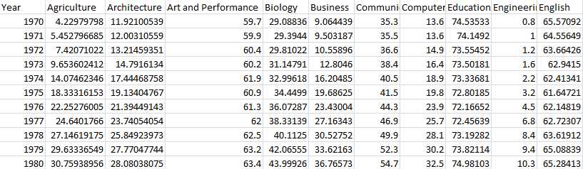
折线图一般用于反映数据在一段时间内的变化情况。我们先导入一份数据(Percentage of bachelor‘s degrees awarded to women in the USA),这个数据集描述了从1970~2011年,美国女性在各个专业的学士学位获取比例的情况:
虽然数据比较全,但是仅仅从这个表格上去对比各个专业之间的差异还是有些困难的,这时我们就可以通过使用matplotlib画图表的方式展示这些数据之间的关系。
1) 引入pandas库后先导入数据:
import pandas as pd
import matplotlib.pyplot as plt


df = pd.read_csv(‘percent-bachelors-degrees-women-usa.csv‘, index_col=‘Year‘)
print(df.info())
print(df.head())

# result
      Agriculture  Architecture  Art and Performance    Biology   Business  \ ... ...         Social Sciences and History
Year                                                                          ... ...   Year
1970     4.229798     11.921005                 59.7  29.088363   9.064439    ... ...   1970                         36.8
1971     5.452797     12.003106                 59.9  29.394403   9.503187    ... ...   1971                         36.2
1972     7.420710     13.214594                 60.4  29.810221  10.558962    ... ...   1972                         36.1
1973     9.653602     14.791613                 60.2  31.147915  12.804602    ... ...   1973                         36.4
1974    14.074623     17.444688                 61.9  32.996183  16.204850    ... ...   1974                         37.3


<class ‘pandas.core.frame.DataFrame‘>
Int64Index: 42 entries, 1970 to 2011
Data columns (total 17 columns):
Agriculture                      42 non-null float64
Architecture                     42 non-null float64
Art and Performance              42 non-null float64
Biology                          42 non-null float64
Business                         42 non-null float64
Communications and Journalism    42 non-null float64
Computer Science                 42 non-null float64
Education                        42 non-null float64
Engineering                      42 non-null float64
English                          42 non-null float64
Foreign Languages                42 non-null float64
Health Professions               42 non-null float64
Math and Statistics              42 non-null float64
Physical Sciences                42 non-null float64
Psychology                       42 non-null float64
Public Administration            42 non-null float64
Social Sciences and History      42 non-null float64
dtypes: float64(17)
memory usage: 5.9 KB
可以看出,‘Year‘为索引列,这次数据统计一共包含了17个专业。
2) 绘图
可以使用matplotlib.pyplot中的plt()方法进行绘图。我们先试着分析某一列的数据,看一下具体是如何展示的:
df_CS = df[‘Computer Science‘]
plt.plot(df_CS)
plt.show()

从图中我们看到,索引值作为X轴的刻度展示,Y轴则表示这一列的具体数值。从这个图中可以直观的看出这段时间学位的获取情况。
3) 添加标题和标签
仅仅这样展示似乎有些单调,matplotlib还提供了一系列可供自定义的功能:
df_CS = df[‘Computer Science‘]
plt.plot(df_CS)
# 为图表添加标题
plt.title("Percentage of Computer Science‘s degrees awarded to women in the USA")
# 为X轴添加标签
plt.xlabel("Years")
# 为Y轴添加标签
plt.ylabel("Percentage")
plt.show()
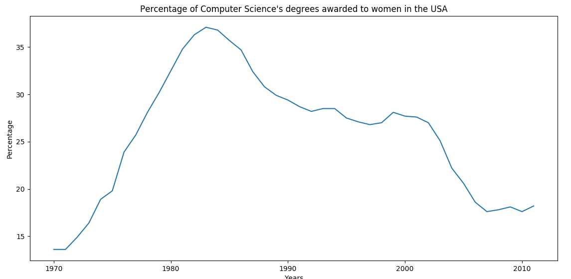
添加了标题和标签,就好看一些了。
4) 绘制多个图形进行对比
如果我们想看Math and Statistics与Computer Science的差异,可以一并绘出并展示:
df_CS = df[‘Computer Science‘]
df_MS = df[‘Math and Statistics‘]
# 可以通过DataFrame的plot()方法直接绘制
# color指定线条的颜色
# style指定线条的样式
# legend指定是否使用标识区分
df_CS.plot(color=‘b‘, style=‘.-‘, legend=True)
df_MS.plot(color=‘r‘, style=‘-‘, legend=True)
plt.title("Percentage of Computer Science‘s degrees VS Math and Statistics‘s")
plt.xlabel("Years")
plt.ylabel("Percentage")
plt.show()

可以看出Math and Statistics明显高于Computer Science。
最后,我们绘制所有数据的曲线:
# alpha指定透明度(0~1)
df.plot(alpha=0.7)
plt.title("Percentage of bachelor‘s degrees awarded to women in the USA")
plt.xlabel("Years")
plt.ylabel("Percentage")
# axis指定X轴Y轴的取值范围
plt.axis((1970, 2000, 0, 200))
plt.show()

5) 保存图像
使用plt.savefig()保存图像,支持PNG, JPG,PDF等格式。
plt.savefig(‘percent-bachelors.png‘)
plt.savefig(‘percent-bachelors.jpg‘)
plt.savefig(‘percent-bachelors.pdf‘)
2.其他类型的图像
除了折线图,matplob还支持绘制散点图等其他类型,只需要在调用plot()画图之前指定kind参数即可。
1) 散点图
散点图可以体现数据在一定范围内的分布情况。上述数据集不适合画散点图,所以我们重新导入一份著名的鸢尾花数据(在数据分析和机器学习中经常被用到)。
我们在导入数据后,分析sepal(萼片)的长度和宽度数据:
iris = pd.read_csv("iris.csv")
# 源数据中没有给column,所以需要手动指定一下
iris.columns = [‘sepal_length‘, ‘sepal_width‘, ‘petal_length‘, ‘petal_width‘, ‘species‘]
# kind表示图形的类型
# x, y 分别指定X, Y 轴所指定的数据
iris.plot(kind=‘scatter‘, x=‘sepal_length‘, y=‘sepal_width‘)
plt.xlabel("sepal length in cm")
plt.ylabel("sepal width in cm")
plt.title("iris data analysis")
plt.show()

从散点图可以看出,数据主要集中在中间靠下的这部分区域(如果使用折线图,就是这些点连起来的折线,将变得杂乱无章)。
2) box箱图
box箱图也可以体现数据的分布情况,与散点图不同的是,它还统计了最大/最小值、中位数的值,一目了然:
iris.plot(kind=‘box‘, y=‘sepal_length‘)
plt.ylabel("sepal length in cm")
plt.show()

3) Histogram柱状图
柱状图体现了数据的分布情况及出现的频率,将数据展示得更加直观。下面我们从数据集中取出类别为"Iris-setosa"的子集,并使用柱状图统计它的四类数据:
# 使用mask取出子集
mask = (iris.species == ‘Iris-setosa‘)
setosa = iris[mask]
# bins指定柱状图的个数
# range指定X轴的取值范围
setosa.plot(kind=‘hist‘, bins=50, range=(0, 8), alpha=0.5)
plt.title("setosa in iris")
plt.xlabel("CM")
plt.show()

Pandas与Matplotlib中常用的内容就给大家介绍到这了。这两种工具非常容易上手,但是想要精通,真正用好也需要花些心思。后面有机会再写一些较深入的文章吧 : )