1.flex-dierction
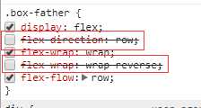
 1 .box-father {
 2     display: flex;
 3     // 默认row(行)
 4     flex-direction: row;
 5     // 行反
 6     flex-direction: row-reverse;
 7     // 列
 8     flex-direction: column;
 9     // 列反
10     flex-direction: column-reverse;
11     .box {
12         width: 50px;
13         height: 50px;
14         background-color: aqua;
15         margin-top: 10px;
16         text-align: center;
17         line-height: 50px;
18         font-weight: 600;
19         color: rgb(141, 105, 105);
20         cursor: pointer;
21     }
22 }
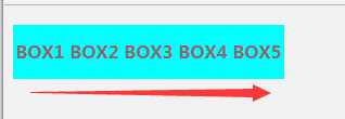
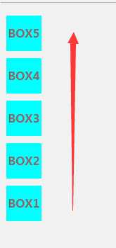
1.1 flex-direction: row;
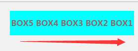
1.2 flex-direction:row-reverse
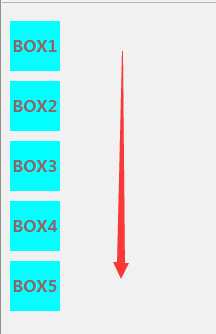
1.3 flex-direction:column
1.4 flex-direction:column-reverse
后面的值会覆盖掉前面的值。
flex-direction属性决定主轴的方向(即项目的排列方向)。
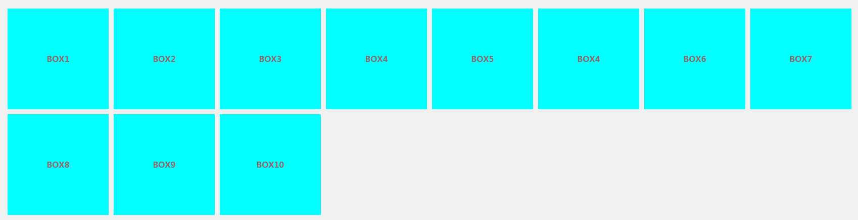
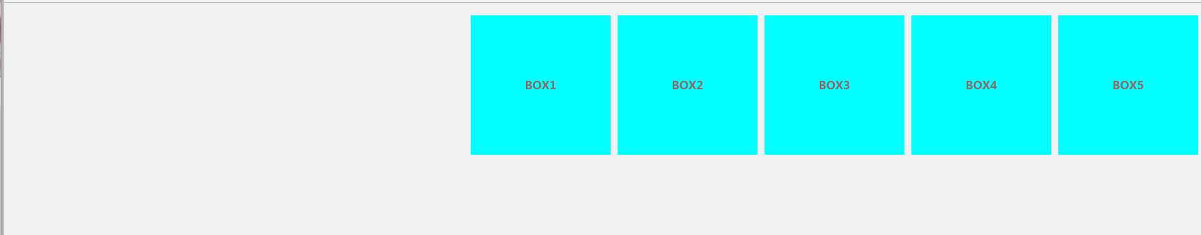
2.flex-wrap
nowrap | wrap | wrap-reverse
默认情况下,项目都排在一条线(又称”轴线”)上。flex-wrap属性定义,如果一条轴线排不下,如何换行。
2.1 flex-wrap: nowrap
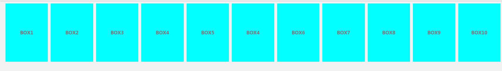
一旦不换行,则压缩元素原本的大小来维持布局。
2.2 flex-wrap: warp
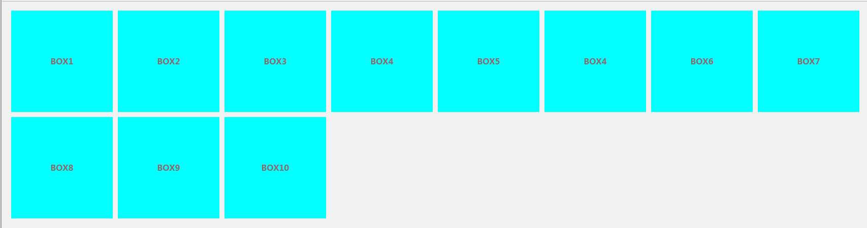
一旦换行,则保持元素原本的大小。
2.3 flex-wrap: warp-reverse
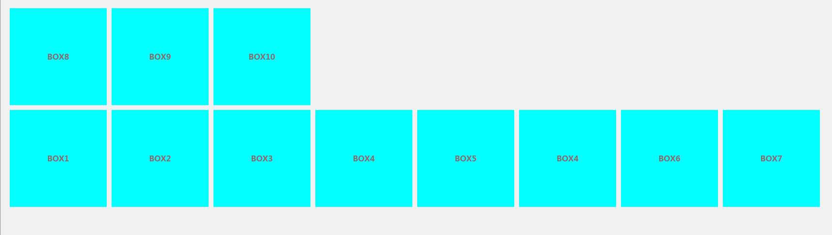
取反。
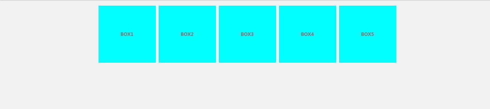
3. flex-flow
简写属性:flex-flow属性是flex-direction属性和flex-wrap属性的简写形式,默认值为row nowrap。
意味着什么? 没错,就是覆盖这两个属性
4.justify-content
定义了项目在主轴上的对齐方式
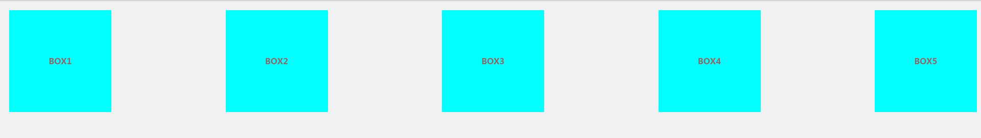
- flex-start(默认值):左对齐
- flex-end:右对齐
- center: 居中
- space-between:两端对齐,项目之间的间隔都相等。
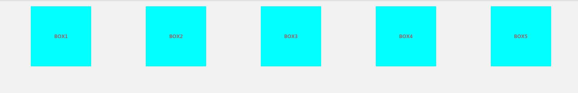
- space-around:每个项目两侧的间隔相等。所以,项目之间的间隔比项目与边框的间隔大一倍。
justify-content: flex-start | flex-end | center | space-between | space-around;
4.1 justify-content:flex-start
4.2 justify-content:flex-end
4.3 justify-content:flex-center
4.4 justify-content:space-between
4.5 justify-content:space-around
4.6 justify-content:space-evenly