参考matplotlib官方指南:
https://matplotlib.org/tutorials/introductory/pyplot.html#sphx-glr-tutorials-introductory-pyplot-py
pyplot是常用的画图模块,功能非常强大,下面就来见识下它的能力吧
1.快速画出常见图形
2.使用关键字字符串作图
3.使用类别变量画图
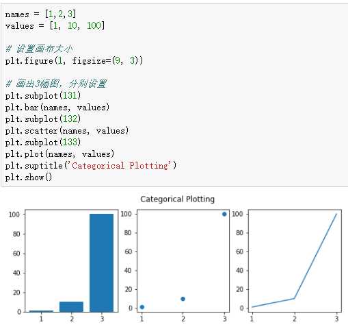
4.创建多图
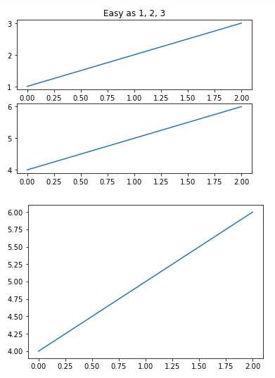
 1 import matplotlib.pyplot as plt
 2 %matplotlib inline
 3 plt.figure(1)                # the first figure
 4 plt.subplot(211)             # the first subplot in the first figure
 5 plt.plot([1, 2, 3])
 6 plt.subplot(212)             # the second subplot in the first figure
 7 plt.plot([4, 5, 6])
 8
 9
10 plt.figure(2)                # a second figure
11 plt.plot([4, 5, 6])          # creates a subplot(111) by default
12
13 plt.figure(1)                # figure 1 current; subplot(212) still current
14 plt.subplot(211)             # make subplot(211) in figure1 current
15 plt.title(‘Easy as 1, 2, 3‘) # subplot 211 title
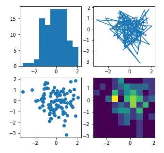
 1 import matplotlib.pyplot as plt
 2 import numpy as np
 3
 4 np.random.seed(19680801)
 5 data = np.random.randn(2, 100)
 6
 7 fig, axs = plt.subplots(2, 2, figsize=(5, 5))
 8 axs[0, 0].hist(data[0])
 9 axs[1, 0].scatter(data[0], data[1])
10 axs[0, 1].plot(data[0], data[1])
11 axs[1, 1].hist2d(data[0], data[1])
12
13 plt.show()
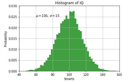
5.添加文本:轴线标签,属性标签
 1 import matplotlib.pyplot as plt
 2 import numpy as np
 3 mu, sigma = 100, 15
 4 x = mu + sigma * np.random.randn(10000)
 5
 6 # the histogram of the data
 7 n, bins, patches = plt.hist(x, 50, normed=True, facecolor=‘g‘, alpha=0.75)
 8
 9
10 plt.xlabel(‘Smarts‘)
11 plt.ylabel(‘Probability‘)
12 plt.title(‘Histogram of IQ‘)
13 plt.text(60, .025, r‘$\mu=100,\ \sigma=15$‘)   # 支持 LaTex格式
14 plt.axis([40, 160, 0, 0.03])
15 plt.grid(True)
16 plt.show()
python数据可视化——matplotlib 用户手册入门:pyplot 画图
原文:https://www.cnblogs.com/feinaio2017/p/9058291.html