1.左右定宽固定,中间自适应的布局
<!DOCTYPE html>
<html lang="en">
<head>
    <meta charset="UTF-8">
    <title>Document</title>
    <style type="text/css">
        .outer{
            background-color: #ccc;
            width: 800px;
            height: 600px;
            display: flex;
        }

        .A {
            background-color: #111;
            width: 100px;
            /*order: 1;*/
        }
        .B {
            background-color: #444;
            /*order: 2;*/
            flex: 1;
        }

        .C {
            background-color: blue;
            width: 200px;
            /*order: 3;*/
        }


    </style>
</head>
<body>

        <div class="outer">
            <div class="A"></div>
            <div class="B"></div>
            <div class="C"></div>
        </div>

</body>
</html>
用flex布局,核心是把中间元素声明flex:1,使其占满剩余空间
2.上下固定,中间自适应的布局
<!DOCTYPE html>
<html lang="en">
<head>
    <meta charset="UTF-8">
    <title>Document</title>
    <style>
        .my{
            background-color: #ccc;
            position: relative;
            width: 300px;
            height: 800px;

        }
        .a {
            height: 100px;
            background-color: red;
            position: absolute;
            top: 0;
            width: 300px;

        }
        .b {
            position: absolute;
            top: 100px;
            bottom: 100px;
            background-color: green;
            width: 300px;
        }
        .c {
            height: 100px;
            position: absolute;
            background-color: blue;
            bottom: 0;
            width: 300px;

        }


    </style>
</head>
<body>
    <div class="my">
        <div class="a"></div>
        <div class="b"></div>
        <div class="c"></div>
    </div>
</body>
</html>
用绝对定位布局,核心是中间元素的top与bottom给出来。
那这个上下固定,中间自适应是否可以用flex来做呢?显然可以,其实问题1与2都是可以用定位或flex来做的。只是在垂直方向上用flex,需要使用flex-direction:column来改变默认的row方向
注意,虽然改变了flex-dircetion主轴方向,但width仍然是已水平的海平面方向的,中间元素在高度方向上进行自适应了。
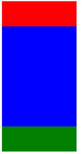
<!DOCTYPE html>
<html lang="en">
<head>
    <meta charset="UTF-8">
    <title>Document</title>
    <style>
        .outer {
            display: flex;
            flex-direction: column;
            height: 600px;
            width: 300px;
            background-color: #ccc;
        }

        .a {
            width: 300px;
            height: 100px;
            background-color: red;
        }
        .b {
            flex: 1;
            width: 300px;
            background-color: blue
        }
        .c {
            width: 300px;
            height: 100px;
            background-color: green;
        }
    </style>
</head>
<body>

    <div class="outer">
        <div class="a"></div>
        <div class="b"></div>
        <div class="c"></div>
    </div>
</body>
</html>
原文:https://www.cnblogs.com/zhansu/p/9160385.html