简单粗暴,直接上重点: transform-origin
接下来是代码。
首先 勾勒出 3个重叠的div
接着 给3个div分别添加 transform: rotate 。
<!DOCTYPE html>
<html lang="en">
<head>
    <meta charset="UTF-8">
    <meta name="viewport" content="width=device-width, initial-scale=1.0">
    <meta http-equiv="X-UA-Compatible" content="ie=edge">
    <title>Document</title>
    <style>
        *{
            margin: 0;
            padding: 0;
        }

        ul{
            width: 200px;
            height: 200px;
            margin: 100px auto;
            border: 1px solid #000;
            position: relative;

        }

        ul li{
            list-style: none;
            width: 200px;
            height: 200px;
            position: absolute;
            left: 0;
            top: 0;
        }

        ul li:nth-child(1){
            background-color: red;

        }

        ul li:nth-child(2){
            background-color: green;

        }

        ul li:nth-child(3){
            background-color: blue;

        }

    </style>
</head>
<body>
    <ul>
        <li></li>
        <li></li>
        <li></li>
    </ul>
</body>
</html>
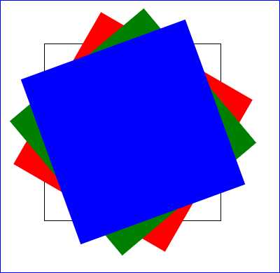
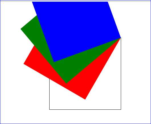
<!DOCTYPE html>
<html lang="en">
<head>
    <meta charset="UTF-8">
    <meta name="viewport" content="width=device-width, initial-scale=1.0">
    <meta http-equiv="X-UA-Compatible" content="ie=edge">
    <title>Document</title>
    <style>
        *{
            margin: 0;
            padding: 0;
        }

        ul{
            width: 200px;
            height: 200px;
            margin: 100px auto;
            border: 1px solid #000;
            position: relative;

        }

        ul li{
            list-style: none;
            width: 200px;
            height: 200px;
            position: absolute;
            left: 0;
            top: 0;
        }

        ul li:nth-child(1){
            background-color: red;
            transform: rotate(30deg);
        }

        ul li:nth-child(2){
            background-color: green;
            transform: rotate(50deg);
        }

        ul li:nth-child(3){
            background-color: blue;
            transform: rotate(70deg);
        }

    </style>
</head>
<body>
    <ul>
        <li></li>
        <li></li>
        <li></li>
    </ul>
</body>
</html>
效果如下图所示。
默认情况下,所有元素都是以自己的中心点作为参考点来进行旋转。
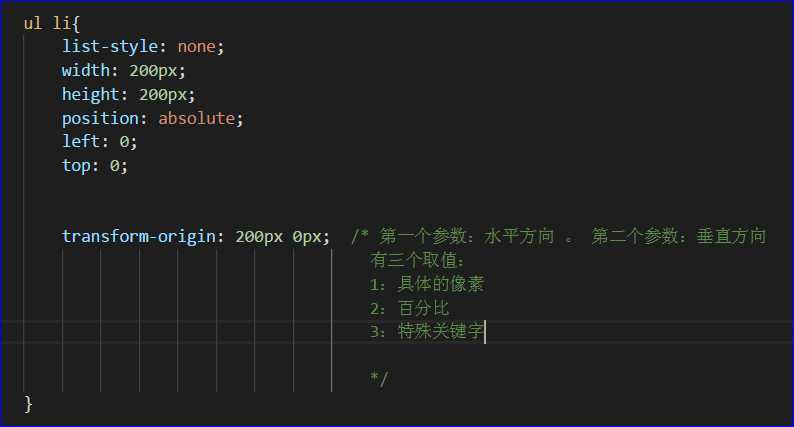
我们可以通过形变中心点属性来修改它的参考点。
示例:以左上角作为中心点 → transform-origin: 0px 0px;
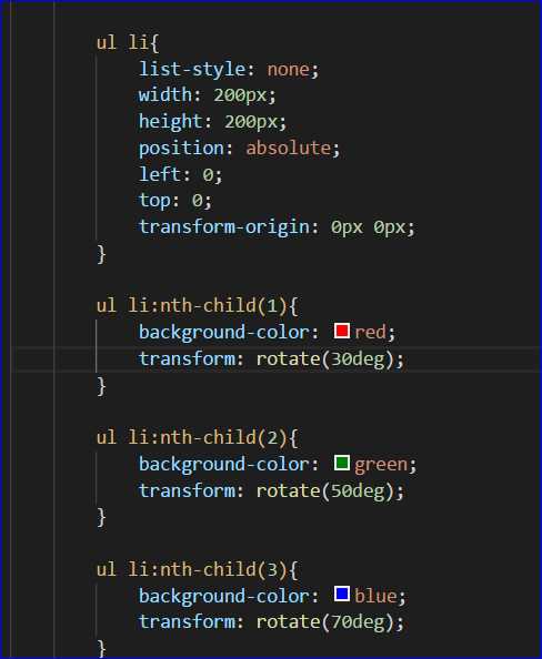
效果:
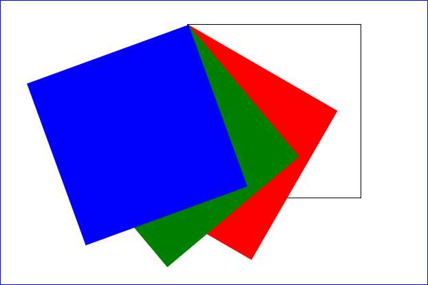
以右上角作为中心点:
效果:
原文:https://www.cnblogs.com/-Tony/p/9175101.html