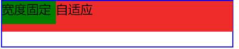
实现左边div元素固定,右边div自适应
两个块级元素
(1)将固定元素设为浮动,此时另一个元素的部分宽度会被浮动元素覆盖,设置另一元素的margin-left或BFC
.par{
    width: 300px;
    border: solid 1px #0000FF;
    height: 60px;
    }
.lnav{
    width: 70px;
    height: 30px;
    background: #008000;
    float: left;
       }
.rnav{
    height: 40px;
    background: #EE2C2C;
    margin-left: 70px;
    }
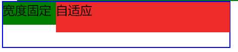
(2)flex布局
.par{
    width: 300px;
    border: solid 1px #0000FF;
    height: 60px;
    display: flex;
    }
.lnav{
    width: 70px;
    height: 30px;
    background: #008000;
    }
.rnav{
    height: 40px;
    background: #EE2C2C;
    flex-grow: 1;
    }
(3)绝对布局(和float类似)
.par{
    width: 300px;
    border: solid 1px #0000FF;
    height: 60px;
    position: relative;
}
.lnav{
    width: 70px;
    height: 30px;
    background: #008000;
    position: absolute;
    left: 0;
    top: 0;
}
.rnav{
    height: 40px;
    background: #EE2C2C;
    margin-left: 70px;
}
(4)display:table
.par{
    width: 300px;
    border: solid 1px #0000FF;
    height: 60px;
    display: table;
    }
.lnav{
    width: 70px;
    background: #008000;
    display: table-cell;
    }
.rnav{
    background: #EE2C2C;
    display: table-cell;
    }
(5)双float+calc()计算属性
.par{
    width: 300px;
    border: solid 1px #0000FF;
    height: 60px;
    overflow: hidden;
    }
.lnav{
    float: left;
    width: 70px;
    height: 30px;
    background: #008000;
    }
.rnav{
    float: left;
    width: calc(100% - 70px);// 减号左右留空格
    height: 40px;
    background: #EE2C2C;
    }
两个行内元素
如:css 实现一个自适应搜索框,输入框部分宽度自适应,搜索按钮宽度固定 (行内元素)
(1)flex布局(与上面相同)
(2)float+calc()+box-sizing
.par{
    width: 300px;
    border: solid 1px #0000FF;
    height: 60px;
    overflow: hidden;
}
.lnav{
    float: left;
    width: 70px;
    height: 30px;
    background: #008000;
    box-sizing: border-box;
}
.rnav{
    float: right;
    width: calc(100% - 70px);
    height: 40px;
    background: #EE2C2C;
    box-sizing: border-box;
}
(3)
原文:https://www.cnblogs.com/xiaoan0705/p/10484350.html