1、边框的圆角
border-radius: 25px; 圆角弧度的大小
可以设置边框、背景色、背景图片的圆角效果及其圆角大小
background: #ccc; 设置背景色的圆角
border: 5px solid #ccc; 设置边框的圆角效果
background-image: url(../images/1.jpg); 设置背景图片的圆角效果
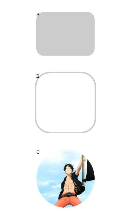
代码内容:

<body>

    <br>
    <br>

    <div class="a">
        A
    </div>

    <br>
    <br>
    <br>

    <div class="b">
        B
    </div>

    <br>
    <br>
    <br>

    <div class="c">
        C
    </div>

</body>
div{
    margin: auto;                                        /*所有div都居中*/
}
.a{
    border-radius: 25px;
    background: #ccc;
    width: 200px;
    height: 150px;

}

.b{
    border-radius: 50px;
    border: 5px solid #ccc;
    width: 200px;
    height: 200px;

}


.c{
    border-radius: 100px;
    background-image: url(../images/1.jpg);
    background-position: left bottom;                    /*图片向左,向下对齐*/
    width: 200px;
    height:200px;
}
显示效果:
2、盒子阴影
box-shadow: 100px 10px 5px #888888;
(左右的偏移量) (上下的偏移量) (虚化程度) (阴影颜色)
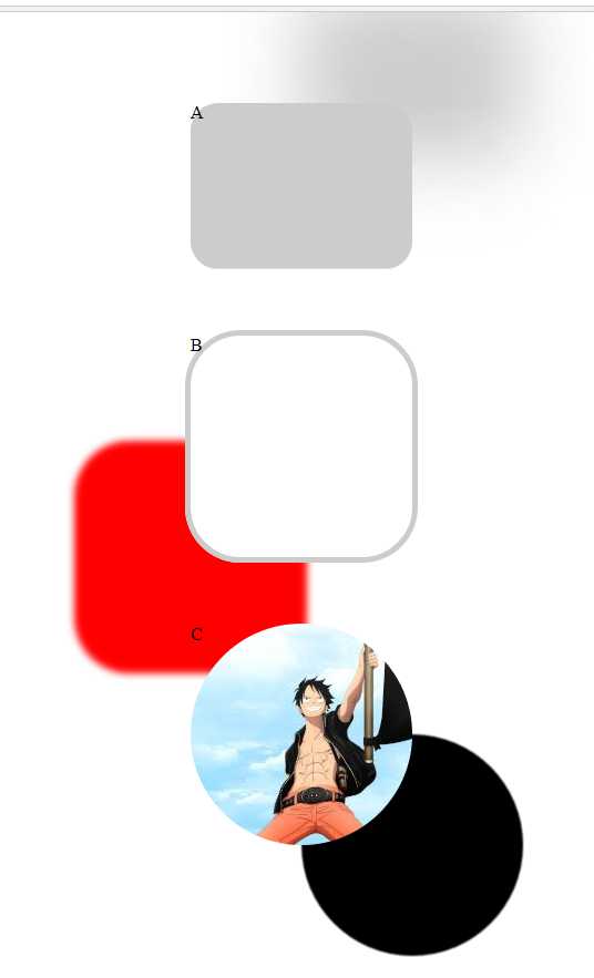
代码示例:
div{
    margin: auto;                                        /*所有div都居中*/
}
.a{
    border-radius: 25px;
    background: #ccc;
    width: 200px;
    height: 150px;


    /*盒子阴影*/
    box-shadow: 100px -100px 100px #ccc;

}

.b{
    border-radius: 50px;
    border: 5px solid #ccc;
    width: 200px;
    height: 200px;

    /*盒子阴影*/
    box-shadow: -100px 100px 10px red;


}


.c{
    border-radius: 100px;
    background-image: url(../images/1.jpg);
    background-position: left bottom;                    /*图片向左,向下对齐*/
    width: 200px;
    height:200px;


    /*盒子阴影*/
    box-shadow: 100px 100px 1px black;

}
效果图:
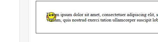
3、背景图片
background-size :背景图片的尺寸
background-image:可以设置多张图片,以逗号隔开。最左侧的为最上层图片
一张图片还可以同时设置多个属性值: background-image:url(../../) right bottom no-repeat;
background-origin :指定图片显示在内容中(centent-box)、内容和边框之间(padding-box)、边框位置(border-box)
效果示意图: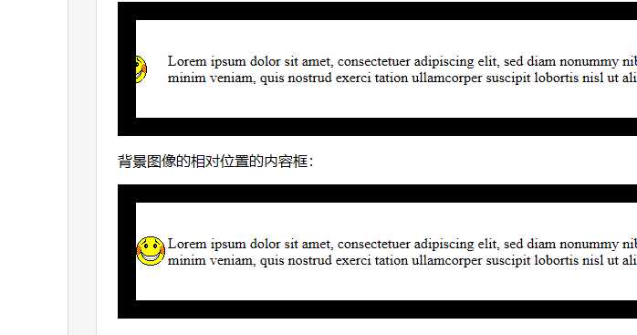
4、渐变
未完待续。。。。。。。。
原文:https://www.cnblogs.com/PHP0222wangdong/p/10484891.html
