1 autonomous custom elements
一般extends HTMLElement, 可以通过<popup-info>或doducment.createElement("popup-info")引入到页面
2 customized built-in elements
继承自基础的html elements,需要添加is属性来引入到页面,<p is="word-count">或 document.createElement("p", {is:"word-count"})
自定义的组件即为一个class,使用前需要用CustomElementRegistry 的define来注册一下。
autonomous custom elements的注册:customElements.define("popup-info", PopupInfo);
customized built-in elements的注册:customElements.define(‘expanding-list‘, ExpandingList,{extends:"ul"});
winodw.customElements返回的是CustomElementRegistry的引用。
自定义组件的生命用期:
1 connectedCallback append到一个元素时会触发这个事件
2 disconnectedCallBack 移除时会触发
3 doptedCallback 组件被移动到别的页面时会触发
4 attributeChangedCallback 组件的属性值改变是会触发。这个回调需要自定义组件提示 static get observedAttributes(){return [‘属性名‘,‘属性名‘,...];}。如果在组件还没 append到某元素上,此时setAttribute也会触发该事件。
它是document node的一种。对保证组件的独立,使其行为、样式、事件等不受外部的影响起关键作用。它给自定义组件里的元素提供了一个隐蔽的分离出来的DOM.
与Shadow DOM相关的几个术语:
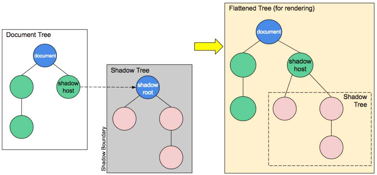
this.attachShadow({mode:‘open‘}),将shadow root加到自定义元素上。mode有两个值:open和closed。open的话,在外边也可以访问到组件的shadowRoot,closed的正好相反.
let myShadowDom = myCustomElem.shadowRoot;
mode为open时myShadowDom可以取到值,并能对里边的元素做操作。mode为close时myShadowDom为null;
function updateStyle(elem) {
  const shadow = elem.shadowRoot; // 访问自定义组件的shadow root
  shadow.querySelector(‘style‘).textContent = `
    div {
      width: ${elem.getAttribute(‘l‘)}px;
      height: ${elem.getAttribute(‘l‘)}px;
      background-color: ${elem.getAttribute(‘c‘)};
    }
  `; // shadow root有跟document类似的方法如getElementById,querySelector等
}
在shadow dom中引入slot来增加灵活性。搭配使用template效果更佳。
slot让用户可给向自定义组件里添加自己的标签元素。它通过name属性来指定一个slot,所以组件内的slot的name要唯一。
<template>标签里的代码片断(DocumentFragment)不会被rend到页面上,只能通过javascript的Node.cloneNode克隆出新的DocumentFragment然后后再appendChild或是insertBefore来加来到dom树上。
template里的documentFragment通过HTMLTemplateElement.content来取得。
<template id="element-details-template">
  <style>
  details {font-family: "Open Sans Light",Helvetica,Arial}
  .name {font-weight: bold; color: #217ac0; font-size: 120%}
  h4 { margin: 10px 0 -8px 0; }
  h4 span { background: #217ac0; padding: 2px 6px 2px 6px }
  h4 span { border: 1px solid #cee9f9; border-radius: 4px }
  h4 span { color: white }
  .attributes { margin-left: 22px; font-size: 90% }
  .attributes p { margin-left: 16px; font-style: italic }
  </style>
  <details>
    <summary>
      <span>
        <code class="name"><<slot name="element-name">NEED NAME</slot>></code>  <!--slot->
        <i class="desc"><slot name="description">NEED DESCRIPTION</slot></i> <!--slot->
      </span>
    </summary>
    <div class="attributes">
      <h4><span>Attributes</span></h4>
      <slot name="attributes"><p>None</p></slot> <!--slot ->
    </div>
  </details>
  <hr>
</template>
customElements.define(‘element-details‘,
  class extends HTMLElement {
    constructor() {
      super(); // constructor里先写上super,this才能被赋值
      var template = document
        .getElementById(‘element-details-template‘)
        .content;// template可以通过dom的方法来取到,它的content属性返回的就是内部的DocumentFragment
      const shadowRoot = this.attachShadow({mode: ‘open‘}) // 自定义组件首先要创建shadow,通过appendChild来往shadow里添加标签元素
        .appendChild(template.cloneNode(true));
  }
})
<element-details>
  <span slot="element-name">slot</span> <!--通过给标签添加slot="slotName"来将这个标签填充到自定义标签里->
  <span slot="description">A placeholder inside a web
    component that users can fill with their own markup,
    with the effect of composing different DOM trees
    together.</span>
  <dl slot="attributes"> <!--如果不给名称为attribute的slot写标签的话,会用自定义组件里的该slot内的标签->
    <dt>name</dt>
    <dd>The name of the slot.</dd>
  </dl>
</element-details>
还有一个与此相关的伪类:define :host :host-context,方法,可以用到时再学习
https://developer.mozilla.org/zh-CN/docs/Web/Web_Components
原文:https://www.cnblogs.com/Gift/p/10688973.html