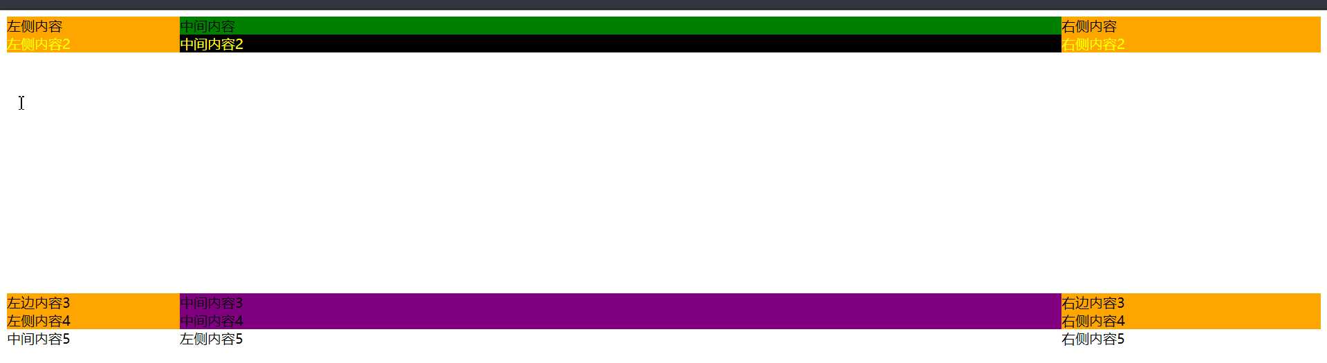
<div class="container">
  <div class="center">
    <div class="cont">中间内容</div>
  </div>
  <div class="left">左侧内容</div>
  <div class="right">右侧内容</div>
</div>
<div class="container2">
  <div class="center2">中间内容2</div>
  <div class="left2">左侧内容2</div>
  <div class="right2">右侧内容2</div>
</div>
<div class="container3">
  <div class="center3">中间内容3</div>
  <div class="left3">左边内容3</div>
  <div class="right3">右边内容3</div>
</div>
<div class="container4">
  <div class="center4">中间内容4</div>
  <div class="left4">左侧内容4</div>
  <div class="right4">右侧内容4</div>
</div>

<div class="container5">
  <div class="center5">中间内容5</div>
  <div class="left5">左侧内容5</div>
  <div class="right5">右侧内容5</div>
</div>
<div class="content">
  <div class="left">左边</div>
  <div class="center">中</div>
  <div class="right">右</div>
</div>
css
.container{min-width:600px; overflow:hidden;}
.center{float:left; width:100%;}
.cont{margin-left:200px; margin-right:300px; background:green;}
.left{float:left; margin-left:-100%; width:200px; background:orange;}
.right{float:left; margin-left:-300px; width:300px; background:orange}
兼容性最好,常用这种写法


/*方案二*/

.container2{position:relative; color:yellow; min-width:600px; overflow:hidden; height:300px}
.center2{position:absolute; left:200px; right:300px; top:0; background:black;}
.left2{position:absolute; left:0;top:0; width:200px; background:orange;}
.right2{position:absolute; right:0; top:0; width:300px; background:orange;}

/*方案3*/
.container3{position:relative; overflow:hidden;}
.left3{float:left; width:200px; background:orange;}
.center3{position:absolute; left:200px;top:0; width:calc(100% - 500px); background:purple;}
.right3{float:right; width:300px; background:orange;}

/*方案四*/
.container4{display:flex; flex-flow:row nowrap;}
.left4{width:200px; background:orange; order:1;}
.center4{flex:1;background:purple; order:2;}
.right4{width:300px;background:orange; order:3;}

.container5{
  display: grid;
  min-width: 600px;
  grid-template-columns:200px 1fr 300px;
}
方案五
.content{
  display: grid;
  min-width: 600px;
  grid-template-columns:200px 1fr 300px;
}
原文:https://www.cnblogs.com/jcxfighting/p/10711107.html