1. 基本概念:标准模型和IE模型
2. CSS如何设置这两种模型
3. JS如何设置获取和模型对应的宽和高
4. 根据盒模型解释边距重叠
5. BFC(边距重叠解决方案)
1. 基本概念:标准模型和IE模型
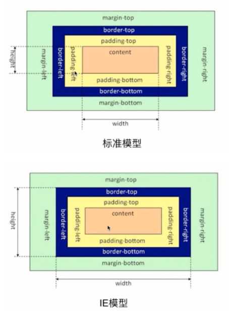
2. CSS如何设置这两种模型
/* 标准模型 */
box-sizing:content-box;

 /*IE模型*/
box-sizing:border-box;
3. JS如何设置获取和模型对应的宽和高
(1) dom.offsetWidth/offsetHeight (最常用,兼容性最好)
(2) dom.style.width/height
这种方式只能取到dom元素内联样式所设置的宽高,也就是说如果该节点的样式是在style标签中或外联的CSS文件中设置的话,通过这种方法是获取不到dom的宽高的。
(3) dom.currentStyle.width/height
这种方式获取的是在页面渲染完成后的结果,就是说不管是哪种方式设置的样式,都能获取到。
但这种方式只有IE浏览器支持。
(4) window.getComputedStyle(dom).width/height
跟(3)原理一样,通用性更好
(5) dom.getBoundingClientRect().width/height
这种方式是根据元素在视窗中的绝对位置来获取宽高的
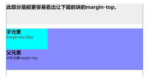
4. 根据盒模型解释边距重叠
父元素没有设置margin-top,而子元素设置了margin-top:20px;可以看出,父元素也一起有了边距。
5. BFC(边距重叠解决方案)
BFC(block formatting context)块级格式化上下文
BFC原理:
(1). 内部的box会在垂直方向上,一个接一个地放
(2). 每个元素的margin box的左边,与包含块border box的左边相接触(对于从做往右的格式化,否则相反)
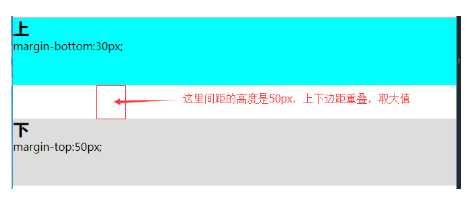
(3). box垂直方向的距离由margin决定,属于同一个bfc的两个相邻box的margin会发生重叠
(4). bfc的区域不会与浮动区域的box重叠
(5). bfc是一个页面上的独立的容器,外面的元素不会影响bfc里的元素,反过来,里面的也不会影响外面的
(6). 计算bfc高度的时候,浮动元素也会参与计算
创建方式:
1. 脱离文档流(float不为none时)
2.position为absolute或fixed
3. display 为inline-block、table-cell、table-caption、flex、inline-flex。
4. overflow不为visible
5. 根元素。
应用场景:
1. 自适应两栏布局
2. 清除内部浮动
3. 防止垂直margin重叠
<!DOCTYPE html>
<html lang="en">
<head>
    <meta charset="UTF-8">
    <title>Document</title>
    <style>
        *{
            margin:0;
            padding:0;
        }
        .top{
            background: #0ff;
            height:100px;
            margin-bottom:30px;
        }
        .bottom{
            height:100px;
            margin-top:50px;
            background: #ddd;
        }
    </style>
</head>
<body>

    <section class="top">
        <h1>上</h1>
        margin-bottom:30px;
    </section>
    <section class="bottom">
        <h1>下</h1>
        margin-top:50px;
    </section>

</body>
</html>
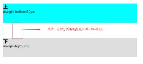
用bfc可以解决垂直margin重叠的问题
<section class="top">
        <h1>上</h1>
        margin-bottom:30px;
    </section>

    <!-- 给下面这个块添加一个父元素,在父元素上创建bfc -->
    <div style="overflow:hidden">
        <section class="bottom">
            <h1>下</h1>
            margin-top:50px;
        </section>
    </div>
原文:https://www.cnblogs.com/sarah-wen/p/10770818.html