使用matplotlib画图的时候,x轴的时间序列显示经常会出现问题自动补全的问题。
df = DataFrame(index=ratio_d_df.index[-20:])
df[‘pct‘] = 0.05
df[‘cruve‘] = (df[‘pct‘] + 1).cumprod()
fig, ax = plt.subplots(dpi=100, figsize=(9,6))
ax.plot(df[‘cruve‘], color = ‘b‘, label=u‘累计收益率‘, alpha = .5)
| pct | cruve | |
|---|---|---|
| date | ||
| 2019-04-26 | 0.05 | 1.050000 |
| 2019-04-29 | 0.05 | 1.102500 |
| 2019-04-30 | 0.05 | 1.157625 |
| 2019-05-06 | 0.05 | 1.215506 |
| 2019-05-07 | 0.05 | 1.276282 |
| 2019-05-08 | 0.05 | 1.340096 |
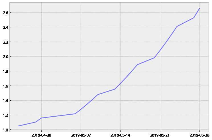
x轴自动补全了周末以及五一假期的数据,图形的表现是不连续,不利于观察实际运行情况。
fig, ax = plt.subplots(dpi=100, figsize=(9,6))
x = df.index
ax.plot(range(20), df[‘cruve‘], color = ‘b‘, label=u‘累计收益率‘, alpha = .5)
ax.set_xticks(range(len(x)))
ax_xticklabels = map(lambda x:str(x)[0:4]+str(x)[5:7]+str(x)[8:10], x)
ax.set_xticklabels(ax_xticklabels)
fig.autofmt_xdate()
ax.set_xlim(-0.5, len(x)-0.5)
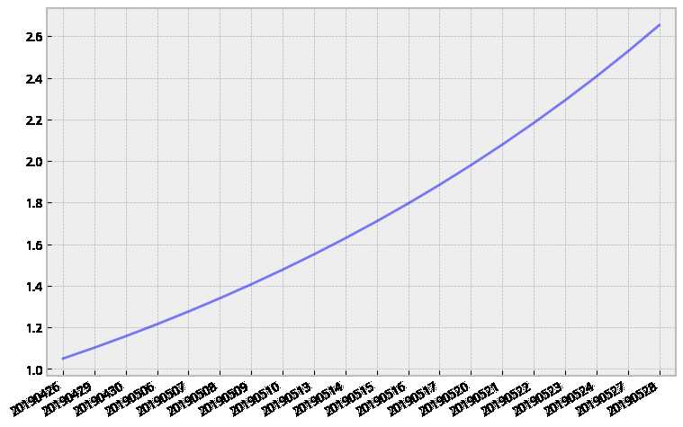
先用连续数列填充,最后再替换成字符串的日期。对于数据比较少情况,这样处理就可以了,如果数据比较多,x轴则显示不了这么多日期,可以使用
ax.xaxis.set_major_locator(mpl.ticker.MultipleLocator(base=len(df)//20))
确定每个坐标轴之间间隔多少数据,这样可以控制x轴显示标签的个数。
原文:https://www.cnblogs.com/p5300/p/10957160.html