。。。中华有神功
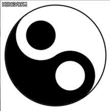
HTML
<table cellpadding="0" cellspacing="0">
    <tr class="tr1">
        <td class="td1"><div class="div1"><p></p></div></td>
        <td class="td2"><div class="div2"><p></p></div></td>
    </tr>
    <tr class="tr2">
        <td class="td3"></td>
        <td class="td4"></td>
    </tr>
</table>
CSS
table{
    width: 4rem;
    height: 4rem;
    border: 0.02rem solid black;
    border-radius: 50%;
    animation: rotate 10s infinite linear;
}
@keyframes rotate{
    0%{
                transform: rotate(0deg);
    }
    100%{
        transform: rotate(-360deg);
    }
}
table .tr1{
    background: black;
}
table .tr1 .td1{
    border-top-left-radius: 100%;
    position: relative;
}
table .tr1 .td1 .div1{
    width: 100%;
    height: 100%;
    border-radius: 50%;
    background: black;
    position: absolute;
    top: 50%;
    display: flex;
    justify-content: center;
    align-items: center;
}
table .tr1 .td1 .div1 p{
    width: 60%;
    height: 60%;
    border-radius: 50%;
    background: white;
}
table .tr1 .td2{
    border-top-right-radius: 100%;
    position: relative;
}
table .tr1 .td2 .div2{
    width: 100%;
    height: 100%;
    border-radius: 50%;
    background: white;
    position: absolute;
    top: 50%;
    display: flex;
    justify-content: center;
    align-items: center;
}
table .tr1 .td2 .div2 p{
    width: 60%;
    height: 60%;
    border-radius: 50%;
    background: black;
}
table .tr2 .td3{
    border-bottom-left-radius: 100%;
}
table .tr2 .td4{
    border-bottom-right-radius: 100%;
}
太极八卦,阴阳五行 —— 不停转
原文:https://www.cnblogs.com/Function-cnblogs/p/10991782.html