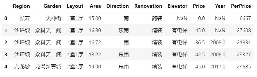
这里放上我比较喜欢的一种条形图设置,使用的是之前爬取的重庆地区链家二手房数据,数据如下:
链接:https://pan.baidu.com/s/17CMwUAdseO8tJWHEQiA8_A
提取码:dl2g
import pandas as pd
import matplotlib.pyplot as plt
import seaborn as sns
df = pd.read_csv(‘lianjia_utf.csv‘)
df.head()
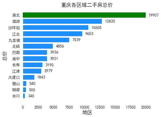
sns.set(style=‘white‘, font_scale=1.2)
# 保证可以显示中文字体
plt.rcParams[‘font.sans-serif‘]=‘simhei‘
# 设置字体大小
font1 = {‘family‘ : ‘simhei‘,
‘weight‘ : ‘normal‘,
‘size‘   : 18,}
# 使用数据透视表
region_pivot = pd.pivot_table(df, values=‘Price‘, index=‘Region‘, aggfunc=‘count‘).reset_index().sort_values(ascending=True,by=‘Price‘)
f, ax = plt.subplots(figsize=(8,6))
# 画条形图
barh = plt.barh(region_pivot[‘Region‘].values,region_pivot[‘Price‘].values, color=‘dodgerblue‘)
barh[-1].set_color(‘green‘)
# 给条形图添加数据标注
for y, x in enumerate(region_pivot[‘Price‘].values):
    plt.text(x+500, y-0.2, "%s" %x)
#删除所有边框
ax.spines[‘right‘].set_visible(False)
ax.spines[‘top‘].set_visible(False)
ax.spines[‘bottom‘].set_visible(False)
ax.spines[‘left‘].set_visible(False)
# ax.set(title=‘重庆各区域二手房总价‘, xlabel=‘地区‘, ylabel=‘总价‘)
plt.tick_params(labelsize=14)
plt.xlabel(‘地区‘, font1)
plt.ylabel(‘总价‘, font1)
plt.title(‘重庆各区域二手房总价‘, font1)
f.savefig(‘1.png‘, bbox_inches=‘tight‘)
运行结果如下:
如果把上图改成柱形图,可以这样做:
sns.set(style=‘white‘, font_scale=1.2)
# 保证可以显示中文字体
plt.rcParams[‘font.sans-serif‘]=‘simhei‘
# 设置字体大小
font1 = {‘family‘ : ‘simhei‘,
‘weight‘ : ‘normal‘,
‘size‘   : 18,}
# 使用数据透视表
region_pivot = pd.pivot_table(df, values=‘Price‘, index=‘Region‘, aggfunc=‘count‘).reset_index().sort_values(ascending=False,by=‘Price‘)
f, ax = plt.subplots(figsize=(12,6))
# 画柱形图
bar = plt.bar(region_pivot[‘Region‘].values,region_pivot[‘Price‘].values, color=‘dodgerblue‘)
bar[0].set_color(‘green‘)
# 给条形图添加数据标注
for x, y in enumerate(region_pivot[‘Price‘].values):
    plt.text(x-0.4, y+500, "%s" %y)
#删除所有边框
ax.spines[‘right‘].set_visible(False)
ax.spines[‘top‘].set_visible(False)
ax.spines[‘bottom‘].set_visible(False)
ax.spines[‘left‘].set_visible(False)
# ax.set(title=‘重庆各区域二手房总价‘, xlabel=‘地区‘, ylabel=‘总价‘)
plt.tick_params(labelsize=14)
plt.xlabel(‘地区‘, font1)
plt.ylabel(‘总价‘, font1)
plt.title(‘重庆各区域二手房总价‘, font1)
f.savefig(‘1_1.png‘, bbox_inches=‘tight‘)
运行结果如下: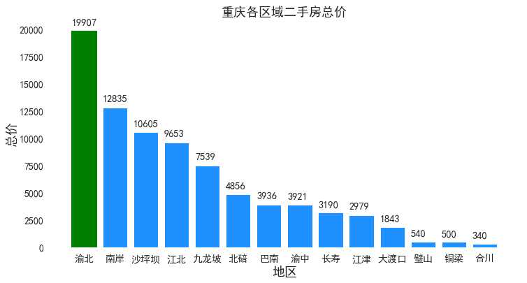
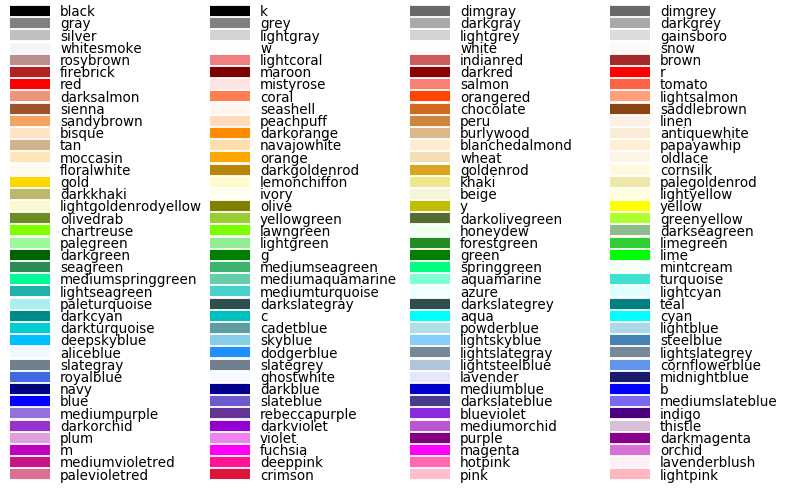
关于配色,matplotlib中的配色,可参考下图:
原文:https://www.cnblogs.com/yunxiaofei/p/11116941.html