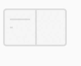
使用css动画实现类似微信读书加载图标的效果,效果图如下:
<span>表示行。<div class="book-icon">
<div class="page-left">
<span></span>
<span></span>
<span></span>
</div>
<div class="page-right">
<span></span>
<span></span>
<span></span>
</div>
</div>.book-icon {
width: 15em;
height: 9em;
border: 0.4em solid #ddd;
border-radius: 0.8em;
display: flex;
background-color: #f5f5f5;
}
.icon-left,
.icon-right {
width: 50%;
padding: 1.2em;
display: flex;
flex-direction: column;
justify-content: space-around;
}
.icon-right {
border-left: 0.4em solid #ddd;
}
.icon-right >span,
.icon-left >span {
border-top: 0.4em solid #ddd;
width: 0;
animation: 3s linear infinite;
}@keyframes row_1 {
0% {
width: 0;
}
16.67%, 100% {
width: 100%;
}
}
@keyframes row_2 {
16.67% {
width: 0;
}
33.33%, 100% {
width: 100%;
}
}
@keyframes row_3 {
33.33% {
width: 0;
}
50%, 100% {
width: 100%;
}
}
@keyframes row_4 {
50% {
width: 0;
}
66.67%, 100% {
width: 100%;
}
}
@keyframes row_5 {
66.67% {
width: 0;
}
83.33%, 100% {
width: 100%;
}
}
@keyframes row_6 {
83.33% {
width: 0;
}
100% {
width: 100%;
}
}.page-left >span:nth-child(1) {
animation-name: row_1;
}
.page-left >span:nth-child(2) {
animation-name: row_2;
}
.page-left >span:nth-child(3) {
animation-name: row_3;
}
.page-right >span:nth-child(1) {
animation-name: row_4;
}
.page-right >span:nth-child(2) {
animation-name: row_5;
}
.page-right >span:nth-child(3) {
animation-name: row_6;
}到此,一个简单的书页加载动画已实现,是否有更加简洁的方案还有待思考。
原文:https://www.cnblogs.com/stronggirlyao/p/11315621.html