效果图:
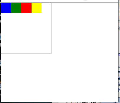
图一:
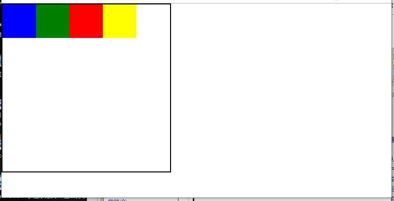
图二:
代码:<!DOCTYPE html<html lang="en"><head>
    <meta charset="UTF-8">
    <title></title>
    <link type="text/css" rel="stylesheet" href=" "/>
    <style type="text/css">
        * {
            margin: 0;
            padding: 0;
       font-size: 0.12rem;
     }
        #float{
            width: 2rem;
            height: 2rem;
            border: 0.01rem solid black;
        }
        #float div{
            width: 0.4rem;
            height: 0.4rem;
            float: left;
        }
        #float .one{
            background-color: blue;
        }
        #float .two{
            background-color: green;
        }
        #float .three{
            background-color: red;
        }
        #float .four{
            background-color: yellow;
        }
    </style>
</head>
<body>
<div id="float">
    <div class="one"></div>
    <div class="two"></div>
    <div class="three"></div>
    <div class="four"></div>
</div>
<script type="text/javascript">
    window.onload = function () {
        // 获取浏览器页面最大宽度
        var maxWidth = document.documentElement.offsetWidth
        document.documentElement.style.fontSize = document.documentElement.offsetWidth/(maxWidth/100) + ‘px‘;
        window.onresize = function(){
            document.documentElement.style.fontSize = document.documentElement.offsetWidth/(maxWidth/100) + ‘px‘;
        }
    }
</script>
</body>
</html>
原文:https://www.cnblogs.com/FlyingLiao/p/11577926.html