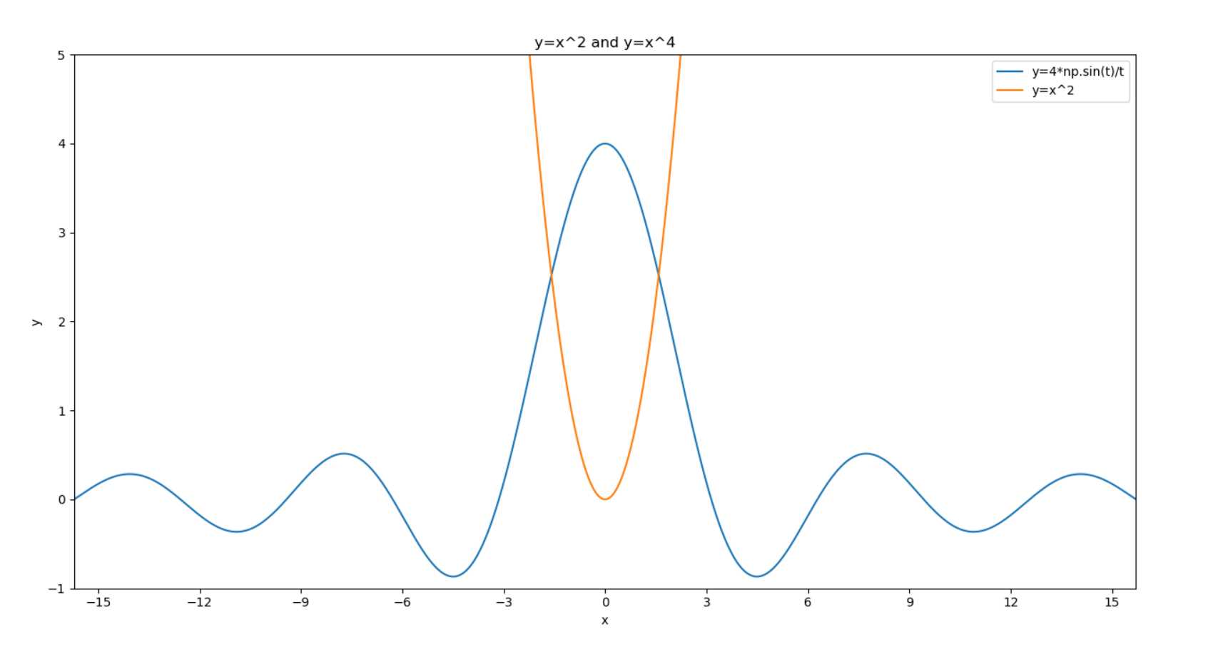
(1)pyplot基础绘图
 1 # -*-coding:utf-8-*-
 2 # !/usr/bin/env python
 3 # Author:@vilicute
 4
 5 import numpy as np
 6 import matplotlib.pyplot as plt
 7
 8 t = np.arange(-5*np.pi, 5*np.pi, 0.01)
 9 plt.title(‘y=x^2 and y=x^4‘)  # 添加标题
10 plt.xlabel(‘x‘)  # x轴名称
11 plt.ylabel(‘y‘)  # y轴名称
12 plt.xlim((-5*np.pi, 5*np.pi))  # x轴范围
13 plt.ylim((-1, 5))  # y轴范围
14 plt.xticks([-15, -12, -9, -6, -3, 0, 3, 6, 9, 12, 15])  # x轴刻度
15 plt.yticks([-1, 0, 1, 2 , 3, 4, 5])  # y轴刻度
16 plt.plot(t, 4*np.sin(t)/t)
17 plt.plot(t, t**2)
18 plt.legend([‘y=4*np.sin(t)/t‘, ‘y=x^2‘])  # 标注说明
19 plt.show()
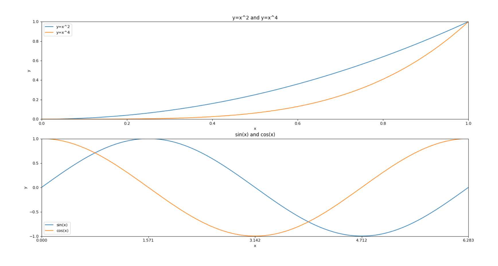
(2)多图绘制
 1 # -*-coding:utf-8-*-
 2 # !/usr/bin/env python
 3 # Author:@vilicute
 4 import numpy as np
 5 import matplotlib.pyplot as plt
 6
 7 t = np.arange(0, 2*np.pi, 0.01)
 8 pl = plt.figure(figsize=(8, 6), dpi=80)  # 确定画布大小
 9 ax1 = pl.add_subplot(2, 1, 1)  # 创建一个2行1列子图,第一个图
10 plt.title(‘y=x^2 and y=x^4‘)  # 添加标题
11 plt.xlabel(‘x‘)  # x轴名称
12 plt.ylabel(‘y‘)  # y轴名称
13 plt.xlim((0, 1))  # x轴范围
14 plt.ylim((0, 1))  # y轴范围
15 plt.xticks([0, 0.2, 0.4, 0.6, 0.8, 1.0])  # x轴刻度
16 plt.yticks([0, 0.2, 0.4, 0.6, 0.8, 1.0])  # y轴刻度
17 plt.plot(t, t**2)
18 plt.plot(t, t**4)
19 plt.legend([‘y=x^2‘, ‘y=x^4‘])  # 标注说明
20
21 ax2 = pl.add_subplot(2, 1, 2)  # 第二个图
22 plt.title(‘sin(x) and cos(x)‘)
23 plt.xlabel(‘x‘)
24 plt.ylabel(‘y‘)
25 plt.xlim((0, np.pi*2))
26 plt.ylim((-1, 1))
27 plt.xticks([0, np.pi/2, np.pi, 3*np.pi/2, np.pi*2])
28 plt.yticks([-1, -0.5, 0, 0.5, 1.0])
29 plt.plot(t, np.sin(t))
30 plt.plot(t, np.cos(t))
31 plt.legend([‘sin(x)‘, ‘cos(x)‘])
32 plt.show()
原文:https://www.cnblogs.com/vilicute/p/11607927.html