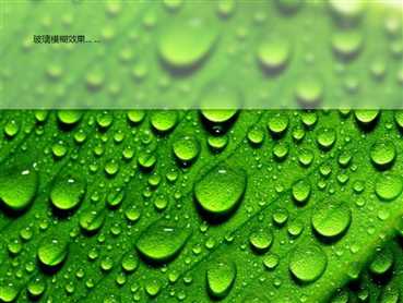
效果图:
<!DOCTYPE html>
<html lang="en" dir="ltr">
  <head>
    <meta charset="utf-8">
    <title></title>
    <style media="screen">
      html,body {
        height: 100%;
        margin: 0px;
      }
      body {
        background-image: url(http://b-ssl.duitang.com/uploads/blog/201406/28/20140628160330_r2RsB.jpeg);
        background-attachment: fixed;
        background-position: center;
        background-size: cover;
        position: relative;
      }
    // 核心css -- 依据父级容器的背景效果实现毛玻璃
      .wrap {
        width: 100%;
        height: 200px;
        position: relative;
        background: inherit;
        box-shadow: 0px 0px 8px #333;
        border-radius: 5px;
        z-index: 0;
      }
      // 模糊效果
      .wrap::before {
        content: ‘‘;
        position: absolute;
        top:0;
        right: 0;
        bottom: 0;
        left: 0;
        background: inherit;
        background-attachment: fixed;
        filter: blur(5px);
        z-index: -1;
      }
      // 增加透明度的白底 -- 非必要
      .wrap::after {
        content: ‘‘;
        position: absolute;
        top:0;
        right: 0;
        bottom: 0;
        left: 0;
        background: rgba(255,255,255,.35);
        z-index: -1;
      }
    </style>
  </head>
  <body>
    <div class="wrap">
      <span style="padding: 60px;display: inline-block;">玻璃模糊效果... ...</span>
    </div>
  </body>
</html>
原文:https://www.cnblogs.com/xtreme/p/11649946.html