linear-gradient() 函数用于创建一个线性渐变的 "图像"。
为了创建一个线性渐变,你需要设置一个起始点和一个方向(指定为一个角度)的渐变效果。你还要定义终止色。终止色就是你想让Gecko去平滑的过渡,并且你必须指定至少两种,当然也会可以指定更多的颜色去创建更复杂的渐变效果。
background-image: linear-gradient(direction, color-stop1, color-stop2, ...);
direction: 用角度值指定渐变方向(或角度)
color-stop1, color-stop2, ...: 用于指定渐变的起止颜色
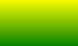
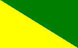
1. 默认渐变方向是从上至下
background: linear-gradient(yellow, green)
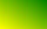
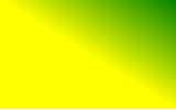
2. 可以用角度值定义渐变方向(可以写成角度 deg)
background: linear-gradient(to top, yellow, green)
/*to top 从下至上 相当于 0deg*/
background: linear-gradient(to right, yellow, green)
/*to right 从下至上 相当于 90deg*/
background: linear-gradient(to bottom, yellow, green)
/*to bottom 从下至上 相当于 180deg*/
background: linear-gradient(to left, yellow, green)
/*to left 从下至上 相当于 270deg*/
background: linear-gradient(to top right, yellow, green)
/*to top right 沿对角线的方向*/
3. 可以用px或百分比指定起始颜色的位置, 默认值为0%
background: linear-gradient(to top right, yellow 50%, green)
background: linear-gradient(to top right, yellow, green 50%)
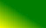
background: linear-gradient(to top right, yellow 50%, green 0);
/* 注意: 起始颜色的位置是从它自身所占的位置开始计算的, 第一个占了50%, 那第二个的 0 就是从50%开始 */
4. 多次使用 linear-gradient() 时
background: linear-gradient(45deg, rgba(0, 0, 0, 0) 50%, #162e48 0),
  linear-gradient(135deg, red 40%, blue, transparent 0),
  linear-gradient(45deg, black, transparent);
/* 后面一条会填充前面一条的透明色 */

5. 看到一个按钮效果, 收藏
<div class="div4">
  <div class="div4-1 active">OFF</div>
  <div class="div4-2">ON</div>
</div>
.div4 {
  width: 144px;
  height: 30px;
  line-height: 30px;
  background: #162e48;
  color: #fff;
  text-align: center;
  margin-bottom: 30px;
}
.div4-1,
.div4-2 {
  width: 86px;
  float: left;
}
.div4-1.active {
  margin-right: -28px;
  background: linear-gradient(-135deg, transparent 20px, #f00 0);
}
.div4-2.active {
  margin-left: -28px;
  background: linear-gradient(45deg, transparent 20px, #f00 0);
}

css3属性之---背景渐变linear-gradient()
原文:https://www.cnblogs.com/---godzilla---/p/11718619.html