<style>
#talkbubble {
width: 120px;
height: 80px;
position: relative;
-moz-border-radius: 10px;
-webkit-border-radius: 10px;
border-radius: 10px;
border: 1px #808080 solid;
background-color: #fff;
}

#talkbubble:before {
content: " ";
position: absolute;
top: 100%;
left: 50px;
width: 0;
height: 0;
border-left: 15px solid transparent;
border-top: 15px solid #808080;
border-right: 15px solid transparent;
}

.inlayer:after {
content: " ";
position: absolute;
top: 100%;
left: 51px;
width: 0;
height: 0;
border-left: 14px solid transparent;
border-top: 14px solid #fff;
border-right: 14px solid transparent;
}

#talkbubble:hover {
background-color: #ff0000;
}

.inlayer:hover:after {
width: 0;
height: 0;
border-left: 14px solid transparent;
border-top: 14px solid #ff0000;
border-right: 14px solid transparent;
}
</style>

<!-- html -->
<div id="talkbubble" class="inlayer">
空心三角形
</div>
空心三角原理:主要利用元素伪类(:before,:after)实现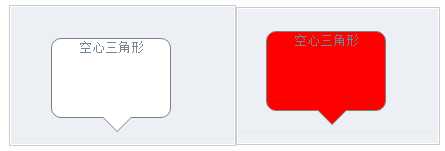
另外附上 三角形向上的css的代码
.tip-em{
    width:12px;
    height:12px;
    position:absolute;
    left:80px;
    top:-10px;
    }
    .em1{
      position: absolute;
      bottom: 100%;
      left: 50px;
      width: 0;
      height: 0;
      border-left: 15px solid transparent;
      border-bottom: 15px solid #808080;
      border-right: 15px solid transparent;
    }
    .em2{
      position: absolute;
      bottom: 100%;
      left: 51px;
      width: 0;
      height: 0;
      border-left: 14px solid transparent;
      border-bottom: 14px solid #fff;
      border-right: 14px solid transparent;
    }
原文:https://www.cnblogs.com/chenhuichao/p/11779571.html