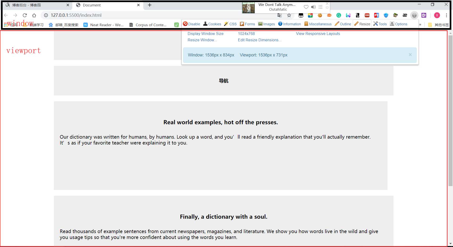
重要内容处设置断点breakpoint
CSS
* {
    margin: 0;
    box-sizing: border-box;
    border: 0;
    padding: 0;
    font-weight: bold;
}

body {
    text-align: center;
}

.container {
    margin-top: 15px;
    width: 960px;
    margin: 0 auto;
}

header,
nav,
footer {
    height: 100px;
    background: #eee;
    margin-bottom: 20px;
    line-height: 100px;
}

section,
aside {
    height: 300px;
    background: #eee;
    line-height: 20px;
    margin-bottom: 20px;
}

section {
    float: left;
    width: 500px;
    margin-right: 20px;
    background: #eee;
}

h3 {
    margin-top: 60px;
    margin-bottom: 30px;
}

p {
    font-weight: normal;
    text-align: left;
    margin: 0 20px;
}

aside {
    float: left;
    width: 440px;
    background: #eee;
}

footer {
    clear: both;
}
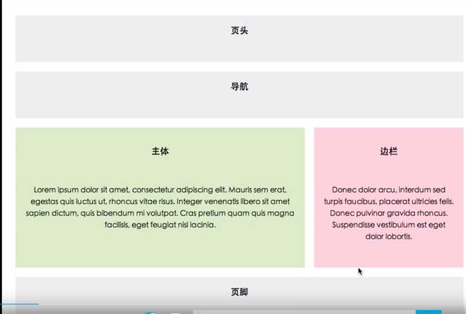
结构布局
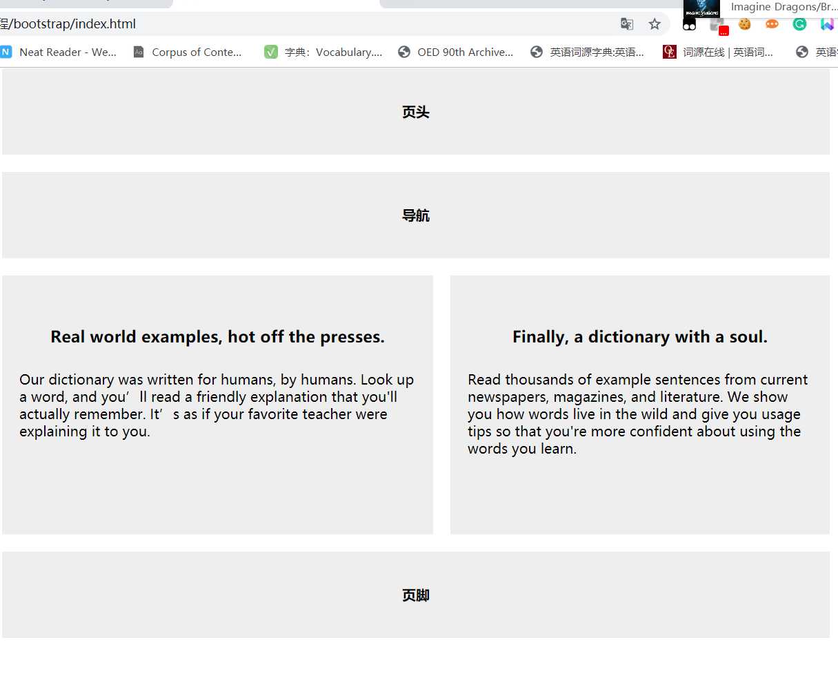
<body>
    <div class="container">
        <header>页头</header>
        <nav>导航</nav>
        <section>
            <h3>Real world examples, hot off the presses.</h3>
            <p>Our dictionary was written for humans, by humans. Look up a word, and you’ll read a friendly explanation that you‘ll actually remember. It’s as if your favorite teacher were explaining it to you.</p>
        </section>
        <aside>
            <h3>Finally, a dictionary with a soul.</h3>
            <p>Read thousands of example sentences from current newspapers, magazines, and literature. We show you how words live in the wild and give you usage tips so that you‘re more confident about using the words you learn.</p>
        </aside>
        <footer>页脚</footer>
    </div>
</body>
css代码精修
* {
margin: 0;
border: 0;
padding: 0;
font-weight: bold;
}
body {
text-align: center;
}
.container {
width: 960px;
margin: 15px auto 0 auto;
}
header,
nav,
footer {
height: 100px;
background: #eee;
margin-bottom: 20px;
line-height: 100px;
}
section,
aside {
height: 300px;
background: #eee;
line-height: 20px;
margin-bottom: 20px;
}
section {
float: left;
width: 55%;
margin-right: 15px;
background: #eee;
overflow: hidden;
}
h3 {
margin-top: 60px;
margin-bottom: 30px;
}
p {
font-weight: normal;
text-align: left;
margin: 0 20px;
}
aside {
float: right;
width: 40%;
background: #eee;
overflow: hidden;
}
footer {
clear: both;
}
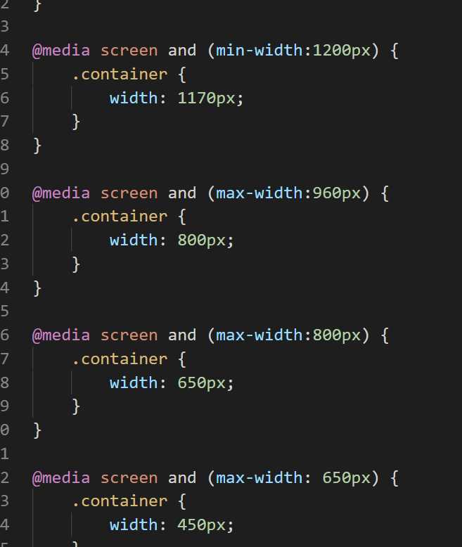
@media screen and (min-width:1200px) {
.container {
width: 1170px;
}
}
@media screen and (max-width:960px) {
.container {
width: 800px;
}
}
@media screen and (max-width:800px) {
.container {
width: 650px;
}
}
@media screen and (max-width: 650px) {
.container {
width: 450px;
}
}
@media screen and (max-device-width: 414px) {
.container {
width: 350px;
}
section,
aside {
width: 100%;
}
}
HTML结构精修
<body>
    <div class="container">
        <header>页头</header>
        <nav>导航</nav>
        <section>
            <h3>Real world examples, hot off the presses.</h3>
            <p>Our dictionary was written for humans, by humans. Look up a word, and you’ll read a friendly explanation that you‘ll actually remember. It’s as if your favorite teacher were explaining it to you.</p>
        </section>
        <aside>
            <h3>Finally, a dictionary with a soul.</h3>
            <p>Read thousands of example sentences from current newspapers, magazines, and literature. We show you how words live in the wild and give you usage tips so that you‘re more confident about using the words you learn.</p>
        </aside>
        <footer>页脚</footer>
    </div>
</body>
主要有了 媒体查询一切就变得简单了 当然后续 我们在结合less 会非常轻松
https://blog.csdn.net/reagan_/article/details/80792213
原文:https://www.cnblogs.com/apelles/p/11915053.html