css引入
<link href="//netdna.bootstrapcdn.com/font-awesome/4.7.0/css/font-awesome.min.css" rel="stylesheet">
body主体结构
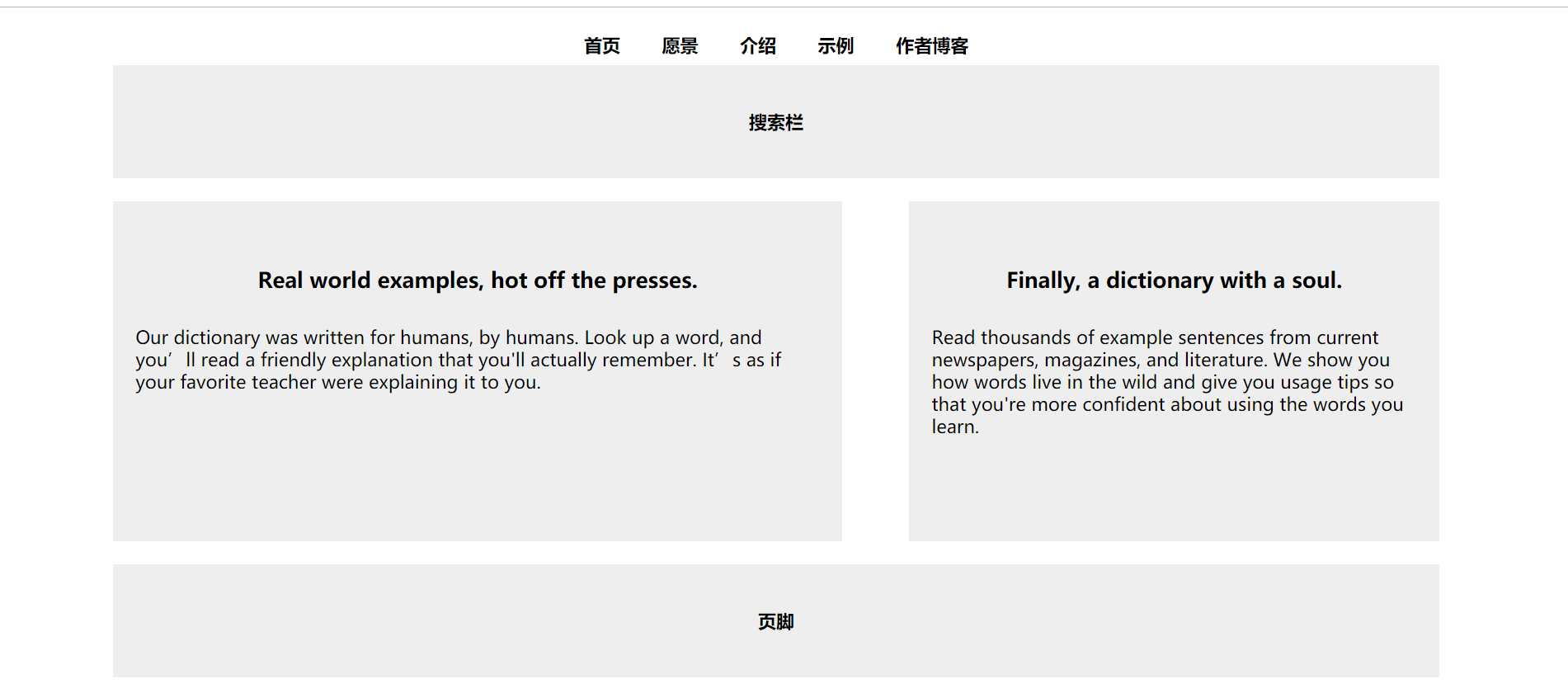
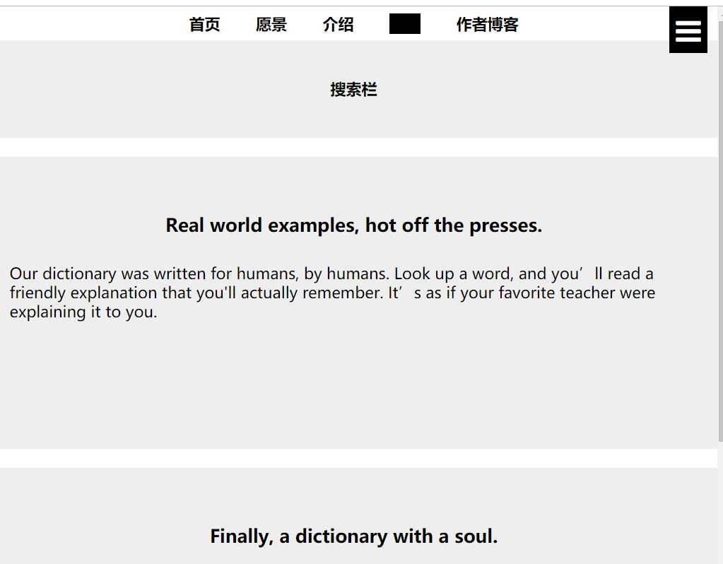
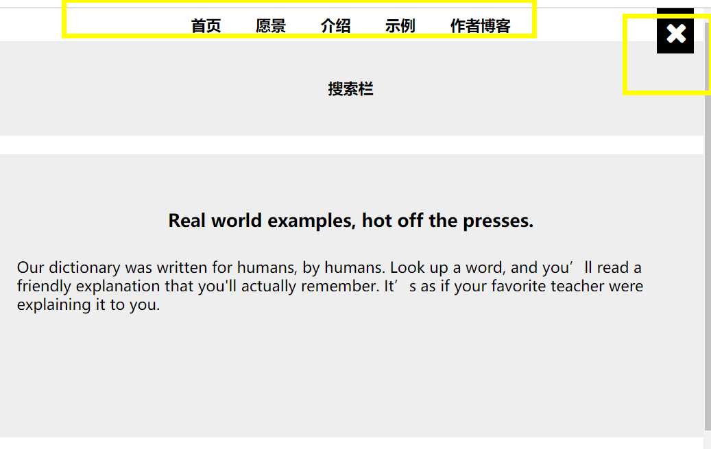
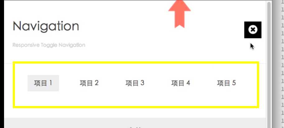
<body id="top">
    <div class="container">
        <a href="#nav" class="open toggle-btn"><i class="fa fa-reorder"></i></a>
        <nav id="nav">
            <ul>
                <li>
                    <a href="#">首页</a>
                </li>
                <li>
                    <a href="#">愿景</a>
                </li>
                <li>
                    <a href="#">介绍</a>
                </li>
                <li>
                    <a href="#">示例</a>
                </li>
                <li>
                    <a href="#">作者博客</a>
                </li>
            </ul>
            <a href="#top" class="close toggle-btn"><i class="fa fa-remove"></i></a>
        </nav>
        <header>搜索栏</header>
        <section>
            <h3>Real world examples, hot off the presses.</h3>
            <p>Our dictionary was written for humans, by humans. Look up a word, and you’ll read a friendly explanation that you‘ll actually remember. It’s as if your favorite teacher were explaining it to you.</p>
        </section>
        <aside>
            <h3>Finally, a dictionary with a soul.</h3>
            <p>Read thousands of example sentences from current newspapers, magazines, and literature. We show you how words live in the wild and give you usage tips so that you‘re more confident about using the words you learn.</p>
        </aside>
        <footer>页脚</footer>
    </div>
</body>
* {
margin: 0;
border: 0;
padding: 0;
font-weight: bold;
}
body {
text-align: center;
}
.container {
width: 960px;
margin: 15px auto 0 auto;
}
header,
footer {
height: 100px;
background: #eee;
margin-bottom: 20px;
line-height: 100px;
}
section,
aside {
height: 300px;
background: #eee;
line-height: 20px;
margin-bottom: 20px;
}
section {
float: left;
width: 55%;
margin-right: 15px;
background: #eee;
overflow: hidden;
}
h3 {
margin-top: 60px;
margin-bottom: 30px;
}
p {
font-weight: normal;
text-align: left;
margin: 0 20px;
}
aside {
float: right;
width: 40%;
background: #eee;
overflow: hidden;
}
footer {
clear: both;
margin-bottom: 0px;
}
@media screen and (min-width:1200px) {
.container {
width: 1170px;
}
}
@media screen and (max-width:960px) {
.container {
width: 100%;
}
section {
width: 55%;
}
aside {
width: 40%;
}
}
@media screen and (max-width:800px) {
.container {
width: 100%;
}
section {
width: 55%;
}
aside {
width: 40%;
}
}
@media screen and (max-device-width: 414px) {
.container {
margin: 0;
width: 100%;
}
section,
aside {
float: none;
width: 100%;
}
footer {
margin-bottom: 0px;
}
}
/* 导航菜单 */
#nav ul li {
list-style: none;
display: inline-block;
padding: 7px 16px;
}
a {
color: black;
text-decoration: none;
}
#nav ul li a:hover {
background: black;
}
.toggle-btn {
display: none;
}
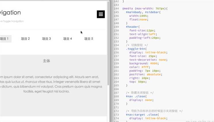
@media screen and (max-width: 768px) {
.container {
margin: 0;
}
section,
aside {
float: none;
width: 100%;
}
/* 切换按钮 */
.toggle-btn {
display: inline-block;
font-size: 30px;
padding: 4px 7px;
background: black;
color: white;
position: absolute;
right: 10px;
top: 0px;
}
.container .close {
display: none;
}
#nav:target .close {
display: inline-block;
}
}
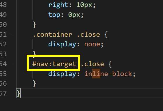
注意这个部分
原文:https://www.cnblogs.com/apelles/p/11918275.html