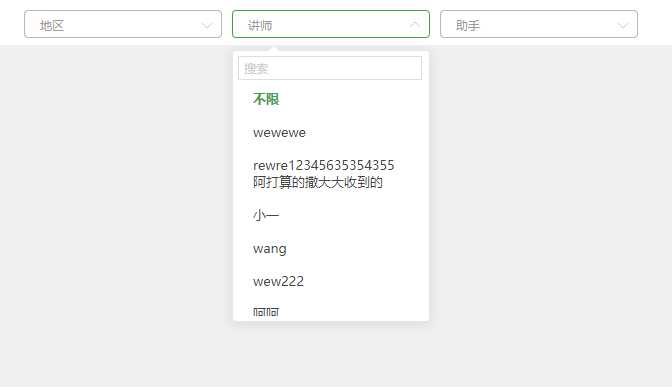
先上效果图:
组件特点:
技术工具说明:
写这篇博客我主要想做两件事,首先逐步讲解如何实现这个组件,然后会放上完整代码,附上使用说明。
进入正文:
创建demo.html
<!DOCTYPE html>
<html lang="en">
<head>
    <meta charset="UTF-8">
    <meta name="viewport" content="width=device-width, initial-scale=1.0">
    <meta http-equiv="X-UA-Compatible" content="ie=edge">
    <title>Document</title>
    <script src="https://cdn.bootcss.com/jquery/3.4.1/jquery.min.js"></script>
    <script src="https://cdn.bootcss.com/vue/2.6.10/vue.min.js"></script>
    <script src="https://cdn.bootcss.com/element-ui/2.10.1/index.js"></script>
</head>
<body>
    <div id="app">

    </div>

    <script>
        new Vue({
            el: ‘#app‘
        })
    </script>
</body>
</html>
新建文件夹component,并在里面新建cw-input-select.js和cw-input-select.css文件
结构如下:
| demo.html
| component
| cw-input-select.js
| cw-input-select.css
在demo.html header标签里引入cw-input-select.js和cw-input-select.css
    <!-- 引入cw-input-select组件 -->
    <link rel="stylesheet" href="component/cw-input-select.css">
    <script src="component/cw-input-select.js"></script>
编写cw-input-select.js
1. 编写一个Vue全局组件基本架子
Vue.component(‘cw-input-select‘, {
    template: ‘<div></div>‘,
    data: function () {
        return {}
    },
    created () {},
    methods: {},
})
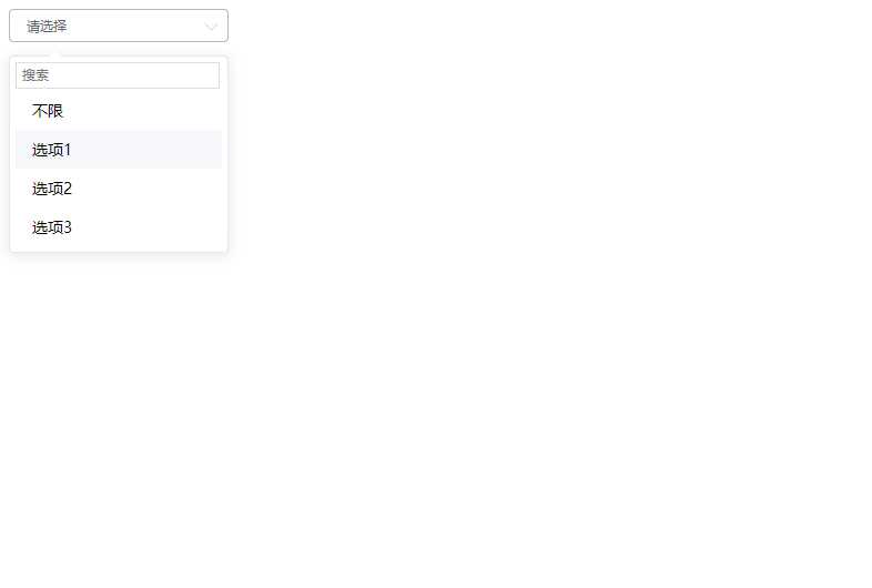
2. 编写静态(无动态数据无交互)的下拉框组件代码,并用静态数组模拟选项(后面替换动态数据源)
component/cw-input-select.js
Vue.component(‘cw-input-select‘, {
    template: `<div class="cw-input-select_wrap">
    <div class="cw-input-select">
        <div class="cw-input-select_box">
            <span>请选择</span>
        </div>
        <div class="cw-input-select_pop">
            <input type="text" class="cw-input-select_ipt" placeholder="搜索" />
            <ul class="cw-input-select_options">
                <li>
                    <span>不限</span>
                </li>
                <li v-for="option in optionsList">
                    {{option}}
                </li>
            </ul>
            <span class="cw-input-select_arrow"></span>
        </div>
    </div>
</div>`,
    data: function () {
        return {
            optionsList: [‘选项1‘, ‘选项2‘, ‘选项3‘]
        }
    },
    created () {},
    methods: {},
})
3. 编写 component/cw-input-select.css

/* 基础样式reset */
input {
    box-sizing: border-box;
    outline: 0;
}
ul {
    margin: 0;
    padding: 0;
}
ul, li {
    list-style: none;
}

/* 组件整体容器 */
.cw-input-select_wrap {
    position: relative;
    width: 198px;
    height: 28px;
    font-size: 14px;
}

/* 组件内容 */
.cw-input-select {
    width: 198px;
    position: absolute;
}

/* 基本下拉框 */
.cw-input-select_box {
    height: 28px;
    border: 1px solid #b7b7b7;
    border-radius: 4px;
    background-color: white;
    position: relative;
    cursor: pointer;
}

/* 基本下拉框里面右边的线体上下箭头(可旋转) */
.cw-input-select_box::after {
    content: ‘‘;
    display: block;
    position: absolute;
    right: 10px;
    top: 8px;
    border-top: 1px solid #C0C4CC;
    border-right: 1px solid #C0C4CC;
    border-radius: 1px;
    width: 8px;
    height: 8px;
    background: transparent;
    transition: transform .3s, -webkit-transform .3s;
    transform: rotate(135deg);
    z-index: 10;
}

/* 基本下拉框 文字 */
.cw-input-select_box > span {
    display: inline-block;
    line-height: 28px;
    padding: 0 30px 0 15px;
    font-size: 12px;
    color: #606266;
    /* 文字超出用省略号 */
    white-space: nowrap;
    text-overflow: ellipsis;
    width: 100%;
    overflow: hidden;
}

/* 选项列表盒子 */
.cw-input-select_pop {
    position: relative;
    background-color: white;
    border: 1px solid #E4E7ED;
    border-radius: 4px;
    max-height: 274px;
    box-shadow: 0 2px 12px 0 rgba(0,0,0,.1);
    margin-top: 12px;
    padding: 5px;
    box-sizing: border-box;
    z-index: 9;
}

/* 选项列表盒子上方的三角形箭头 */
.cw-input-select_arrow {
    position: absolute;
    display: block;
    width: 0;
    height: 0;
    border-color: transparent;
    border-style: solid;
    border-width: 6px;
    filter: drop-shadow(0 2px 12px rgba(0, 0, 0, .03));
    top: -6px;
    left: 35px;
    margin-right: 3px;
    border-top-width: 0;
    border-bottom-color: #fff;
    z-index: 99;
}

/* 选项列表盒子里面的输入框 */
.cw-input-select .cw-input-select_pop .cw-input-select_ipt {
    position: absolute;
    top: 5px;
    z-index: 99;
    height: 24px;
    line-height: 20px;
    width: 94%;
    border: 1px solid #DCDFE6;
    padding: 1px 5px;
    font-size: 12px;
}

/* 选项列表内容 */
.cw-input-select_options {
    display: block;
    margin-top: 26px;
    max-height: 234px;
}

/* 选项单元 */
.cw-input-select_options li {
    padding: 8px 15px;
    background-color: white;
    cursor: pointer;
}

/* 选项单元hover */
.cw-input-select_options li:hover {
    background-color: #F5F7FA;
}
css注释我尽量写详细,因为很难把css分开讲解。
至此,效果如下:
-
(未完待续)
原文:https://www.cnblogs.com/cathy1024/p/11952986.html
