
1、代码
import numpy as np
import pandas as pd
import matplotlib.pyplot as plt

# 生成数据,创建 DataFrame
np.random.seed(27)
data = np.random.rand(7, 3)
index = [‘Customer ‘ + str(i) for i in range(1, 8)]
Metrics = [‘Metric ‘ + str(i) for i in range(1, 4)]
df = pd.DataFrame(data, index=index, columns=pd.Index(Metrics, name=‘Metrics‘))

# 设置图形属性及布局
plt.style.use(‘ggplot‘)
fig = plt.figure(‘百里希文‘)
axes = fig.subplots(nrows=1, ncols=2)
ax1, ax2 = axes.ravel()

# 在第 1 个坐标系创建竖直条形图
df.plot(kind=‘bar‘, ax=ax1, alpha=0.7, title=‘Bar Plot‘ )
plt.setp(ax1.get_xticklabels(), rotation=45, fontsize=10)
plt.setp(ax1.get_yticklabels(), rotation=0, fontsize=10)
ax1.set_xlabel(‘Customer‘), ax1.set_ylabel(‘Value‘)

# 在第 2 个坐标系创建箱线图
colors = dict(boxes=‘DarkBlue‘, whiskers=‘Gray‘, medians=‘r‘, caps=‘k‘)
df.plot(kind=‘box‘, ax=ax2, color=colors, sym=‘r.‘, title=‘Box Plot‘)
plt.setp(ax2.get_xticklabels(), rotation=45, fontsize=11)
plt.setp(ax2.get_yticklabels(), rotation=0, fontsize=11)
ax2.set_xlabel(‘Metric‘), ax2.set_ylabel(‘Value‘)

# 调整图形显示位置
fig.subplots_adjust(left=0.05, bottom=0.2, right=0.95,
                    top=0.95, hspace=0.1, wspace=0.1)

plt.show()
2 图形如下
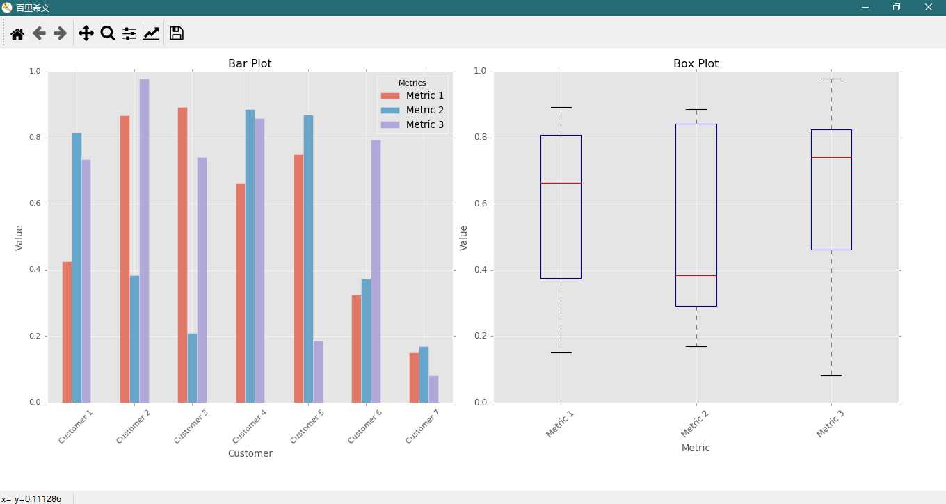
。。。
原文:https://www.cnblogs.com/shanger/p/12046415.html