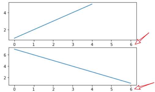
当你通过pyplot.subplot()、pyplot.axes()函数或者Figure.add_subplot()、Figure.add_axes()方法创建一个Axes时,你可以通过sharex关键字参数传入另一个Axes表示共享X轴;或者通过sharey关键字参数传入另一个Axes表示共享Y轴。共享轴线时,当你缩放某个Axes时,另一个Axes也跟着缩放。
举例:
import matplotlib
import matplotlib.pyplot as plt
fig = plt.figure()
ax1 = fig.add_subplot(211)
ax1.plot([1,2,3,4,5])
ax2 = fig.add_subplot(212,sharex=ax1)
ax2.plot([7,6,5,4,3,2,1])
fig.show()
如果你想创建网格中的许多subplot,旧式风格的代码非常繁琐:
# 旧式风格
fig=plt.figure()
ax1=fig.add_subplot(221)
ax2=fig.add_subplot(222,sharex=ax1,sharey=ax1)
ax3=fig.add_subplot(223,sharex=ax1,sharey=ax1)
ax4=fig.add_subplot(224,sharex=ax1,sharey=ax1)
新式风格的代码直接利用pyplot.subplots()函数一次性创建:
# 新式风格的代码
fig,((ax1,ax2),(ax3,ax4))=plt.subplots(2,2,sharex=True,sharey=True)
ax1.plot(...)
ax2.plot(...)
 ...
它创建了Figure和对应所有网格SubPlot。你也可以不去解包而直接:
# 新式风格的代码
fig,axs=plt.subplots(2,2,sharex=True,sharey=True)
ax1=axs[0,0]
ax2=axs[0,1]
ax3=axs[1,0]
ax4=axs[1,1]
...
返回的axs是一个nrows*ncols的array,支持numpy的索引。
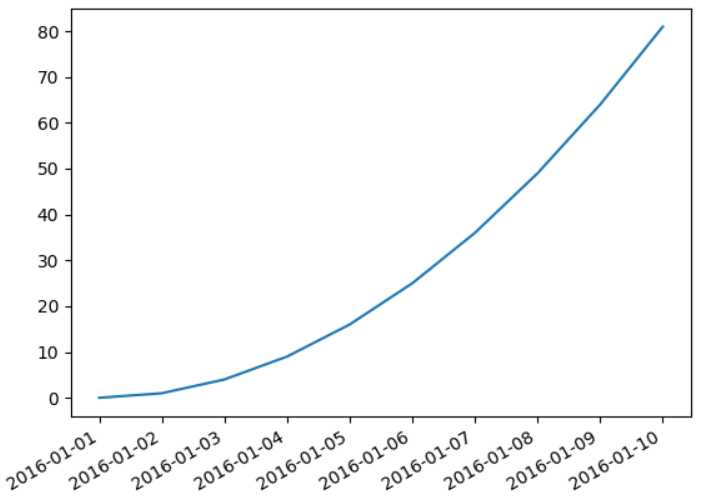
当x轴为时间日期时,有可能间隔太密集导致显示都叠加在一起。此时可以用matplotlib.figure.Figure.autofmt_xdate()函数来自动调整X轴日期的显式。
也可以调整X轴的显示格式。当X轴为时间时,其显示由Axes.fmt_xdata属性来提供。该属性是一个函数对象或者函数,接受一个日期参数,返回该日期的显示字符串。matplotlib已经提供了许多date formatter,你可以直接使用ax.fmt_xdata=matplotlib.dates.DateFormatter(‘%Y-%m-%d‘)。
import datetime
import matplotlib.pyplot as plt
import matplotlib.dates as mdates
d0 = datetime.date(2016,1,1)
ndates = [d0+datetime.timedelta(i) for i in range(10)]
n_ys = [i*i for i in range(10)]

fig,ax = plt.subplots(1)
ax.plot(ndates,n_ys)
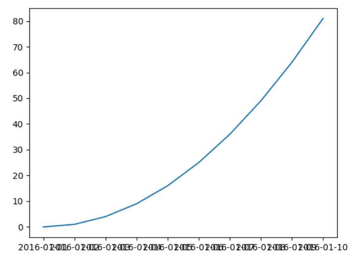
fig.autofmt_xdate() # 调整x轴时间的显示
ax.fmt_xdata = mdates.DateFormatter(‘%Y-%m-%d‘) # 格式化器
plt.show()
# 解决ticklabel字重叠:
ax = sns.countplot(x="downNetwork", data=offline_data_shuffle)

ax.set_xticklabels(ax.get_xticklabels(), rotation=40, ha="right")
plt.tight_layout()
plt.show()
要想在文本中使用LATEX,你需要使用‘$...$‘这种字符串(即使用‘$‘作为界定符)。通常建议使用raw字符串,即r‘$...$‘的格式,因为原生字符串不会转义‘\‘,从而使得大量的LATEX词法能够正确解析。
举例:
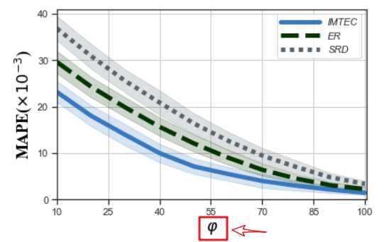
sns.set(style=‘ticks‘)
sns.set_context(rc={‘lines.linewidth‘:5})

plt.xlim((10,100.5))
plt.ylim((0,41))
plt.xticks(np.arange(10, 100.5, 15))
plt.yticks(np.arange(0,41,10))
# "greyish", "faded green",
colors = ["windows blue", "dark green",  "slate grey"]
palette = sns.xkcd_palette(colors)
ax = sns.lineplot(x="phi", y="MAPE",hue = ‘alg‘, style=‘alg‘,data=df_mape_change_phi, markers = False,palette=palette)
# - 实线-- 短线-.短点相间线:虚点线
# ax.lines[0].set_linestyle("-")
# ax.lines[1].set_linestyle("-.")
# ax.lines[2].set_linestyle("--")
plt.xlabel(r‘$\varphi$‘, fontdict={‘color‘: ‘black‘,‘family‘: ‘Times New Roman‘,‘size‘: 18})
plt.ylabel(r‘MAPE($\times 10^{-3}$)‘, fontdict={‘color‘: ‘black‘,‘family‘: ‘Times New Roman‘,‘size‘: 18})
plt.legend([‘IMTEC‘,‘ER‘,‘SRD‘],prop={‘style‘: ‘italic‘},handlelength=4)#图例
plt.grid(True)
plt.tight_layout()
plt.savefig(‘local_pic/phi_mape.jpg‘,dpi=600)
# plt.savefig(‘loc_svg/TD_precision_tasknum.svg‘)
plt.show()
pyplot.cla():清除current axis。非当前axis不受影响pyplot.clf():清除current figure。但是它不关闭windowpyplot.close():关闭windowFigure.clf():清除该Figure对象的所有内容。Axes.set_xticks(()) Axes.set_yticks(()) Axes.set_axis_off() #清除tick和边框
在linux 下,为了支持中文,则在开头设置:
import matplotlib.pyplot as plt
plt.rcParams[‘font.sans-serif‘] = [‘SimHei‘]  #matplotlib 中文字体
原文:https://www.cnblogs.com/nxf-rabbit75/p/12099147.html