话不多说先上图:

有三部分组成:1. 底下灰色条部分 2.上层涂色部分 3. 百分比显示部分
- <Style TargetType="{x:Type ProgressBar}">
- <Setter Property="Maximum" Value="100" />
- <Setter Property="Height" Value="70" />
- <Setter Property="Value" Value="20" />
- <Setter Property="Foreground" Value="#40a2c2"/>
- <Setter Property="SnapsToDevicePixels" Value="True" />
- <Setter Property="Template">
- <Setter.Value>
- <ControlTemplate TargetType="{x:Type ProgressBar}">
- <Grid x:Name="Root">
- <Grid.RowDefinitions>
- <RowDefinition></RowDefinition>
- <RowDefinition Height="35" ></RowDefinition>
- </Grid.RowDefinitions>
- <Grid Grid.Row="0">
- <Canvas Grid.Row="0" Height="38">
- <Canvas x:Name="Tooltip" Canvas.Left="{Binding ActualWidth, ElementName=PART_Indicator,Converter={StaticResource progressBarValueLocationConverter}}">
- <Image x:Name="Shape_5" Height="30" Canvas.Left="4" Source="percentagebar_Images/Shape 5.png" Canvas.Top="2" Width="43">
- <Image.Effect>
- <DropShadowEffect BlurRadius="3" Color="Black" Direction="-90" Opacity="0.43" ShadowDepth="2"/>
- </Image.Effect>
- </Image>
- <TextBlock Text="{Binding Value, RelativeSource={RelativeSource AncestorType={x:Type ProgressBar}},Converter={StaticResource progressBarValueTextFormatConverter}}" Foreground="White" FontWeight="Bold" FontSize="13" FontFamily="Helvetica75-Bold" IsHyphenationEnabled="True" LineStackingStrategy="BlockLineHeight" Canvas.Left="13" LineHeight="13" TextAlignment="Left" TextWrapping="Wrap" Canvas.Top="9.56">
- <TextBlock.Effect>
- <DropShadowEffect BlurRadius="0" Color="Black" Direction="-270" Opacity="1" ShadowDepth="1"/>
- </TextBlock.Effect>
- </TextBlock>
- </Canvas>
- </Canvas>
- </Grid>
-
- <Path Grid.Row="1" x:Name="PART_Track" Data="F1M8,1C8,1 335,1 335,1 338.866,1 342,4.134 342,8 342,11.866 338.866,15 335,15 335,15 8,15 8,15 4.134,15 1,11.866 1,8 1,4.134 4.134,1 8,1z" Canvas.Left="0" Canvas.Top="0">
- <Path.Effect>
- <DropShadowEffect BlurRadius="0" Color="White" Direction="-90" Opacity="0.26" ShadowDepth="1"/>
- </Path.Effect>
- <Path.Fill>
- <SolidColorBrush Color="Black" Opacity="0.23137254901960785"/>
- </Path.Fill>
- </Path>
- <Border Grid.Row="1" x:Name="PART_Indicator" BorderBrush="Transparent" HorizontalAlignment="Left" VerticalAlignment="Top" Margin="3,2,0,0" Height="12" MaxWidth="338" Background="{TemplateBinding Foreground}" CornerRadius="7.5,7.5,7.5,7.5" SnapsToDevicePixels="{TemplateBinding SnapsToDevicePixels}"></Border>
-
- </Grid>
- <!--<ControlTemplate.Triggers>
- <Trigger Property="Orientation" Value="Vertical">
- <Setter Property="LayoutTransform" TargetName="Root">
- <Setter.Value>
- <RotateTransform Angle="-90" />
- </Setter.Value>
- </Setter>
- </Trigger>
- </ControlTemplate.Triggers>-->
- </ControlTemplate>
- </Setter.Value>
- </Setter>
- </Style>
样式代码里可以看到 Tamplate里有两层,一层是上标进度百分比,一层是进度条。
由于上标和进度条base我是直接在Blend里导入psd图层生成的代码 所以是画布格式的。这也注定了整个图形不可改变,除非改变path或者Image。
另外下层的两个Border 命名必须是x:Name="PART_Track" 和 x:Name="PART_Indicator" 这是进度条样式规定。
关于注释部分,因为我是path画出来的base 本就横向,无法改成纵向,所以无法纵向属性触发,有大神有好的解决方法请留言赐教。
上标的位置是绑定为x:Name="PART_Indicator"的宽度,所以可以跟随显示。 textbook显示的是ProgressBar的Value值。这部分做了两个Convert转换器,分别是将画布Left值转成(x:Name="PART_Indicator"的宽度-25)、将textbook的文字格式化为ProgressBar的Value值+“%”。
- public class ProgressBarValueLocationConverter :IValueConverter
- {
-
- public object Convert(object value, Type targetType, object parameter, System.Globalization.CultureInfo culture)
- {
- return ((double)value - 25);
- }
-
- public object ConvertBack(object value, Type targetType, object parameter, System.Globalization.CultureInfo culture)
- {
- return 0;
- }
- }
-
-
- public class ProgressBarValueTextFormatConverter:IValueConverter
- {
- public object Convert(object value, Type targetType, object parameter, System.Globalization.CultureInfo culture)
- {
- return value.ToString() + "%";
- }
-
- public object ConvertBack(object value, Type targetType, object parameter, System.Globalization.CultureInfo culture)
- {
- throw new NotImplementedException();
- }
- }
完成^^
使用的时候,可以改变Value值,Foreground值
<ProgressBar Foreground="Black" Value="10" HorizontalAlignment="Center" VerticalAlignment="Center"></ProgressBar>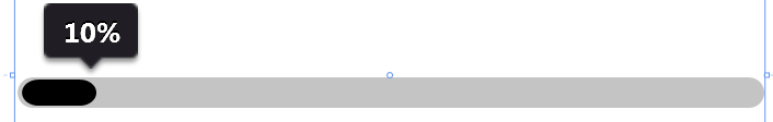
【WPF控件】简约实用,进度百分比跟随显示的Progressbar
原文:https://www.cnblogs.com/lonelyxmas/p/12174841.html