1,过渡:transition:使元素指定属性从A状态过渡平滑过渡到B状态,而不是直接过去,
2.语法:transition:all 1s ease 0s;
第一个参数:需要过渡的属性 ,all(默认)所有属性都过渡 基本上所有属性都能过渡 不能过渡:float/渐变*/
第二个参数:过渡时间 s
第三个参数: 缓冲描述词,速率 ease:逐渐变慢 linear:匀速过渡 ease-in:先慢后快 ease-out:先快后慢 ease-in-out:先慢后快再慢
第四个参数:延迟时间 0s就是不延迟
语法:animation:box 3s infinite 0s;
定义动画:@keyframes 动画名称{

        from{

            A 状态

        }to{

            B 状态

        }

        /*0%~~100%*/

       0%{

        }
animation动画属性:
1.animation-name:动画的名称
2.animation-duration:动画持续时长
3.animation-timing-function:定义动画的速率 ease -in - out - 贝塞尔曲线
4.animation-delay:延迟时间
5.animation-iteration-count:播放次数 infinite:无限次数
6.animation-direction:动画播放方向
nomal:一直向前播放,当到最后一帧会回到第一帧;
reverse:跟normal方向相反
alternate:往复播放
alternate-reverse:跟alternate反向
7.animation-fill-mode : forwards:动画播放完毕回到第一帧的状态
none:默认,不设置 both:动画播放完毕后会回到结束或开始状态,结束状态优先
8.animation-play-state:控制动画播放 paused:暂停动画 running:启动继续播放
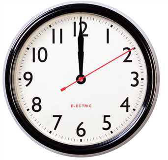
<style type="text/css">
    .div1 {
        width: 512px;
        height: 512px;
        /* 设置背景图片 */
        background-image: url(img/clock.png);
        /*相对定位 需要在父级元素设置,防止绝对定位跑出范围*/
        position: relative;
    }

    .div2 {
        width: 32px;
        height: 148px;
        background-image: url(img/hour.png);
        /*绝对定位*/
        position: absolute;
        top: 240px;
        left: 239px;
        /* 旋转开始点 */
        transform: rotate(180deg);
        transform-origin: center 17px;
        /*读取动画 600000s内完成 分为6000步 无限循环*/
        animation: tun 600000s steps(6000, end) infinite;
    }

    .div3 {
        width: 32px;
        height: 218px;
        background-image: url(img/minute.png);
        /*绝对定位*/
        position: absolute;
        top: 240px;
        left: 239px;
        transform: rotate(180deg);
        transform-origin: center 17px;
        /*读取动画 6000s内完成 分为600步 无限循环*/
        animation: tun 6000s steps(600, end) infinite;
    }

    .div4 {
        width: 16px;
        height: 278px;
        background-image: url(img/second.png);
        /*绝对定位*/
        position: absolute;
        top: 179px;
        left: 247px;
        /*设置指针在180度 deg=度*/
        transform: rotate(180deg);
        /*设置旋转元素的基点位置:center定义视图被置于 Y 轴的何处。可能的值:77px*/
        transform-origin: center 77px;
        /*读取动画 60s内完成 分为60步 无限循环*/
        animation: tun 60s steps(60, end) infinite;
    }
    /*定义一个指针运动的动画*/

    @keyframes tun {
        /*百分之0的时候在12点位置*/
        0% {
            transform: rotate(180deg);
        }
        /*百分之一百的时候在180+360=540在正好旋转一圈*/
        100% {
            transform: rotate(540deg);
        }
    }
</style>

<body>
    <!-- 创建一个时钟的背景图片 -->
    <div class="div1">
        <!-- 时针 -->
        <div class="div2"></div>
        <!-- 分针 -->
        <div class="div3"></div>
        <!-- 秒针 -->
        <div class="div4"></div>
    </div>

</body>
原文:https://www.cnblogs.com/jiangquhan/p/12195352.html