例子:
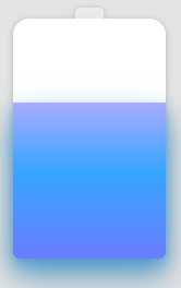
html:
<div class="container">
    <div class="battery"></div>
</div>
css:
html,
body {
    width: 100%;
    height: 100%;
    display: flex;
    background: #e4e4e4;
}

.container {
    position: relative;
    width: 140px;
    margin: auto;
}

.battery {
    height: 220px;
    box-sizing: border-box;
    border-radius: 15px 15px 5px 5px;
    filter: drop-shadow(0 1px 3px rgba(0,0,0,0.22));
    background: #fff;
    z-index: 1;

    &::before {
        content: "";
        position: absolute;
        width: 26px;
        height: 10px;
        left: 50%;
        top: 0;
        transform: translate(-50%, -10px);
        border-radius: 5px 5px 0 0;
        background: rgba(240, 240, 240, .88);
    }

    &::after {
        content: "";
        position: absolute;
        left: 0;
        right: 0;
        bottom: 0;
        top: 90%;
        background: linear-gradient(to bottom, #7abcff 0%, #00BCD4 44%, #2196F3 100%);
        border-radius: 0px 0px 5px 5px;
        box-shadow: 0 14px 28px rgba(33, 150, 243, 0), 0 10px 10px rgba(9, 188, 215, 0.08);
        animation: charging 6s linear infinite;
        filter: hue-rotate(90deg);
    }
}

@keyframes charging {
    50% {
        box-shadow: 0 14px 28px rgba(0, 150, 136, 0.83), 0px 4px 10px rgba(9, 188, 215, 0.4);
    }

    95% {
        top: 5%;
        filter: hue-rotate(0deg);
        border-radius: 0 0 5px 5px;
        box-shadow: 0 14px 28px rgba(4, 188, 213, .2), 0 10px 10px rgba(9, 188, 215, 0.08);
    }
    100% {
        top: 0%;
        filter: hue-rotate(0deg);
        border-radius: 15px 15px 5px 5px;
        box-shadow: 0 14px 28px rgba(4, 188, 213, 0), 0 10px 10px rgba(9, 188, 215, 0.4);
    }
}
例子2::波浪型
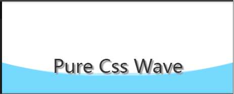
html:
<h2>Pure Css Wave</h2>
css:
body {
    position: relative;
    align-items: center;
    min-height: 100vh;
    background-color: rgb(118, 218, 255);
    overflow: hidden;

    &:before, &:after {
        content: "";
        position: absolute;
        left: 50%;
        min-width: 300vw;
        min-height: 300vw;
        background-color: #fff;
        animation-name: rotate;
        animation-iteration-count: infinite;
        animation-timing-function: linear;
    }

    &:before {
        bottom: 15vh;
        border-radius: 45%;
        animation-duration: 10s;
    }

    &:after {
        bottom: 12vh;
        opacity: .5;
        border-radius: 47%;
        animation-duration: 10s;
    }
}

@keyframes rotate {
    0% {
        transform: translate(-50%, 0) rotateZ(0deg);
    }
    50% {
        transform: translate(-50%, -2%) rotateZ(180deg);
    }
    100% {
        transform: translate(-50%, 0%) rotateZ(360deg);
    }
}

h2 {
    position: relative;
    color: #333;
    z-index: 10;
    text-align: center;
    height: 100vh;
    line-height: 140vh;
    font-size: 8vw;
    text-shadow: 3px 3px 2px #999;
}
例子3:强大的充电效果
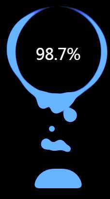
html:
<div class="g-container">
    <div class="g-number">98.7%</div>
    <div class="g-contrast">
        <div class="g-circle"></div>
        <ul class="g-bubbles">
            <li></li>
            <li></li>
            <li></li>
            <li></li>
            <li></li>
            <li></li>
            <li></li>
            <li></li>
            <li></li>
            <li></li>
            <li></li>
            <li></li>
            <li></li>
            <li></li>
            <li></li>
        </ul>
    </div>
</div>
css:
html,
body {
    width: 100%;
    height: 100%;
    display: flex;
    background: #000;
    overflow: hidden;
}

.g-number {
    position: absolute;
    width: 300px;
    top: 27%;
    text-align: center;
    font-size: 32px;
    z-index: 10;
    color: #fff;
}

.g-container {
    position: relative;
    width: 300px;
    height: 400px;
    margin: auto;
}

.g-contrast {
    filter: contrast(15) hue-rotate(0);
    width: 300px;
    height: 400px;
    background-color: #000;
    overflow: hidden;
    animation: hueRotate 10s infinite linear;
}

.g-circle {
    position: relative;
    width: 300px;
    height: 300px;
    box-sizing: border-box;
    filter: blur(8px);

    &::after {
        content: "";
        position: absolute;
        top: 40%;
        left: 50%;
        transform: translate(-50%, -50%) rotate(0);
        width: 200px;
        height: 200px;
        background-color: #00ff6f;
        border-radius: 42% 38% 62% 49% / 45%;
        animation: rotate 10s infinite linear;
    }

    &::before {
        content: "";
        position: absolute;
        width: 176px;
        height: 176px;
        top: 40%;
        left: 50%;
        transform: translate(-50%, -50%);
        border-radius: 50%;
        background-color: #000;
        z-index: 10;
    }
}

.g-bubbles {
    position: absolute;
    left: 50%;
    bottom: 0;
    width: 100px;
    height: 40px;
    transform: translate(-50%, 0);
    border-radius: 100px 100px 0 0;
    background-color: #00ff6f;
    filter: blur(5px);
}

li {
    position: absolute;
    border-radius: 50%;
    background: #00ff6f;
}

@for $i from 0 through 15 {
    li:nth-child(#{$i}) {
        $width: 15 + random(15) + px;
        left: 15 + random(70) + px;
        top: 50%;
        transform: translate(-50%, -50%);
        width: $width;
        height: $width;
        animation: moveToTop #{random(6) + 3}s ease-in-out -#{random(5000)/1000}s infinite;
    }
}

@keyframes rotate {
    50% {
        border-radius: 45% / 42% 38% 58% 49%;
    }
    100% {
        transform: translate(-50%, -50%) rotate(720deg);
    }
}

@keyframes moveToTop {
    90% {
        opacity: 1;
    }
    100% {
        opacity: .1;
        transform: translate(-50%, -180px);
    }
}

@keyframes hueRotate {
    100% {
        filter: contrast(15) hue-rotate(360deg);
    }
}
文章案例来自:https://juejin.im/post/5e00240ee51d45583c1cc9a7
原文:https://www.cnblogs.com/chao202426/p/12221086.html