用于画直方图。
参数列表:
plt.hist(x, bins=None, range=None, density=None, weights=None, cumulative=False, bottom=None, histtype=‘bar‘, align=‘mid‘, orientation=‘vertical‘, rwidth=None, log=False, color=None, label=None, stacked=False, normed=None)
返回值:
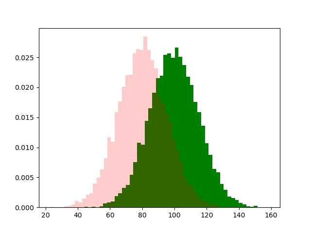
import numpy as np
import matplotlib.pyplot as plt

np.random.seed(19260801)

mu1, sigma1 = 100, 15
mu2, sigma2 = 80, 15
x1 =  np.random.normal(mu1,sigma1,10000) # (均值,标准差,个数)
x2 =  np.random.normal(mu2,sigma2,10000)

# the histogram of the data
# 50:将数据分成50组
# color:颜色;alpha:透明度
# density:是密度而不是具体数值
n1, bins1, patches1 = plt.hist(x1, bins=50,  density=True, color=‘g‘, alpha=1)
n2, bins2, patches2 = plt.hist(x2, bins=50,  density=True, color=‘r‘, alpha=0.2)

plt.show()
根据plt.hist()返回值,很容易画出分布曲线
#print(len(bins1)) #51
#print(len(n1))  #50
plt.plot(bins1[:-1],n1,‘--‘)
plt.plot(bins2[:-1],n2,‘--‘)

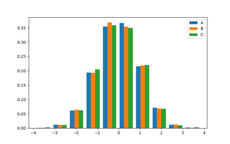
import numpy as np
import matplotlib.pyplot as plt

# 生成3组值,每组的个数可以不一样
x1,x2,x3 = [np.random.randn(n) for n in [10000, 5000, 2000]]

plt.figure(figsize=(8,5))
# 在 ax.hist 函数中先指定图例 label 名称
plt.hist([x1, x2, x3], bins=10, density=True, histtype=‘bar‘)

# 通过 ax.legend 函数来添加图例
plt.legend(list("ABC"))

plt.show()
你可以给图示或图添加标题。但是默认不支持中文,需要自己添加中文字体。
windows的字体文件放在 C:\Windows\Fonts,通过fontproperties设置字体,fontsize设置字体大小.
import matplotlib

songTi = matplotlib.font_manager.FontProperties(fname=‘C:\\Windows\\Fonts\\msyh.ttc‘)
plt.title("多类型直方图",fontproperties=songTi,fontsize=12)
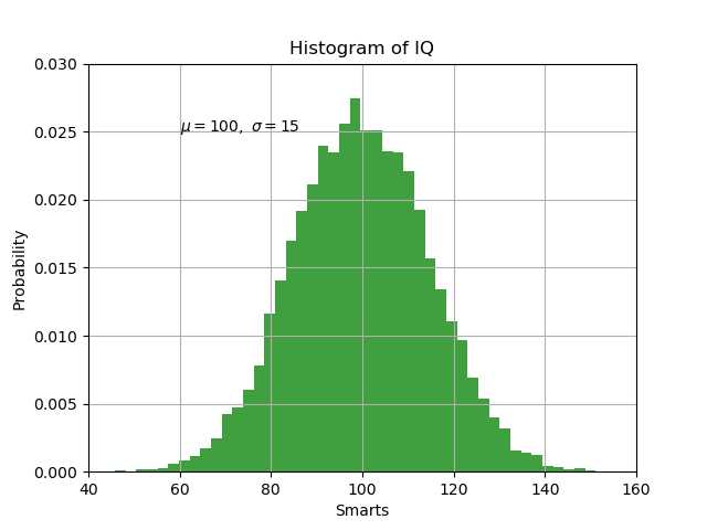
import numpy as np
import matplotlib.pyplot as plt

# Fixing random state for reproducibility
np.random.seed(19680801)

mu, sigma = 100, 15
x = mu + sigma * np.random.randn(10000)

# the histogram of the data
n, bins, patches = plt.hist(x, 50, density=True, facecolor=‘g‘, alpha=0.75)


plt.xlabel(‘Smarts‘)
plt.ylabel(‘Probability‘)
plt.title(‘Histogram of IQ‘)
plt.text(60, .025, r‘$\mu=100,\ \sigma=15$‘)  #(x,y,str,...)
plt.xlim(40, 160)
plt.ylim(0, 0.03)
plt.grid(True)
plt.show()
参考链接:
3. matplotlib.pyplot.text官方文档及示例
4. CSDN-Watch_dou-matplotlib之hist详解
原文:https://www.cnblogs.com/lfri/p/12251387.html