布局的传统解决方案,基于盒状模型,依赖 display 属性 + position属性 + float属性。它对于那些特殊布局非常不方便,比如,垂直居中就不容易实现。
flex-direction属性决定主轴的方向(即项目的排列方向)。
.box {
  flex-direction: row | row-reverse | column | column-reverse;
}
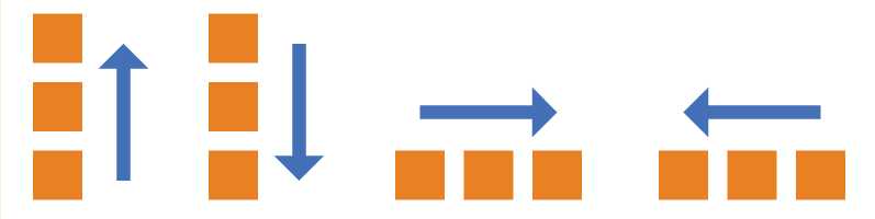
它可能有4个值。
row(默认值):主轴为水平方向,起点在左端。row-reverse:主轴为水平方向,起点在右端。column:主轴为垂直方向,起点在上沿。column-reverse:主轴为垂直方向,起点在下沿
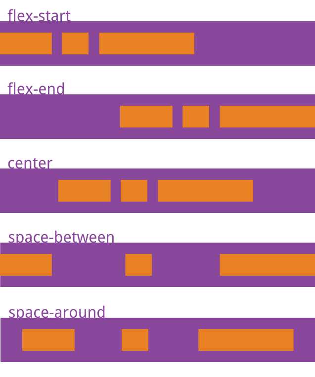
justify-content属性定义了项目在主轴上的对齐方式。
.box {
  justify-content: flex-start | flex-end | center | space-between | space-around;
}
align-items属性定义项目在交叉轴上如何对齐。
.box {
  align-items: flex-start | flex-end | center | baseline | stretch;
}
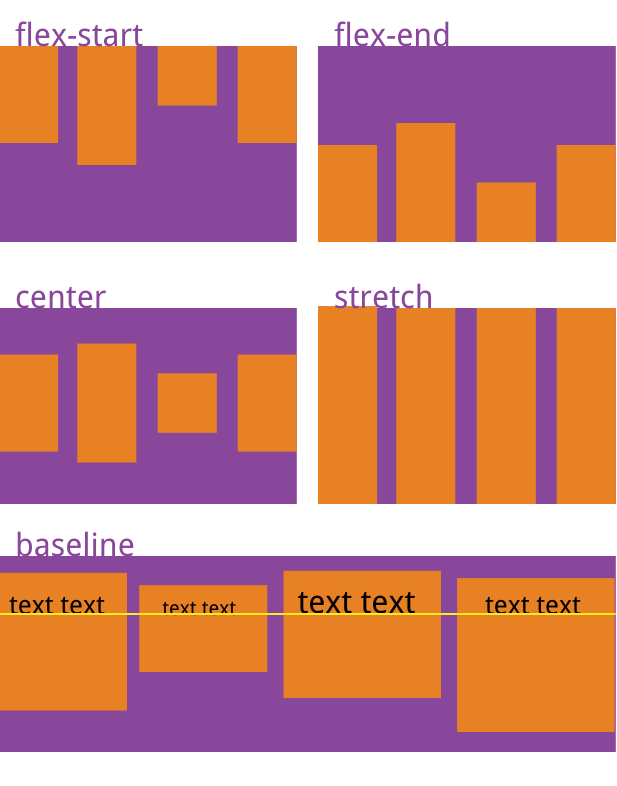
它可能取5个值。具体的对齐方式与交叉轴的方向有关,下面假设交叉轴从上到下。
flex-start:交叉轴的起点对齐。flex-end:交叉轴的终点对齐。center:交叉轴的中点对齐。baseline: 项目的第一行文字的基线对齐。stretch(默认值):如果项目未设置高度或设为auto,将占满整个容器的高度。
flex 还有好多的属性 详见 阮一峰
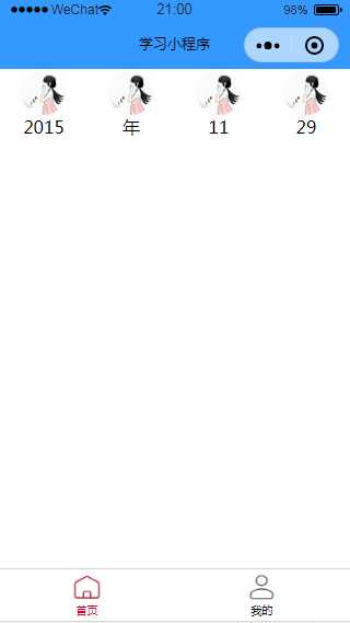
下面以在微信中应用为例
/* index.wxml */

<view class="menu">
  <view class="item">
    <image src="/static/girl.jpg"></image>
    <text>2015</text>
  </view>
    <view class="item">
    <image src="/static/girl.jpg"></image>
    <text>年</text>
  </view>
    <view class="item">
    <image src="/static/girl.jpg"></image>
    <text>11</text>
  </view>
    <view class="item">
    <image src="/static/girl.jpg"></image>
    <text>29</text>
  </view>
</view>
/**index.wxss**/
image{
  width: 100rpx;
  height: 100rpx;
  border-radius: 50rpx;            图片变圆角
}
.menu{                  flex用法

  display: flex;
  /* 在水平方向排列 */
  /* row规定主轴方向水平 */
  /* column规定主轴方向垂直 */
  flex-direction: row;
  /* 在主轴方向如何展示 flex-start/center/space-around/space-between */
  justify-content: space-around;
}

/* 在wxml中嵌套的样式 */
.menu .item{
  display: flex;
  flex-direction: column;
  align-items: center;
}
原文:https://www.cnblogs.com/a438842265/p/12337319.html