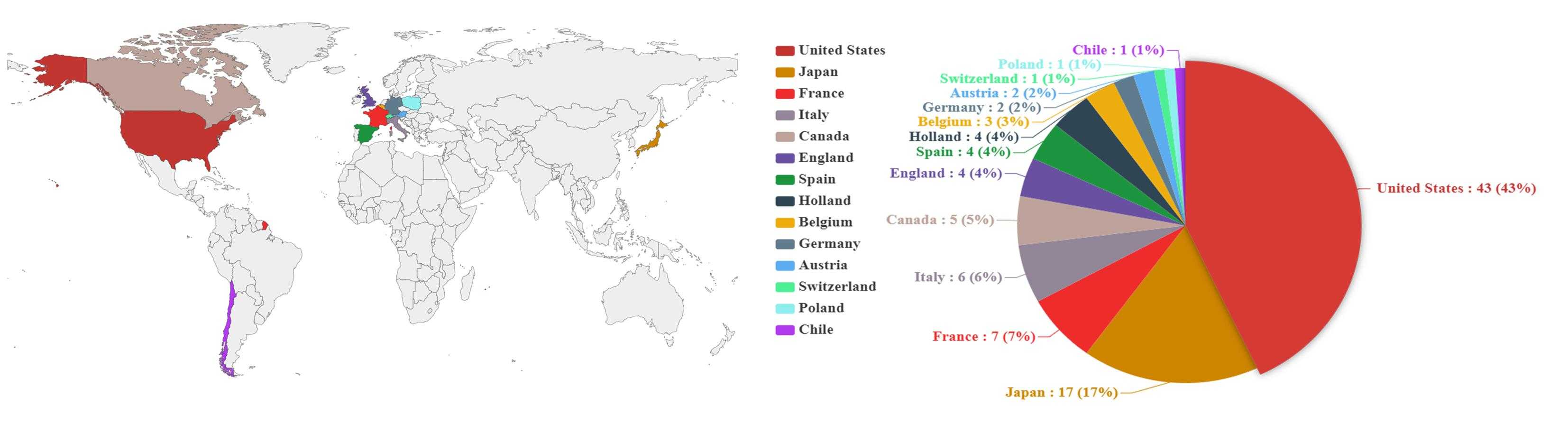
 上图是最终的效果图,制作该图片分为两个步骤:
世界地图:
<!DOCTYPE html>
<html>
<head>
    <meta charset="UTF-8">
    <title>Awesome-pyecharts</title>
            <script type="text/javascript" src="https://assets.pyecharts.org/assets/echarts.min.js"></script>
        <script type="text/javascript" src="https://assets.pyecharts.org/assets/maps/world.js"></script>

</head>
<body>
  <!-- 此处style里 宽度和高度是可以自定义的,宽度和高度于生成图片的尺寸相关 ,在下面的饼状图中则同理-->
    <div id="d9d03d4443a248218fb00e0b295240bd" class="chart-container" style="width:1800px; height:1200px;"></div>
    <script>
        var chart_d9d03d4443a248218fb00e0b295240bd = echarts.init(
            document.getElementById(‘d9d03d4443a248218fb00e0b295240bd‘), ‘white‘, {renderer: ‘canvas‘});
        var option_d9d03d4443a248218fb00e0b295240bd = {

    ‘legend‘:{
        ‘show‘:false,
    },
    // 默认的颜色数组 (如果不明确设置每个数据项的颜色,则会采用默认的数组
    "color": [
        "#c23531",
        "#2f4554",
        "#61a0a8",
        "#d48265",
        "#749f83",
        "#ca8622",
        "#bda29a",
        "#6e7074",
        "#546570",
        "#c4ccd3",
        "#f05b72",
        "#ef5b9c",
        "#f47920",
        "#905a3d",
        "#fab27b",
        "#2a5caa",
        "#444693",
        "#726930",
        "#b2d235",
        "#6d8346",
        "#ac6767",
        "#1d953f",
        "#6950a1",
        "#918597"
    ],
    "series": [
        {
            // 图标类型为 地图
            "type": "map",
            "name": "test",
            "label": {
                "show": false,
                "position": "top",
                "margin": 8
            },
            // 地图类型为 世界地图
            "mapType": "world",
            // ItemStyle 中设置每一个数据项的颜色
            "data": [
                {
                    "name": "United States",
                    "value": 43,
                    ‘itemStyle‘:{
                        ‘color‘:"#c23531"
                    }
                },
                {
                    "name": "Japan",
                    "value": 17,
                    ‘itemStyle‘:{
                        ‘color‘:"#CD8500"
                    }
                },
                {
                    "name": "France",
                    "value": 7,
                    ‘itemStyle‘:{
                        ‘color‘:"#EE2C2C"
                    }
                },
                {
                    "name": "Italy",
                    "value": 6,
                    ‘itemStyle‘:{
                        ‘color‘:"#918597"
                    }
                },
                {
                    "name": "Canada",
                    "value": 5,
                    ‘itemStyle‘:{
                        ‘color‘:"#bda29a"
                    }
                },
                {
                    "name": "United Kingdom",
                    "value": 4,
                    ‘itemStyle‘:{
                        ‘color‘:"#6950a1"
                    }
                },
                {
                    "name": "Spain",
                    "value": 4,
                    ‘itemStyle‘:{
                        ‘color‘:"#1d953f"
                    }
                },
                {
                    "name": "Holland",
                    "value": 4,
                    ‘itemStyle‘:{
                        ‘color‘:"#2f4554"
                    }
                },
                {
                    "name": "Belgium",
                    "value": 3,
                    ‘itemStyle‘:{
                        ‘color‘:"#EEAD0E"
                    }
                },
                {
                    "name": "Germany",
                    "value": 2,
                    ‘itemStyle‘:{
                        ‘color‘:"#607B8B"
                    }
                },
                {
                    "name": "Austria",
                    "value": 2,
                    ‘itemStyle‘:{
                        ‘color‘:"#5CACEE"
                    }
                },
                {
                    "name": "Switzerland",
                    "value": 1,
                    ‘itemStyle‘:{
                        ‘color‘:"#4EEE94"
                    }
                },
                {
                    "name": "Poland",
                    "value": 1,
                    ‘itemStyle‘:{
                        ‘color‘:"#8DEEEE"
                    }
                },
                {
                    "name": "Chile",
                    "value": 1,
                    ‘itemStyle‘:{
                        ‘color‘:"#B23AEE"
                    }
                },

            ],
            "roam": true,
            "zoom": 1,
            // 去除各个国家上的小红点
            "showLegendSymbol": false,
            "emphasis": {}
        }
    ],
    "legend": [
        {
            "data": [
                "test"
            ],
            "selected": {
                "test": true
            }
        }
    ],
    // 鼠标悬浮,单机产生的效果
    "tooltip": {
        "show": true,
        "trigger": "item",
        "triggerOn": "mousemove|click",
        "axisPointer": {
            "type": "line"
        },
        "textStyle": {
            "fontSize": 14
        },
        "borderWidth": 0
    }
};
        chart_d9d03d4443a248218fb00e0b295240bd.setOption(option_d9d03d4443a248218fb00e0b295240bd);
    </script>
</body>
</html>
复制以上代码,使用编辑器(sublime或其他)创建HTML文件,在Chrome浏览器中打开,就可以看到生成的世界地图了,点击右键,图片另存为,将图片保存下来
饼状图代码:
<!DOCTYPE html>
<html>
<head>
    <meta charset="UTF-8">
    <title>Awesome-pyecharts</title>
            <script type="text/javascript" src="https://assets.pyecharts.org/assets/echarts.min.js"></script>
        <script type="text/javascript" src="https://assets.pyecharts.org/assets/maps/world.js"></script>

</head>
<body>
    <div id="d9d03d4443a248218fb00e0b295240bd" class="chart-container" style="width:1200px; height:800px;"></div>
    <script>
        var chart_d9d03d4443a248218fb00e0b295240bd = echarts.init(
            document.getElementById(‘d9d03d4443a248218fb00e0b295240bd‘), ‘white‘, {renderer: ‘canvas‘});
        var option_d9d03d4443a248218fb00e0b295240bd = {
    title: {
        text: ‘No. of papers‘,
        left: ‘center‘
    },
    legend: {
        orient: ‘vertical‘,
        left: ‘left‘,
        // 图例数据
        data: [‘United States‘, ‘Japan‘, ‘France‘, ‘Italy‘, ‘Canada‘, ‘England‘, ‘Spain‘, ‘Holland‘, ‘Belgium‘, ‘Germany‘, ‘Austria‘, ‘Switzerland‘, ‘Poland‘, ‘Chile‘],
        // 设置图例的文字样式

        textStyle:{

                fontWeight:‘bold‘,
                fontSize:‘20‘,
                fontFamily:‘Times New Roman‘ //字体


        }
    },
    series: [
        {
            name: ‘‘,
            type: ‘pie‘, // 图的类型为饼图
            radius: ‘55%‘, // 饼图半径
            clockwise:true, // 顺时针排列各项数据
            center: [‘50%‘, ‘60%‘],  //饼图的中心坐标
            // 饼图中数据项标签设置
            label:{
                show:true,
                position:‘outside‘,
                // 格式设置 详细请看:www.echartsjs.com/zh/option.html#series-pie.label.formatter

                formatter: ‘{a} {b} : {c} ({d}%)‘,
                fontWeight:‘bold‘,
                fontSize:‘20‘,
                fontFamily:‘Times New Roman‘

            },
            // ItemStyle 中设置每一个数据项的颜色
            data: [
                {value: 43, name: ‘United States‘,itemStyle:{color:‘#c23531‘}},

                {value: 17, name: ‘Japan‘,itemStyle:{color:‘#CD8500‘}},

                {value: 7, name: ‘France‘,itemStyle:{color:‘#EE2C2C‘}},

                {value: 6, name: ‘Italy‘,itemStyle:{color:‘#918597‘}},

                {value: 5, name: ‘Canada‘,itemStyle:{color:‘#bda29a‘}},

                {value: 4, name: ‘England‘,itemStyle:{color:‘#6950a1‘}},

                {value: 4, name: ‘Spain‘,itemStyle:{color:‘#1d953f‘}},

                {value: 4, name: ‘Holland‘,itemStyle:{color:‘#2f4554‘}},

                {value: 3, name: ‘Belgium‘,itemStyle:{color:‘#EEAD0E‘}},

                {value: 2, name: ‘Germany‘,itemStyle:{color:‘#607B8B‘}},

                {value: 2, name: ‘Austria‘,itemStyle:{color:‘#5CACEE‘}},

                {value: 1, name: ‘Switzerland‘,itemStyle:{color:‘#4EEE94‘}},

                {value: 1, name: ‘Poland‘,itemStyle:{color:‘#8DEEEE‘}},

                {value: 1, name: ‘Chile‘,itemStyle:{color:‘#B23AEE‘}},


            ],
            emphasis: {
                itemStyle: {
                    shadowBlur: 10,
                    shadowOffsetX: 0,
                    shadowColor: ‘rgba(0, 0, 0, 0.5)‘
                }
            }
        }
    ]
};
        chart_d9d03d4443a248218fb00e0b295240bd.setOption(option_d9d03d4443a248218fb00e0b295240bd);
    </script>
</body>
</html>
与上面的世界地图操作相同,最后保存饼状图片
该步骤使用了ps,具体步骤是:
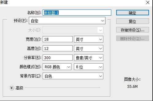
此处宽度和高度可以自定义,一般一开始可以设置大一点,到后面生成图片之前进行裁剪
接着把两张图片拖入画布中,调整大小与位置,再将两个图层栅格化,最后文件另存为.jpg文件,整个过程结束。
关于echart.js的详细信息或其它类型的图片可以参考:https://www.echartsjs.com/zh/index.html
原文:https://www.cnblogs.com/gagag/p/12382022.html