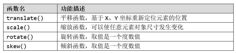
transform:[transform-function] *;
transform-function:设置变形函数,可以是一个,也可以是多个,中间以空格分开。
div{
transform:rotate(7deg);
-ms-transform:rotate(7deg); /* IE 9 */
-webkit-transform:rotate(7deg); /* Safari and Chrome */
}
1、语法
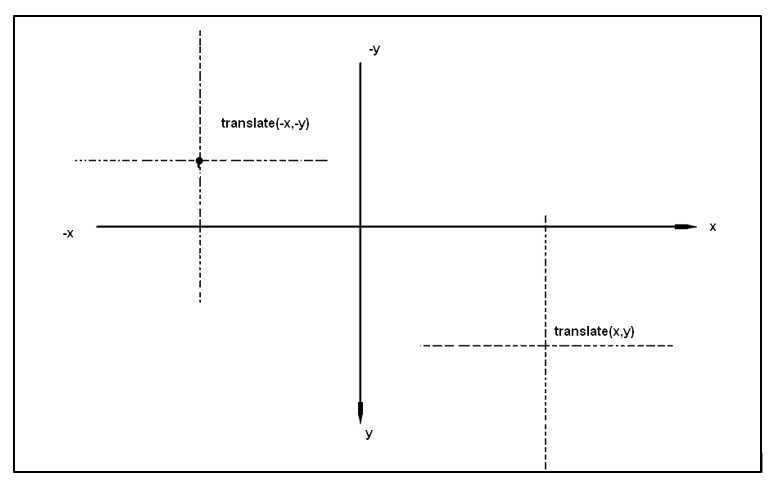
translate(tx,ty);
tx:X轴(横坐标)移动的向量长度
ty:Y轴(横坐标)移动的向量长度
2、示例代码
<head lang="en">
    <meta charset="UTF-8">
    <title>translate的使用</title>
    <style>
        li{
            list-style: none;
            float: left;
            width: 80px;
            line-height: 40px;
            background: rgba(242, 123, 5, 0.61);
            border-radius: 6px;
            font-size: 16px;
            margin-left: 3px;
        }
        li a{
            text-decoration: none;
            color: #fff;
            display: block;
            text-align: center;
            height: 40px;
        }
        li a:hover{
            background: rgba(242, 88, 6, 0.87);
            border-radius: 6px;
            /*设置a元素在鼠标移入时向右下角移动4px,8px*/
            transform: translate(4px,8px);
            -webkit-transform: translate(4px,8px);
            -o-transform: translate(4px,8px);
            -moz-transform: translate(4px,8px);
            /*transform: translateX(4px) translateY(8px);*/
        }
    </style>
</head>
<body>
    <ul>
        <li><a href="#">服装城</a></li>
        <li><a href="#">美妆馆</a></li>
        <li><a href="#">超市</a></li>
        <li><a href="#">全球购</a></li>
        <li><a href="#">闪购</a></li>
        <li><a href="#">团购</a></li>
        <li><a href="#">拍卖</a></li>
        <li><a href="#">金融</a></li>
    </ul>
</body>
3、一个方向上的位移
transform:translate(100px,0)等效于transform:translateX(100px)
transform:translate(0,100px)等效于transform:translateY(100px)
1、语法
scale(sx,sy);
sx:横向坐标(宽度)方向的缩放量
sy:纵轴坐标(高度)方向的缩放量
2、参数说明
scale()函数可以只接收一个值,也可以接收两个值,只有一个值时,第二个值默认和第一个值相等。
3、示例代码
其他代码同2D位移示例代码
li a:hover{
background: rgba(242, 88, 6, 0.87);
border-radius: 6px;
/*设置a元素在鼠标移入时放大1.5倍显示*/
transform: scale(1.5);
-webkit-transform: scale(1.5);
-moz-transform: scale(1.5);
-o-transform: scale(1.5);
 }
1、语法
skew(ax, ay);
ax:水平方向(X轴)的倾斜角度(单位:deg,度)
ay:垂直方向(Y轴)的倾斜角度(单位:deg,度)
2、参数说明
可以仅设置沿着X轴或Y轴方向倾斜:
3、示例代码
其他代码同2D位移示例代码
li a:hover{

background: rgba(242, 88, 6, 0.87);

border-radius: 6px;

/*设置a元素在鼠标移入时向左下角倾斜*/

transform: skew(40deg,-20deg);

-webkit-transform: skew(40deg,-20deg);

-moz-transform: skew(40deg,-20deg);

-o-transform: skew(40deg,-20deg);

/*transform: skewX(40deg);*/

/*-webkit-transform: skewX(40deg);*/

/*-moz-transform: skewX(40deg);*/

/*-o-transform: skewX(40deg);*/

 }
1、语法
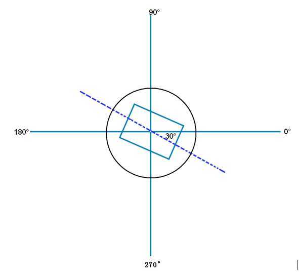
rotate(a);
参数a单位使用deg表示。
参数a取正值时元素相对原来中心顺时针旋转。
2、示例代码
<head lang="en">
    <meta charset="UTF-8">
    <title>rotate的使用</title>
    <style>
        div {
            width: 300px;
            margin: 40px auto;
            text-align: center;
        }
        img:hover {
            /*定义动画的状态,鼠标移入旋转并放大图片*/
            transform: rotate(-90deg) scale(2);
            -webkit-transform: rotate(-90deg) scale(2);
            -moz-transform: rotate(-90deg) scale(2);
            -o-transform: rotate(-90deg) scale(2);
        }
    </style>
</head>
<body>
    <div>
        <img src="image/tx.jpg" alt="img"/>
    </div>
</body>
transition呈现的是一种过渡,是一种动画转换的过程,如渐现、渐弱、动画快慢等。
CSS3 transition的过渡功能更像是一种“黄油”,通过一些CSS的简单动作触发样式平滑过渡。
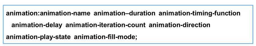
transition:[transition-property transition-duration transition-timing-function transition-delay ]
定义转换动画的CSS属性名称。语法:
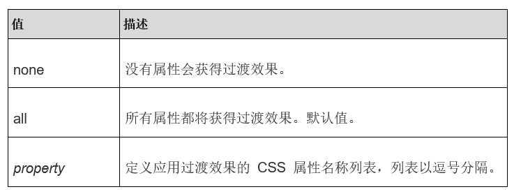
transition-property: none|all| property;
定义转换动画的时间长度,即从设置旧属性到换新属性所花费的时间,单位为秒(s)。
指定浏览器的过渡速度,以及过渡期间的操作进展情况,通过给过渡添加一个函数来指定动画的快慢方式
指定一个动画开始执行的时间,当改变元素属性值后多长时间去执行过渡效果
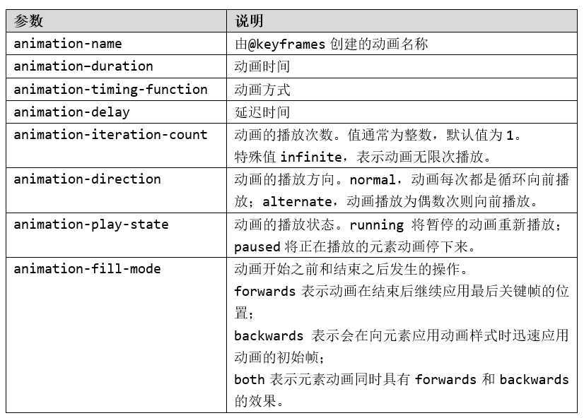
animation实现动画主要由两个部分组成
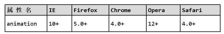
浏览器支持
语法
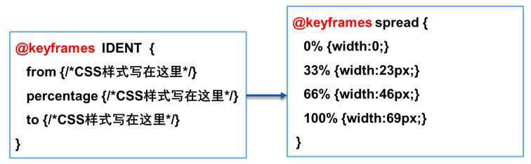
说明:
例如:@-webkit-keyframes、@-moz- keyframes。
语法
参数说明
<head lang="en">
    <meta charset="UTF-8">
    <title>animation的使用</title>
    <style>
        div{
            width: 100px;
            height: 100px;
            background: red;
            /*调用动画*/
            animation: spread 2s linear infinite;
            -webkit-animation: spread 2s linear infinite;
            -moz-animation: spread 2s linear infinite;
            -o-animation: spread 2s linear infinite;
        }
        /*创建动画关键帧*/
        @keyframes spread {
            0%{
                width: 0;
                transform: translate(100px,0);
            }
            25%{
                width: 20px;
                transform: translate(200px,0);
            }
            50%{
                width: 50px;
                transform:translate(300px,0);
            }
            75%{
                width: 70px;
                transform:translate(200px,0);
            }
            100%{
                width: 100px;
                transform:translate(100px,0);
            }
        }
        @-webkit-keyframes spread {
            0%{
                width: 0;
                transform: translate(100px,0);
            }
            25%{
                width: 20px;
                transform: translate(200px,0);
            }
            50%{
                width: 50px;
                transform:translate(300px,0);
            }
            75%{
                width: 70px;
                transform:translate(200px,0);
            }
            100%{
                width: 100px;
                transform:translate(100px,0);
            }
        }
    </style>
</head>
<body>
    <div></div>
</body>
原文:https://www.cnblogs.com/rask/p/12395956.html