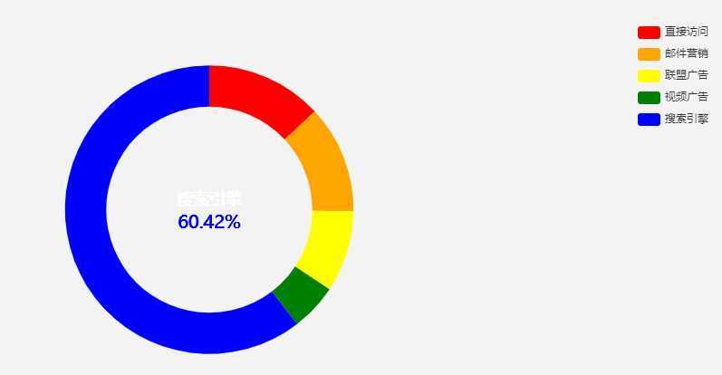
饼状图中间默认文字,当鼠标移入饼状图后,显示对应的名称和值,用到鼠标移入事件
为了判断鼠标是否移出饼状图,在饼状图外围又加了一个隐形的圆,宽1px,下面代码中的 series[1]
示例放到饼状图的右边,当示例过多会自动成多列
参考地址:https://www.cnblogs.com/lmxHome/p/10768906.html
let currName = "";
let myChart = echarts.getInstanceByDom(document.getElementById(‘chart-panel‘));
//console.log(myChart);
myChart.on(‘mouseover‘, (params) => {
    currName = params.name;
console.log(params)
    let op = myChart.getOption();
    let _label = {
        normal:{
            show: true,
            position: ‘center‘,
            formatter: [
                `{a|${params.name}}`,
                `{b|${params.percent + "%"}}`
            ].join(‘\n‘),
            rich: {
                a: {
                    color:‘#fff‘,
                    fontSize: 18,
                    lineHeight: 30
                },
                b: {
                    color:‘blue‘,
                    fontSize: 20,
                    foneWeight:‘bold‘,
                },

            }
        }
    }
    if(params.seriesIndex === 1){
        _label.normal.formatter = [‘zhiliang‘].join(‘\n‘)
    }
    op.series[0].label = _label;
    myChart.setOption(op,true)
})

option = {
    tooltip: {
        trigger: ‘item‘,
        formatter: ‘{a} <br/>{b}: {c} ({d}%)‘
    },
    legend: {
        orient: ‘vertical‘,
        right: 10,
        top: 20,
        bottom: 20,
        data: [‘直接访问‘, ‘邮件营销‘, ‘联盟广告‘, ‘视频广告‘, ‘搜索引擎‘]
    },
    color : [ ‘red‘, ‘orange‘, ‘yellow‘, ‘green‘, ‘blue‘, ‘indigo‘, ‘purple‘ ],
    series: [
        {
            name: ‘访问来源‘,
            type: ‘pie‘,
            radius: [‘50%‘, ‘70%‘],
            avoidLabelOverlap: false,

            label: {
              normal:{
                    show: true,
                    position: ‘center‘,

                    formatter: [
                        ‘zhiliang‘
                    ].join(‘\n‘),
                    rich: {
                        a: {
                            color:‘#fff‘,
                            fontSize: 18,
                            lineHeight: 30
                        },
                        b: {
                            color:‘yellow‘,
                            fontSize: 20,
                            foneWeight:‘bold‘,
                            textShadowBlur: 20,
                            textShadowColor: ‘yellow‘
                        },

                    }
                }
            },
            labelLine: {
                normal: {
                    show: false
                }
            },
            data: [
                {value: 335, name: ‘直接访问‘,color:"#cccccc"},
                {value: 310, name: ‘邮件营销‘},
                {value: 234, name: ‘联盟广告‘},
                {value: 135, name: ‘视频广告‘},
                {value: 1548, name: ‘搜索引擎‘}
            ]
        },
        {
            name: ‘边框1‘,
            type: ‘pie‘,
            hoverAnimation:false,
            radius:[‘75%‘, ‘75%‘],

            labelLine:{
              normal:{
                  show: false
              }
            },
            itemStyle:{
                normal:{
                    borderWidth:1,
                    borderColor:"#ffffff" ,
                    opacity:0
                }
            },
            data: [
                {
                    value: 100,
                    tooltip:{
                        show:false
                    }
                }
            ]
        },
    ]
};
原文:https://www.cnblogs.com/feiyangyao/p/12416423.html