分面绘图通常会占用大量空间。
边际图:使用margins = TRUE可以展示所有的边际图。
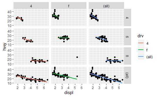
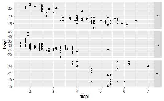
mpg2 <- subset(mpg, cyl != 5 & drv %in% c("4", "f"))

###### 章节7.2.1
p <- qplot(displ, hwy, data = mpg2) +
  geom_smooth(aes(colour = drv),method = "lm", se = F)
p + facet_grid(cyl ~ drv, margins = T)
例:
https://www.cnblogs.com/dingdangsunny/p/12327916.html#_label1_2
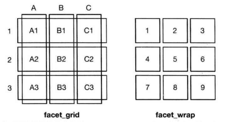
同列的面板必须拥有相同的x标度,同行的面板必须拥有相同的y标度。
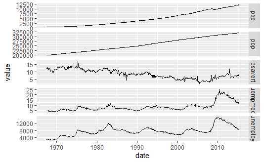
library(reshape2)
em <- melt(economics, id = "date")
# 0.9.0版本中 melt() 函数需要加载 reshape2 包
qplot(date, value, data = em, geom = "line", group = variable) +
  facet_grid(variable ~ ., scale = "free_y")
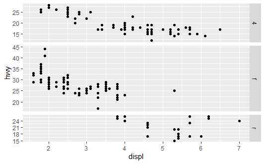
models <- qplot(displ, hwy, data = mpg)

models
models + facet_grid(drv ~ ., scales = "free", space = "free") + theme(strip.text.y = element_text())
models + facet_grid(drv ~ ., scales = "free", space = "fixed") + theme(strip.text.y = element_text())
分面相距较远,组间无重叠,在组与组之间可能会重叠时有优势;分组各组绘制在同一面板,容易发现组间细微的差别。
另外,分面在比较两个变量相对于两个不同的图形属性时更为容易,分面的另一优势是数据子集若有不同的尺度范围,各个面板可以做出相应调整。
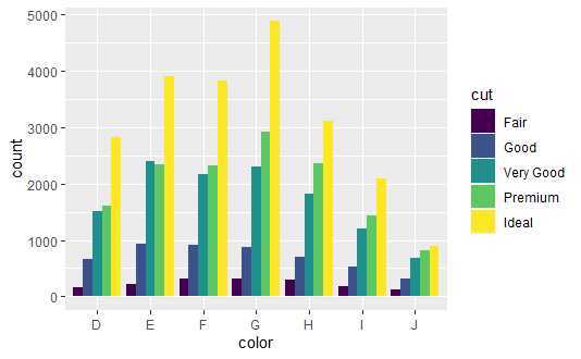
dplot <- ggplot(diamonds, aes(color, fill = cut))
dplot + geom_bar(position = "dodge")
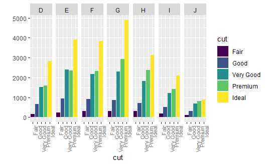
qplot(cut, data = diamonds, geom = "bar", fill = cut) + facet_grid(. ~ color) +
theme(axis.text.x = element_text(angle = 90, hjust = 1, size = 8, colour = "grey50"))
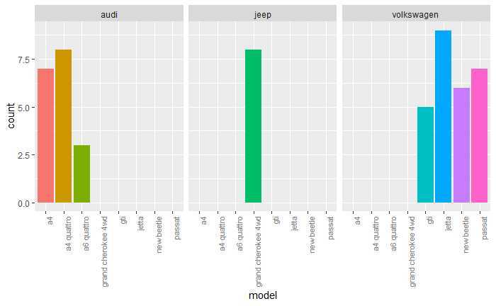
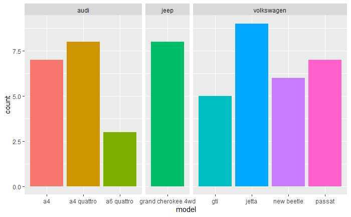
mpg4 <- subset(mpg, manufacturer %in% c("audi", "volkswagen", "jeep"))
mpg4$manufacturer <- as.character(mpg4$manufacturer)
mpg4$model <- as.character(mpg4$model)
base <- ggplot(mpg4, aes(fill = model)) + geom_bar(position = "dodge") + theme(legend.position = "none")
base + aes(x = model) + facet_grid(. ~ manufacturer) +
theme(axis.text.x = element_text(angle = 90, hjust = 1, size = 8, colour = "grey50"))
base + aes(x = model) + facet_grid(. ~ manufacturer) +
facet_grid(. ~ manufacturer, scales = "free_x", space = "free")
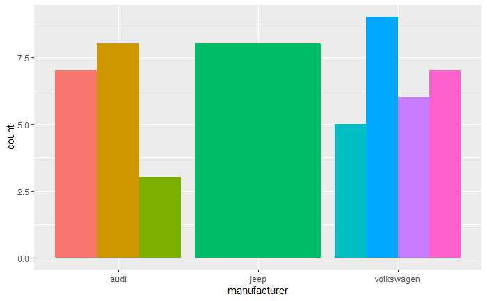
base + aes(x = manufacturer)
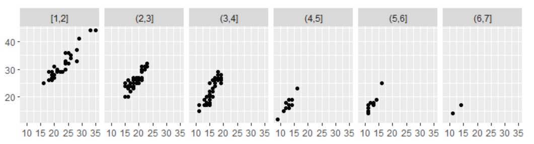
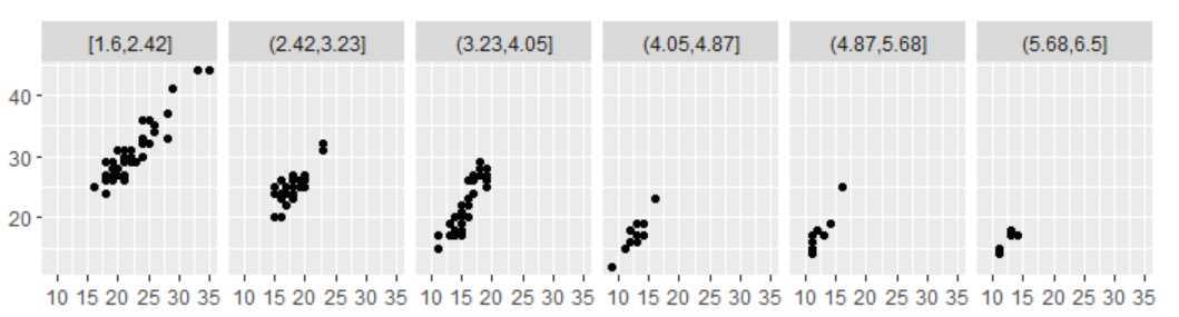
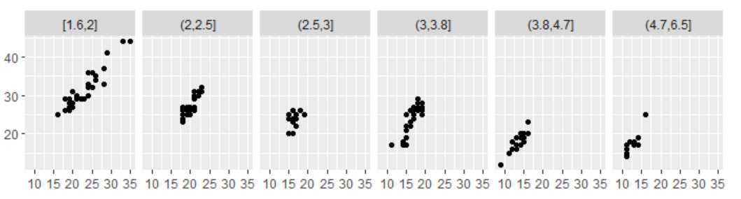
mpg2$disp_ww <- cut_interval(mpg2$displ, length = 1)
mpg2$disp_wn <- cut_interval(mpg2$displ, n = 6)
mpg2$disp_nn <- cut_number(mpg2$displ, n = 6)

plot <- qplot(cty, hwy, data = mpg2) + labs(x = NULL, y = NULL)
plot + facet_wrap(~disp_ww, nrow = 1)
plot + facet_wrap(~disp_wn, nrow = 1)
plot + facet_wrap(~disp_nn, nrow = 1)
坐标系是将两种位置标度结合在一起组成的2维定位系统。
| 名称 | 描述 |
| cartesian | 笛卡尔坐标系 |
| equal | 同尺度笛卡尔坐标系 |
| flip | 翻转的笛卡尔坐标系 |
| trans | 变换的笛卡尔坐标系 |
| map | 地图射影 |
| polar | 极坐标系 |
注:coord_equal和coord_fixed等价。
坐标变换分为两步:首先,几何形状的参数变换只依据定位,而不是定位和维度;下一步就是将每个位置转化到新的坐标系中。
d<-data.frame(x = 1:100, y = 1:100)
qplot(x, y, data = d, geom = "line") + coord_equal()
qplot(x, y, data = d, geom = "line") + coord_polar()
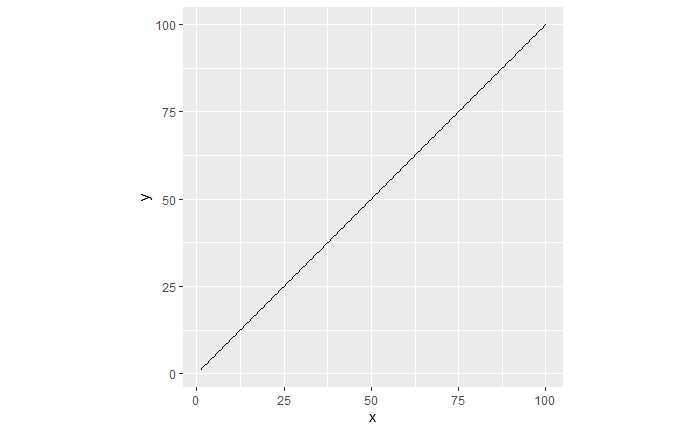
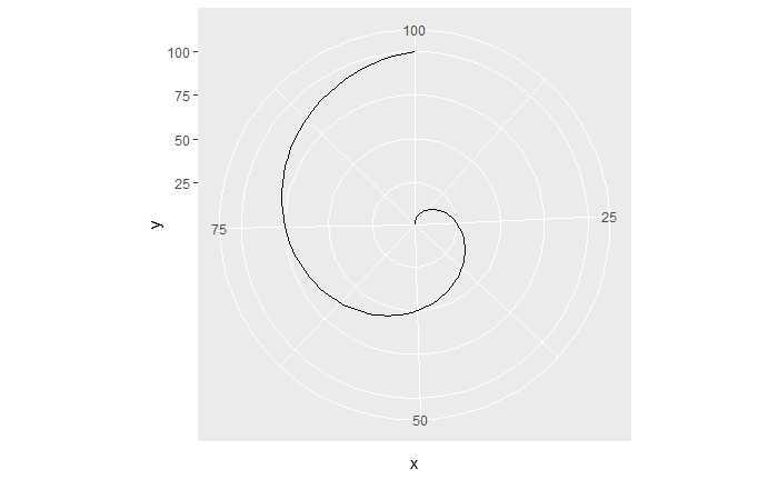
直角坐标系中的直线在极坐标系中变为螺线。
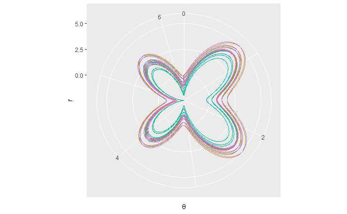
蝴蝶线:
th_x < -rep(seq(0, 2*pi, 0.005), 20)
th <- seq(0, 40*pi, 0.005)
r <- exp(sin(th)) - 2 * cos(4 * th) + (sin((2*th - pi) / 24))^5
th_n <- cut_number(th, n = 20)
qplot(th_x[1:length(th)], r, colour = th_n, geom = "line") + coord_polar() +
  guides(colour = F) + labs(x=expression(theta))
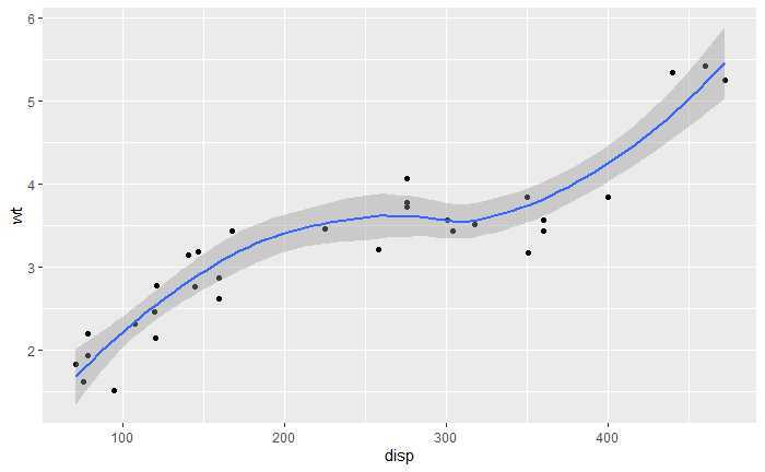
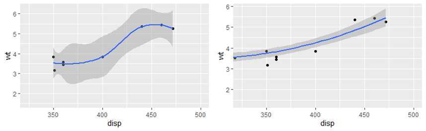
coord_cartesian有xlim和ylim参数,局部放大图形。
(p <- qplot(disp, wt, data = mtcars) + geom_smooth())
p + scale_x_continuous(limits = c(325, 500))
p + coord_cartesian(xlim = c(325, 500))
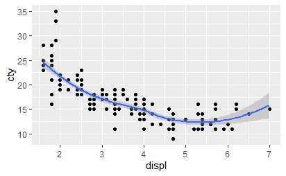
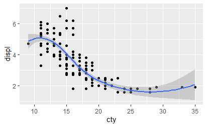
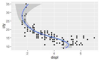
使用coord_flip调换x和y轴。
qplot(displ, cty, data = mpg) + geom_smooth()
qplot(cty, displ, data = mpg) + geom_smooth()
qplot(cty, displ, data = mpg) + geom_smooth() +
  coord_flip()
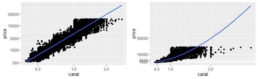
qplot(carat, price, data = diamonds, log = "xy") + geom_smooth(method = "lm")
## 译者注: 原书中为‘pow10‘,0.9.0 中为 exp_trans(10),且需加载scales包
library(scales)
last_plot() + coord_trans(x = exp_trans(10), y = exp_trans(10))
coord_equal保证x轴和y轴有相同的标度。默认1:1,通过修改ratio可以进行修改。
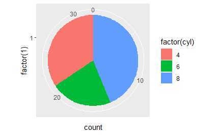
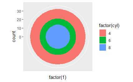
极坐标系统最常用于饼图,饼图是在极坐标下堆叠的条形图。
coord_polar(theta = "x", start = 0, direction = 1, clip = "on")
# A pie chart = stacked bar chart + polar coordinates
pie <- ggplot(mtcars, aes(x = factor(1), fill = factor(cyl))) +
 geom_bar(width = 1)
pie + coord_polar(theta = "y")
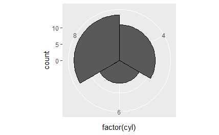
# A coxcomb plot = bar chart + polar coordinates
cxc <- ggplot(mtcars, aes(x = factor(cyl))) +
  geom_bar(width = 1, colour = "black")
cxc + coord_polar()

# The bullseye chart
pie + coord_polar()
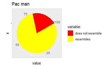
# Hadley‘s favourite pie chart
df <- data.frame(
  variable = c("does not resemble", "resembles"),
  value = c(20, 80)
)
ggplot(df, aes(x = "", y = value, fill = variable)) +
  geom_col(width = 1) +
  scale_fill_manual(values = c("red", "yellow")) +
  coord_polar("y", start = pi / 3) +
  labs(title = "Pac man")
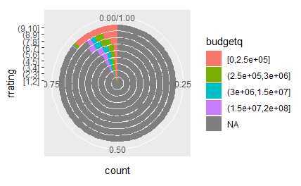
# Windrose + doughnut plot
if (require("ggplot2movies")) {
movies$rrating <- cut_interval(movies$rating, length = 1)
movies$budgetq <- cut_number(movies$budget, 4)

doh <- ggplot(movies, aes(x = rrating, fill = budgetq))

# Wind rose
doh + geom_bar(width = 1) + coord_polar()
# Race track plot
doh + geom_bar(width = 0.9, position = "fill") + coord_polar(theta = "y")
}
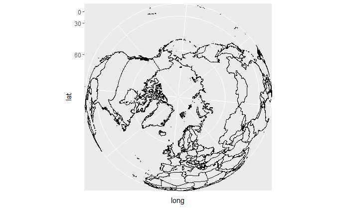
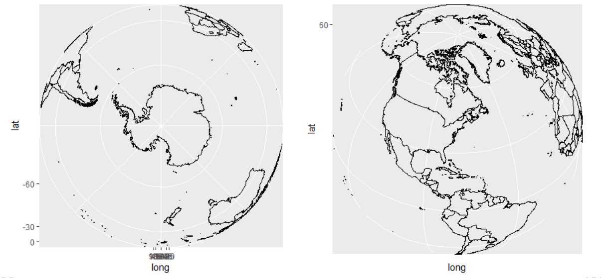
世界地图:
if (require("maps")) {
# World map, using geom_path instead of geom_polygon
world <- map_data("world")
worldmap <- ggplot(world, aes(x = long, y = lat, group = group)) +
  geom_path() +
  scale_y_continuous(breaks = (-2:2) * 30) +
  scale_x_continuous(breaks = (-4:4) * 45)

# Orthographic projection with default orientation (looking down at North pole)
worldmap + coord_map("ortho")
}

if (require("maps")) {
# Looking up up at South Pole
worldmap + coord_map("ortho", orientation = c(-90, 0, 0))
}

if (require("maps")) {
# Centered on New York (currently has issues with closing polygons)
worldmap + coord_map("ortho", orientation = c(41, -74, 0))
}
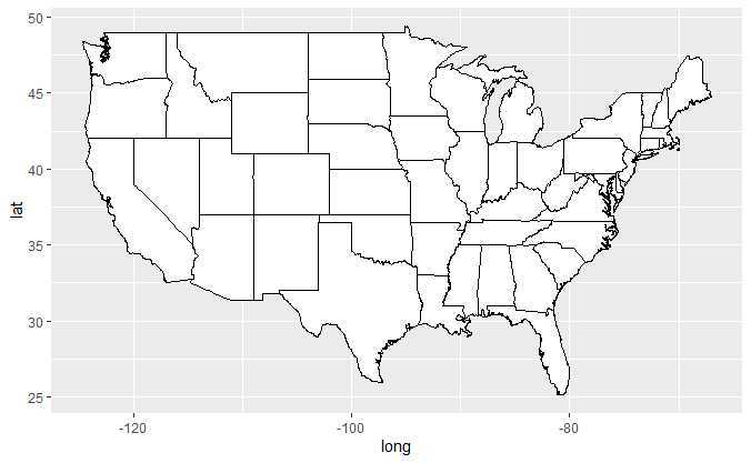
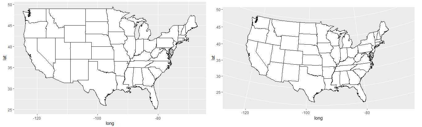
if (require("maps")) {
states <- map_data("state")
usamap <- ggplot(states, aes(long, lat, group = group)) +
  geom_polygon(fill = "white", colour = "black")

# Use cartesian coordinates
usamap
}

if (require("maps")) {
usamap + coord_map("conic", lat0 = 30)
}

if (require("maps")) {
usamap + coord_map("bonne", lat0 = 50)
}
其他示例在https://www.cnblogs.com/dingdangsunny/p/12354072.html#_label6
原文:https://www.cnblogs.com/dingdangsunny/p/12481959.html