主题系统控制着图形中的非数据元素外观,它不会影响几何对象和标度等数据元素。这题不能改变图形的感官性质,但它可以使图形变得更具美感,满足整体一致性的要求。主题的控制包括标题、坐标轴标签、图例标签等文字调整,以及网格线、背景、轴须的颜色搭配。
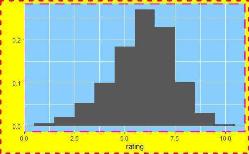
library(ggplot2movies)
## 主题改变的效果。
# (左)默认的灰色主题:灰色背景,白色网格线。
# (右) 黑白主题:白色背景,灰色网格线。
qplot(rating, data = movies, binwidth = 1)
last_plot() + theme_bw()
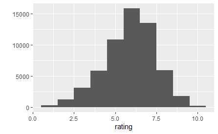
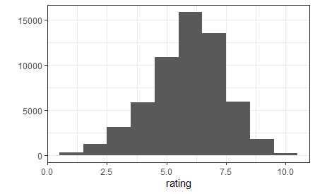
默认的theme_gray()使用淡灰色背景和白色网格线;另一固定主题theme_bw()为传统的白色背景和深灰色的网格线。上图展示了两个主题的异同。
theme_gray()和theme_bw()都由唯一的参数base_size()来控制基础字体的大小。基础字体大小指的是轴标题的大小,图形标题比它大20%,轴须标签比它小20%。
主题由控制图形外观的多个元素组成。
| 主题元素 | 类型 | 描述 |
| axis.line | segment | 直线和坐标轴 |
| axis.text.x | text | x轴标签 |
| axis.text.y | text | y轴标签 |
| axis.ticks | segment | 轴须标签 |
| axis.title.x | text | 水平轴标签 |
| axis.title.y | text | 竖直轴标签 |
| legend.background | rect | 图例背景 |
| legend.key | rect | 图例符号 |
| legend.text | rect | 图例标签 |
| legend.title | text | 图例标题 |
| panel.background | rect | 面板背景 |
| panel.border | rect | 面板边界 |
| panel.grid.major | line | 主网络线 |
| panel.grid.minor | line | 次网络线 |
| plot.background | tect | 整个图形背景 |
| plot.title | text | 图形标题 |
| strip.background | tect | 分面标签背景 |
| strip.text.x | text | 水平条状文本 |
| strip.text.y | text | 竖直条状文本 |
hgramt <- hgram + labs(title = "This is a histogram")
hgramt + theme(plot.title = element_text(size = 20, colour = "red", face = "bold", angle = 180, hjust = 0.5))
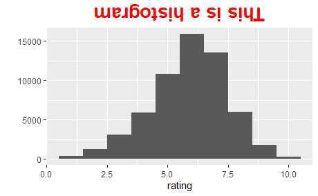
角度的改变可能对轴须标签很有用处。
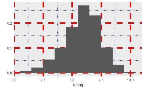
hgram + theme(panel.grid.major = element_line(colour = "red", size = 2, linetype = "dashed"),
              panel.grid.minor = element_line(colour = "blue", size = 0.5, linetype = "dotted"))
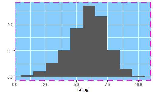
hgram + theme(plot.background = element_rect(fill = "yellow", colour = "red", size = 2, linetype = "dotted"),
              panel.background = element_rect(fill = "#87CEFF", colour = "#FF00FF", size = 1.5, linetype = "dashed"))
last_plot() + theme(plot.background = element_blank())
使用theme_get()可得到当前的主题。theme()可在一幅图中对某些元素进行局部性修改,theme_update()可为后面图形的绘制进行全局性地修改。
old_theme <- theme_update(plot.background = element_rect(fill = "#FF83FA"),
panel.background = element_rect(fill = "#9B30FF"), axis.text.x = element_text(colour = "#FFFF00"),
axis.text.y = element_text(colour = "#FFFF00", hjust = 1), axis.title.x = element_text(colour = "#FFFF00",
face = "bold"), axis.title.y = element_text(colour = "#FFFF00", face = "bold",
angle = 90))
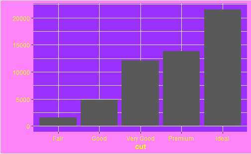
qplot(cut, data = diamonds, geom = "bar")
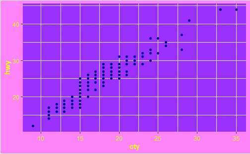
qplot(cty, hwy, data = mpg)
theme_set(old_theme)
不会配色画出来的图是真的难看!这糟糕的配色看的我眼花头疼。
基本图形输出有两种类型:矢量型和光栅型。矢量图是过程化的,意味着放大不会损失细节,光栅图以阵列形式存储,具有固定的最优观测大小。
ggsave()是为图形交互而优化过的函数。
qplot(mpg, wt, data = mtcars)
ggsave(file = "output.pdf")
pdf(file = "output.pdf", width = 6, height = 6)
# 在脚本中,你需要明确使用 print() 来打印图形
qplot(mpg, wt, data = mtcars)
qplot(wt, mpg, data = mtcars)
dev.off()
以上代码将两幅图存入output.PDF中。
| 软件 | 推荐的图形设备 |
| Illustrator | svg |
| latex | ps |
| MS Office | png(600dpi) |
| Open Office | png(600dpi) |
| pdflatex | pdf,png(600dpi) |
| web | png(72dpi) |
图形准备:
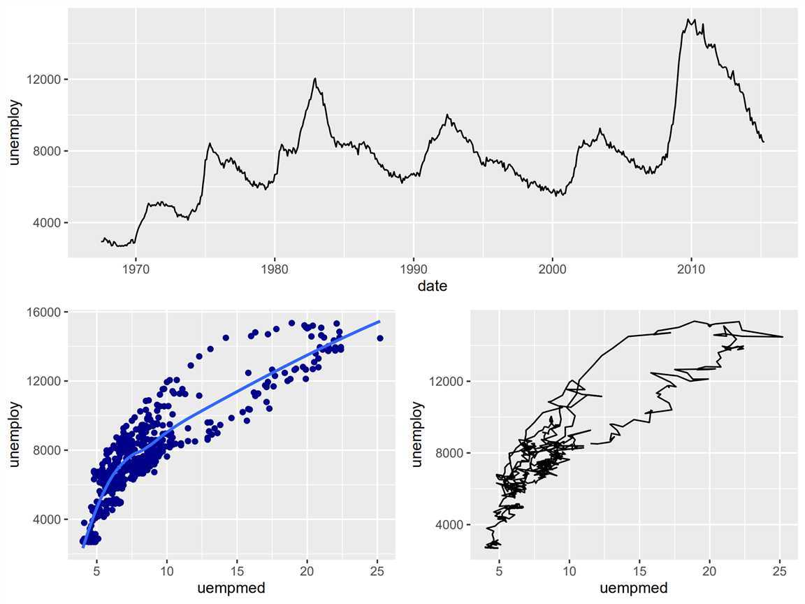
(a <- qplot(date, unemploy, data = economics, geom = "line"))
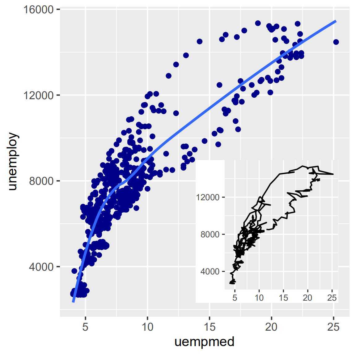
(b <- qplot(uempmed, unemploy, data = economics) +
geom_smooth(se = F))
(c <- qplot(uempmed, unemploy, data = economics, geom = "path"))
viewplot()函数可创建视图窗口,参数x、y、width、height控制视图窗口的大小和位置。默认的测量单位是“npc”,范围从0到1。
(0, 0)代表的位置是左下角,(1, 1)代表右上角,(0.5, 0.5)代表窗口中心。也可以使用unit(2, "cm")或unit(1, "inch")这样的绝对单位。
csmall <- c + theme_gray(9) + labs(x = NULL, y = NULL) + theme(plot.margin = unit(rep(0,
    4), "lines"))
pdf("polishing-subplot.pdf", width = 4, height = 4)
b
print(csmall, vp = subvp)
dev.off()
pdf("polishing-layout.pdf", width = 8, height = 6)
grid.newpage()
pushViewport(viewport(layout = grid.layout(2, 2)))
vplayout <- function(x, y) viewport(layout.pos.row = x, layout.pos.col = y)
print(a, vp = vplayout(1, 1:2))
print(b, vp = vplayout(2, 1))
print(c, vp = vplayout(2, 2))
dev.off()
原文:https://www.cnblogs.com/dingdangsunny/p/12485795.html