为什么要尝试这种布局方式呢?
因为上中下布局,通常中间的内容会有上下滑动的需求,而通过定位来写这些滑动时,在ios上会出现滑动问题,比如说,滑动中间的内容,导致把整个网页拖拽动了,而
中间内容却没有拖拽动,还有一些其它的问题,总之是定位引起的的,特别是fixed定位在ios上容易出问题。今天见了一个用flex做这种布局的,于是就试试。
<!DOCTYPE html>
<html lang="en">
<head>
  <meta charset="UTF-8">
  <meta name="viewport" content="width=device-width, initial-scale=1.0">
  <title>Document</title>
  <style>
    *{margin:0;padding:0;}
    .main{
      height:100vh;
      display: flex;
      flex-direction: column;
    }
    .top{
      height:200px;
      background:pink;
    }
    .nav{
      height:40px;
      display: flex;
      justify-content: space-around;
      align-items: center;
      background:green;
    }
    .content{
      flex: 1;
      display: flex;
      flex-direction: column;
      overflow: hidden;
      background:yellow;
    }
    .content .content_top{
        flex:1;
        overflow: scroll;
        background: #f5f5f5;
        padding:10px 16px;
    }
    .content .content_bottom{
      height:60px;
      background:purple;
    }
  </style>
</head>
<body>
  <div class="main">
    <div class="top">顶部</div>
    <div class="nav"><span>导航</span><span>导航</span></div>
    <div class="content">
      <div class="content_top">
        主要内容块,需要上下滑动
      </div>
      <div class="content_bottom">
        底部
      </div>
    </div>
  </div>
</body>
</html>
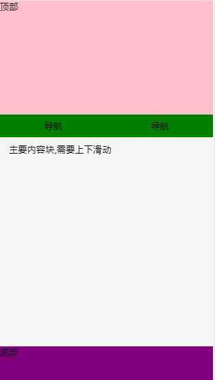
效果:
。
原文:https://www.cnblogs.com/fqh123/p/12634040.html