一、使用 Plotly Experss
1. 散点图
a. 输入数据:
1 import plotly.express as px
2 fig = px.scatter(x=[0, 1, 2, 3, 4], y=[0, 1, 4, 9, 16])
3 fig.show()
b. Pandas导入:
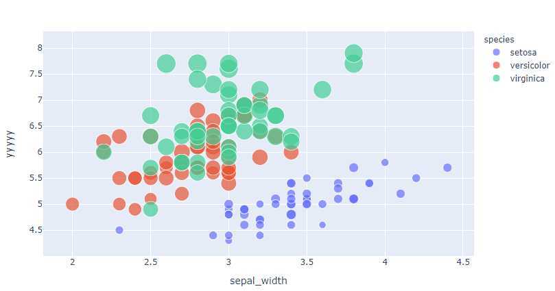
重新命名X,Y轴名称;还可以设置颜色,Size,等;其中的颜色,大小等参数,输入的都是列名称;
import plotly.express as px
df = px.data.iris() # iris is a pandas DataFrame
# fig = px.scatter(df, x="sepal_width", y="sepal_length",color=‘species‘,size=‘petal_length‘,hover_data=[‘petal_width‘])
fig =px.scatter(df,x="sepal_width", y="sepal_length",labels={‘sepal_width‘:‘xxxx‘,‘sepal_length‘:‘yyyy‘},color=‘species‘,size=‘petal_length‘,hover_data=[‘sepal_length‘])

fig.show()
2. 线图
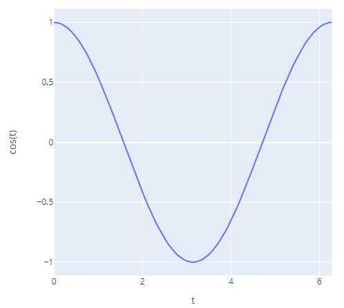
a. 直接输入:
import plotly.express as px
import numpy as np

t = np.linspace(0, 2*np.pi, 100)

fig = px.line(x=t, y=np.cos(t), labels={‘x‘:‘t‘, ‘y‘:‘cos(t)‘})
fig.show()
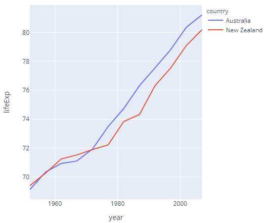
b. Pandas输入:其中的颜色,大小等参数,输入的都是列名称;
import plotly.express as px
df = px.data.gapminder().query("continent == ‘Oceania‘")
fig = px.line(df, x=‘year‘, y=‘lifeExp‘, color=‘country‘)
fig.show()
二、 使用 go.Scatter (go: plotly.graph_objects)
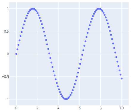
1.最简单的散点图
import plotly.graph_objects as go
import numpy as np

N = 1000
t = np.linspace(0, 10, 100)
y = np.sin(t)

fig = go.Figure(data=go.Scatter(x=t, y=y, mode=‘markers‘))

fig.show()
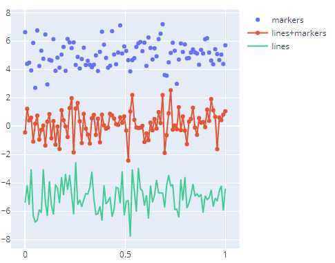
2. 散点图的集中不同形式

 1 import plotly.graph_objects as go
 2
 3 # Create random data with numpy
 4 import numpy as np
 5 np.random.seed(1)
 6
 7 N = 100
 8 random_x = np.linspace(0, 1, N)
 9 random_y0 = np.random.randn(N) + 5
10 random_y1 = np.random.randn(N)
11 random_y2 = np.random.randn(N) - 5
12
13 fig = go.Figure()
14
15 # Add traces
16 fig.add_trace(go.Scatter(x=random_x, y=random_y0,
17                     mode=‘markers‘,
18                     name=‘markers‘))
19 fig.add_trace(go.Scatter(x=random_x, y=random_y1,
20                     mode=‘lines+markers‘,
21                     name=‘lines+markers‘))
22 fig.add_trace(go.Scatter(x=random_x, y=random_y2,
23                     mode=‘lines‘,
24                     name=‘lines‘))
25
26 fig.show()
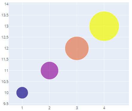
3.气泡散点图
import plotly.graph_objects as go

fig = go.Figure(data=go.Scatter(
    x=[1, 2, 3, 4],
    y=[10, 11, 12, 13],
    mode=‘markers‘,
    marker=dict(size=[40, 60, 80, 100],
                color=[0, 1, 2, 3])
))

fig.show()
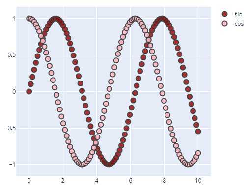
4. 稍复杂的散点图
import plotly.graph_objects as go
import numpy as np


t = np.linspace(0, 10, 100)

fig = go.Figure()

fig.add_trace(go.Scatter(
    x=t, y=np.sin(t),
    name=‘sin‘,
    mode=‘markers‘,
    marker_color=‘rgba(152, 0, 0, .8)‘
))

fig.add_trace(go.Scatter(
    x=t, y=np.cos(t),
    name=‘cos‘,
    marker_color=‘rgba(255, 182, 193, .9)‘
))

# Set options common to all traces with fig.update_traces
fig.update_traces(mode=‘markers‘, marker_line_width=2, marker_size=10)
fig.update_layout(title=‘Styled Scatter‘,
                  yaxis_zeroline=False, xaxis_zeroline=False)


fig.show()
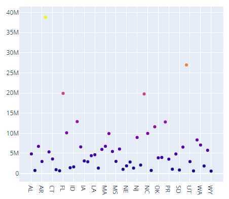
5. 悬停显示
import plotly.graph_objects as go
import pandas as pd

data= pd.read_csv("https://raw.githubusercontent.com/plotly/datasets/master/2014_usa_states.csv")

fig = go.Figure(data=go.Scatter(x=data[‘Postal‘],
                                y=data[‘Population‘],
                                mode=‘markers‘,
                                marker_color=data[‘Population‘],
                                text=data[‘State‘])) # 悬停显示的设置项

fig.update_layout(title=‘Population of USA States‘)
fig.show()
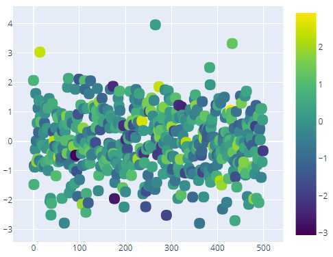
6. 有颜色维度的散点图
import plotly.graph_objects as go
import numpy as np

fig = go.Figure(data=go.Scatter(
    y = np.random.randn(500),
    mode=‘markers‘,
    marker=dict(
        size=16,
        color=np.random.randn(500), #set color equal to a variable
        colorscale=‘Viridis‘, # one of plotly colorscales
        showscale=True
    )
))

fig.show()
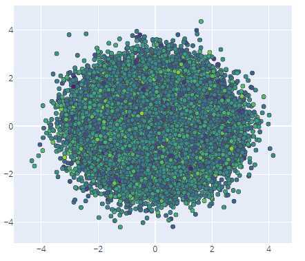
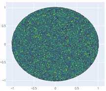
7. 处理大数据集
建议使用Scattergl() 代替 Scatter(), 可以增加提高速度,改善交互性,以及绘制更多数据的能力!
import plotly.graph_objects as go
import numpy as np

N = 100000
fig = go.Figure(data=go.Scattergl(
    x = np.random.randn(N),
    y = np.random.randn(N),
    mode=‘markers‘,
    marker=dict(
        color=np.random.randn(N),
        colorscale=‘Viridis‘,
        line_width=1
    )
))

fig.show()
import plotly.graph_objects as go
import numpy as np

N = 100000
r = np.random.uniform(0, 1, N)
theta = np.random.uniform(0, 2*np.pi, N)

fig = go.Figure(data=go.Scattergl(
    x = r * np.cos(theta), # non-uniform distribution
    y = r * np.sin(theta), # zoom to see more points at the center
    mode=‘markers‘,
    marker=dict(
        color=np.random.randn(N),
        colorscale=‘Viridis‘,
        line_width=1
    )
))

fig.show()
原文:https://www.cnblogs.com/zhemeshenqi/p/12693083.html
