为其父元素设置如下。此方法对内联元素(inline), 内联块(inline-block), 内联表(inline-table),inline-flex元素水平居中都有效。
#container{
    text-align: center;
}
设置 margin-left 和 margin-right 成 auto
#center{
    width: 100px;
    margin: 0 auto;
}
先将父元素设置为相对定位,再将子元素设置为绝对定位,向右移动子元素,移动距离为父容器的一半,最后通过向左移动子元素的一半宽度以达到水平居中。
宽度未知时的方法,transform属于css3内容,兼容性存在一定问题,高版本浏览器需要添加一些前缀。
/*宽度已知*/
#container{
    width: 1000px;
    height: 1000px;
    /*css代码核心*/
    position:relative;   /* 父元素设置 */
}
#center{
    width: 500px;
    height: 500px;
    /*css代码核心*/
    position:absolute;
    left:50%;        /* 向右移动父元素的一半 */
    margin-left: -250px;    /* 向左移动自身的一半 */
}
/*宽度未知*/
#container {
    position:relative;
}
#center{
    position:absolute;
    left:50%;
    transform:translateX(-50%);    /* 向左移动自身的一半 */
}
如果一行中有两个或两个以上的块级元素,通过设置块级元素的显示类型为inline-block和父容器的text-align属性从而使多块级元素水平居中。
#container{
    text-align:center;
}

#center{
    display:inline-block;
}
利用弹性布局(flex),实现水平居中,其中justify-content用于设置弹性盒子元素在主轴(横轴)方向上的对齐方式。
弹性布局(flex)详解
#container{
    display:flex;
    justify-content:center;
}
等遇到了再来分析吧。
#center{
    height:12px;
    line-height:12px;
}
这种方式在较老的浏览器存在兼容性问题。
#container{
    display:flex;
    flex-direction:column;
    justify-content:center;
}
table部分具体用到的时候再写吧。
绝对定位元素距离顶部50%,再使元素垂直方向上反向偏移50%
/* 宽度已知 */
#container {
    position: relative;
}
#center {
    position: absolute;
    top: 50%;
    height: 100px;
    margin-top: -50px;
}
/* 宽度未知 */
.container {
    position: relative;
}
#center {
    position: absolute;
    top: 50%;
    transform: translateY(-50%);
}
主轴X,辅轴Y,辅轴居中对齐
.container {
    display:flex;
    align-items:center;
}
主轴Y,辅轴X,主轴居中对齐
#container {
    display: flex;
    flex-direction: column;
    justify-content: center;
}
具体用到在分析吧。
利用“精灵元素”(ghost element)技术实现垂直居中,即在父容器内放一个100%高度的伪元素,让文本和伪元素垂直对齐,从而达到垂直居中的目的。
.ghost-center {
    position: relative;
}
.ghost-center::before {
    content: " ";
    display: inline-block;
    height: 100%;
    width: 1%;
    vertical-align: middle;
}
.ghost-center p {
    display: inline-block;
    vertical-align: middle;
    width: 20rem;
}
#container{
    width: 1000px;
    height: 1000px;
    /*css核心代码*/
    position: relative;
}
#center{
    width: 100px;
    height: 100px;
    /*css核心代码*/
    position: absolute;
    top: 50%;
    left: 50%;
    margin: -50px 0 0 -50px;
}
这种方式无需知道被垂直居中元素的高和宽,但不能兼容低版本的IE浏览器。
#container{
    width: 1000px;
    height: 1000px;
    /*css核心代码*/
    position: relative;
}
.container{
    width: 100px;
    height: 100px;
    /*css核心代码*/
    position: absolute;
    top: 0;
    left: 0;
    right: 0;
    bottom: 0;
    margin: auto;
}
以下方法在高度和宽度已知时也可用
CSS3的transform固然好用,但在项目的实际运用中必须考虑兼容问题,大量的hack代码可能会导致得不偿失。
#container {
    position: relative;
}
#center {
    position: absolute;
    top: 50%;
    left: 50%;
    transform: translate(-50%, -50%);
}
justify-content为主轴对齐方式align-items为辅轴对齐方式。不兼容低版本的IE浏览器。
#container {
    height: 100vh; /*必须有高度*/
    display: flex;
    justify-content: center;
    align-items: center;
}
(最简单写法)容器元素设为 flex 布局或是grid布局,子元素只要写 margin: auto 即可,不能兼容低版本的IE浏览器。
#container {
    height: 100vh;/*必须有高度*/
    display: grid;
  }
#center {
    margin: auto;
}
当要被居中的元素是inline或者inline-block的时候,可以巧妙的将父级容器设置为display:table-cell,配合text-align:center和vertical-align:middle即可以实现水平垂直居中。
#container{
    display:table-cell;
    text-align:center;
    vertical-align:middle;
}
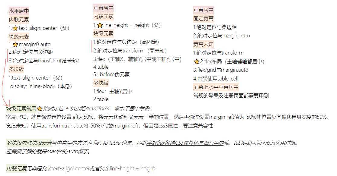
屏幕上水平垂直居中十分常用,常规的登录及注册页面都需要用到。要保证较好的兼容性,还需要用到表布局。
<!DOCTYPE html>
<html lang="en">

<head>
    <meta charset="UTF-8">
    <meta name="viewport" content="width=device-width, initial-scale=1.0">
    <title>Document</title>
    <style>
        .outer {
            display: table;
            position: absolute;
            height: 100%;
            width: 100%;
        }

        .middle {
            display: table-cell;
            vertical-align: middle;
        }

        .inner {
            margin:0 auto;
            background: #2b2b2b;
            color: #fff;
            padding: 2rem;
            max-width: 320px;
        }
    </style>
</head>

<body>
    <div class="outer">
        <div class="middle">
            <div class="inner">
                <p>水平垂直居中</p>
            </div>
        </div>
    </div>
</body>

</html>
原文:https://www.cnblogs.com/L-xmin/p/12708370.html