WPF支持真正的透明效果。这意味着,如果在一个性质或元素上层叠另外几个形状或元素,并让所有这些形状和元素具有不同的透明度,就会看到所期望的效果。通过该特性能够创建透过上面的元素可以看到的的图像背景,这是最简单的情形。最复杂的情形是,使用该特性可创建多层动画和其他效果,对于其他框架来说这是很难实现的。
一、使用元素半透明
可采用以下几种方法使元素具有半透明效果:
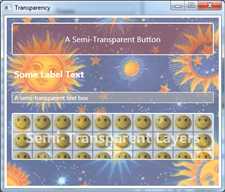
下图显示的例子具有多个半透明层。
下面是XAML中的窗口内容:
<Window x:Class="Drawing.Transparency"
        xmlns="http://schemas.microsoft.com/winfx/2006/xaml/presentation"
        xmlns:x="http://schemas.microsoft.com/winfx/2006/xaml"
        Background="White" Title="Transparency" Height="385" Width="450">
    <StackPanel Margin="5">
        <StackPanel.Background>
            <ImageBrush ImageSource="celestial.jpg" Opacity="0.7"/>
        </StackPanel.Background>
        <Button Foreground="White" FontSize="16" Margin="10"
            BorderBrush="White" Background="#60AA4030"
            Padding="20">A Semi-Transparent Button</Button>
        <Label Margin="10" FontSize="18" FontWeight="Bold" Foreground="White">Some Label Text</Label>
        <TextBox Margin="10" Background="#AAAAAAAA" Foreground="White" BorderBrush="White">A semi-transparent text box</TextBox>
        <Button Margin="10" Padding="25" BorderBrush="White" >
            <Button.Background>
                <ImageBrush ImageSource="happyface.jpg" Opacity="0.6"
TileMode="Tile" Viewport="0,0,0.1,0.4"/>
            </Button.Background>
            <StackPanel>

                <TextBlock Foreground="#75FFFFFF"  TextAlignment="Center"
                   FontSize="30"
                   FontWeight="Bold" TextWrapping="Wrap" >Semi-Transparent Layers</TextBlock>

            </StackPanel>
        </Button>
    </StackPanel>
</Window>
透明是较受欢迎的WPF特性之一。实际上,透明特性非常容易使用而且工作的非常好,所有有些过于泛滥地被用于WPF用户界面。因此主义不要过度使用透明特性。
二、透明掩码
Opacity属性使用元素的所有内容都是部分透明的。OpacityMask属性提供了更大的灵活性。可使用元素的特定区域透明或部分透明,从而实现各种常见的以及新颖的效果。例如,可使用OpacityMask属性将形状逐渐褪色到完全透明。
OpacityMask属性接受任何画刷。画刷的alpha通常确定了什么地方是透明的。例如,如果使用SolidColorBrush画刷设置非透明颜色,元素将保持完全可见。颜色的其他细节(红、绿和蓝成分)并不重要,当设置OpacityMask属性时会忽略它们。
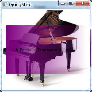
使用SolidColorBrush画刷设置OpacityMask属性没有什么意义,因为可使用Opacity属性更容易地实现相同的效果。然而,当使用更特殊的画刷类型时,例如使用LinearGradient或RadialGradientBrush画刷,OpacityMask属性就变得更有用了。使用渐变将一种纯色变换到透明色,可创建在整个元素表面褪色的透明效果。例如,下面的按钮就使用了这种效果:
<Window x:Class="Drawing.OpacityMask"
        xmlns="http://schemas.microsoft.com/winfx/2006/xaml/presentation"
        xmlns:x="http://schemas.microsoft.com/winfx/2006/xaml"
        Title="OpacityMask" Height="300" Width="300">
    <Window.Background>
        <ImageBrush ImageSource="grandpiano.jpg"></ImageBrush>
    </Window.Background>
    <Grid Margin="10,50">
        <Button Background="Purple" FontSize="14" FontWeight="Bold">
            <Button.OpacityMask>
                <LinearGradientBrush StartPoint="0,0" EndPoint="1,0">
                    <GradientStop Offset="0" Color="Black"></GradientStop>
                    <GradientStop Offset="1" Color="Transparent"></GradientStop>
                </LinearGradientBrush>
            </Button.OpacityMask>
            <Button.Content>A Partially Transparent Button</Button.Content>
        </Button>
    </Grid>
</Window>
下图在一个窗口上显示了该按钮,在该窗口中还显示了一幅名贵钢琴的图片。
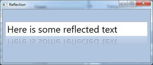
还可结合使用OpacityMask属性和VisualBrush画刷来创建反射效果。例如,以下标记创建了最常见的WPF效果之一——具有镜像文本的文本框。当输入文本时,VisualBrush画刷就会在下面绘制反射文本。使用VisualBrush画刷绘制一个矩形,该矩形使用OpacityMask属性褪色反射的文本,使反射文本与上面真实的元素区别开来:
<Window x:Class="Drawing.Reflection"
        xmlns="http://schemas.microsoft.com/winfx/2006/xaml/presentation"
        xmlns:x="http://schemas.microsoft.com/winfx/2006/xaml"
         Title="Reflection" Height="208.8" Width="491.2" Background="LightSteelBlue"
    >
    <Grid Margin="10" Grid.IsSharedSizeScope="True" VerticalAlignment="Center">
        <Grid.RowDefinitions>
            <RowDefinition Height="Auto" SharedSizeGroup="Row"></RowDefinition>
            <RowDefinition SharedSizeGroup="Row"></RowDefinition>
        </Grid.RowDefinitions>
        <TextBox Name="txt" FontSize="30">Here is some reflected text</TextBox>
        <Rectangle Grid.Row="1" RenderTransformOrigin="1,0.5">
            <Rectangle.Fill>
                <VisualBrush Visual="{Binding ElementName=txt}"></VisualBrush>
            </Rectangle.Fill>
            <Rectangle.OpacityMask>
                <LinearGradientBrush StartPoint="0,0" EndPoint="0,1">
                    <GradientStop Offset="0.3" Color="Transparent"></GradientStop>
                    <GradientStop Offset="1" Color="#44000000"></GradientStop>
                </LinearGradientBrush>
            </Rectangle.OpacityMask>
            <Rectangle.RenderTransform>
                <ScaleTransform ScaleY="-1"></ScaleTransform>
            </Rectangle.RenderTransform>
        </Rectangle>
    </Grid>
</Window>
该例使用LinearGradientBrush画刷在完全透明的颜色和半透明的颜色之间进行渐变,是反射内容更加平淡。该例还使用RenderTransform翻转矩形,是反射的内容上下颠倒。因为使用了该变换,所以渐变过渡点(gradient Stops)必须反向设置。下图显示了最终效果:
原文:https://www.cnblogs.com/treeskyer/p/12727852.html