完成时间:1.5小时(实验),0.5小时(实验报告)
import numpy as np
import pandas as pd
import warnings
warnings.filterwarnings("ignore")
import seaborn as sns
import matplotlib.pyplot as plt
%matplotlib inline
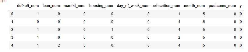
df=pd.read_csv("bank-additional-full.csv",sep=";")
plt.rcParams[‘font.sans-serif‘] = [‘KaiTi‘]#作图指的定默认字体中文
plt.rcParams[‘font.serif‘] = [‘KaiTi‘]#作图的中文
plt.rcParams[‘axes.unicode_minus‘] = False # 解决保存图像是负号‘-‘显示为方块的问题
df.head()
| age | job | marital | education | default | housing | loan | contact | month | day_of_week | ... | campaign | pdays | previous | poutcome | emp.var.rate | cons.price.idx | cons.conf.idx | euribor3m | nr.employed | y | |
|---|---|---|---|---|---|---|---|---|---|---|---|---|---|---|---|---|---|---|---|---|---|
| 0 | 56 | housemaid | married | basic.4y | no | no | no | telephone | may | mon | ... | 1 | 999 | 0 | nonexistent | 1.1 | 93.994 | -36.4 | 4.857 | 5191.0 | no |
| 1 | 57 | services | married | high.school | unknown | no | no | telephone | may | mon | ... | 1 | 999 | 0 | nonexistent | 1.1 | 93.994 | -36.4 | 4.857 | 5191.0 | no |
| 2 | 37 | services | married | high.school | no | yes | no | telephone | may | mon | ... | 1 | 999 | 0 | nonexistent | 1.1 | 93.994 | -36.4 | 4.857 | 5191.0 | no |
| 3 | 40 | admin. | married | basic.6y | no | no | no | telephone | may | mon | ... | 1 | 999 | 0 | nonexistent | 1.1 | 93.994 | -36.4 | 4.857 | 5191.0 | no |
| 4 | 56 | services | married | high.school | no | no | yes | telephone | may | mon | ... | 1 | 999 | 0 | nonexistent | 1.1 | 93.994 | -36.4 | 4.857 | 5191.0 | no |
定义数值型列表和类别变量列表:
numberVar=[‘age‘,‘duration‘,‘campaign‘,‘pdays‘,‘previous‘,‘emp.var.rate‘,‘cons.price.idx‘,‘cons.conf.idx‘,‘euribor3m‘,‘nr.employed‘]
categoryVar=[‘job‘,‘marital‘,‘education‘,‘default‘,‘housing‘,‘loan‘,‘contact‘,‘month‘,‘day_of_week‘,‘poutcome‘,‘y‘]
将营销成功和失败分为两个集合,分别统计每个集合中每一类人群的数量。由于营销成功和失败之间的样本不平衡,直接使用绝对值进行比较是不容易发现有用的信息的。将营销成功和失败两个集合分别求它们内部不同取值的占比,结果就相对明显了。将两个系列的百分比相减:

1.将营销成功(y==‘yes‘)的样本放入dfy中,失败样本放入dfn中:
dfy = df[df.y ==‘yes‘]
dfn = df[df.y == ‘no‘]
2.分别计算出营销成功和失败的样本总量
posCount=dfy.shape[0]
negCount=dfn.shape[0]
print(posCount)
print(negCount)
3.将marital所有可能的取值,放入一个列表
vlist=df.marital.unique()
vlist
4.求出正负例(营销成功/失败)样本中,婚姻状况的取值分布(转字典类型)
yCounts = dfy[‘marital‘].value_counts().to_dict()
nCounts = dfn[‘marital‘].value_counts().to_dict()
print(yCounts)
print(nCounts)
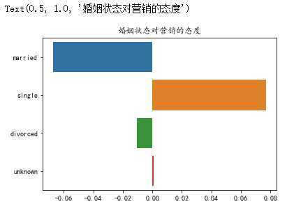
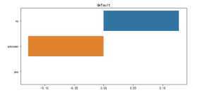
5.计算每一种婚姻状态下,营销成功和失败的百分比差值。成功百分百-失败百分百(编码参考demo)
这里使用‘married‘,看看已婚和未婚群体接受营销的百分比差值:
#使用yCount[‘married‘]不合适,当数据不存在时会报告错误。更合适的做法是当数据不存在时返回0
count = yCounts.get(‘married‘)/posCount - nCounts.get(‘married‘)/negCount
count
CountLst=[yCounts.get(i)/posCount-nCounts.get(i)/negCount for i in vlist]
print(CountLst)
6.可视化百分比
sns.barplot(CountLst,vlist)
plt.title(‘婚姻状态对营销的态度‘)
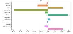
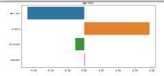
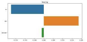
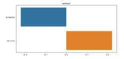
将前面“婚姻”状况对营销结果影响的分析,推广到所有变量。使用for循环,遍历所有的分类变量。参考前文代码,原本使用‘marital‘,现在使用col来表达。
for col in categoryVar:
    plt.figure(figsize=(8,4))
    yCounts =dfy[col].value_counts().to_dict()
    nCounts =dfn[col].value_counts().to_dict()
    vlist =df[col].unique()
    countLst=[yCounts.get(i,0)/posCount-nCounts.get(i,0)/negCount for i in vlist]

    sns.barplot(countLst, vlist)
    plt.title(col)
    plt.tight_layout()
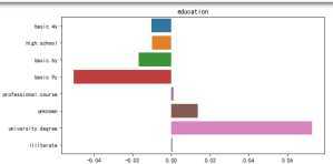
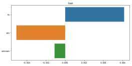
这里以教育这个特征的分析为例:从图中可以看出具备大学学历的客户更倾向于接受营销进行定期存款。
分析变量之间可能的关系,通过可视化方式去进一步挖掘其中的有用的信息
df[‘gender‘] = df["gender"].map({0:"girl", 1:"boy",2:"unknown"})
为了实现对相关系数的计算(相关度矩阵的计算要求变量必须为数字),许多以字符串形式表达的分类变量需要转为数值变量才可以进一步计算。对于大部分的分类变量,可以通过映射的方式实现直接的转换。通过map方法,可以将DataFrame中的值实现映射。
这里,我们希望了解各个数值变量与目标(变量y)的相关度,因此需要先将y转为数值类型(即,将’yes’映射成1,‘no’映射为0)
df[‘y‘] = df["y"].map({"no":0, "yes":1})
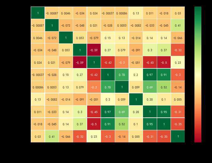
这里定义了heatmap函数,dataset表示含有数据集的dataframe, col则是需要进行相关度分析的列表。本实验要求所有的数值型变量另外再加一个y变量。例如[‘age‘,‘duration‘,....,‘y‘]
# 使用热力图可视化数据集多个变量之间的相关度
def heatmap(dataset, col):
    corr_data = dataset[col]
    corr = corr_data.corr()  #计算相关度矩阵
    cor_plot = sns.heatmap(corr,annot=True,cmap=‘RdYlGn‘,linewidths=0.2)
    plt.xticks(fontsize=12,rotation=-30) #x轴的字体和旋转角度
    plt.yticks(fontsize=12) #y轴的字体和旋转角度
    plt.title(‘相关度矩阵‘)  # 标题
    plt.show()
使用相关度矩阵和热力图,观察数值变量(‘age‘,‘duration‘,‘campaign‘,‘pdays‘,‘previous‘,‘emp.var.rate‘,‘cons.price.idx‘,‘cons.conf.idx‘,‘euribor3m‘,‘nr.employed‘,‘y‘)的相关度。
注:注意需要将图形调整到合适大小。 例如: plt.figure(figsize=(11, 8))
plt.figure(figsize=(11, 8))
heatmap(df, [‘age‘,‘duration‘,‘campaign‘,‘pdays‘,‘previous‘,‘emp.var.rate‘,‘cons.price.idx‘,‘cons.conf.idx‘,‘euribor3m‘,‘nr.employed‘,‘y‘] )
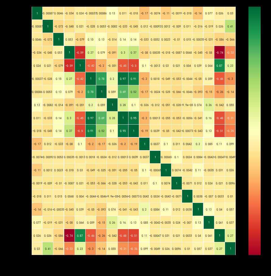
分类变量分为有序和无序两种。本例中一些分类变量并无顺序,这里先按照人为理解将其解释为有序变量(但是在后续机器学习中,必须按照实际情况进行分析)。通过热力图大致了解其关联情况。分类变量进行映射:
 在映射中,新增加一列_num结尾的变量,用于保存映射的结果
# 对default_num的值进行转换
df[‘default_num‘] = df[‘default‘].map({‘yes‘: 0,‘unknown‘: 0,‘no‘: 1})
#再次查看转换后的值:
df.default_num.value_counts()
 # 每个不同的变量取什么值,由自己决定,只要是不重复的连续整数变量即可
df[‘education_num‘] = df[‘education‘].map({‘illiterate‘: 0,‘basic.4y‘: 1,‘basic.6y‘: 2,‘basic.9y‘:3,‘high.school‘:4,
‘professional.course‘:5,‘unknown‘:6,‘university.degree‘:7})
df[‘month_num‘] = df[‘month‘].map({‘jan‘: 1,‘feb‘: 2,‘mar‘: 3,‘apr‘:4,‘may‘:5,
‘jun‘:6,‘jul‘:7,‘aug‘:8,‘sep‘:9,‘oct‘:10,‘nov‘:11,‘dec‘:12})
df[‘loan_num‘] = df[‘loan‘].map({‘no‘: 0,‘unknown‘: 1,‘yes‘: 2})

 # 请补充:如下的变量
df[‘marital_num‘] = df[‘marital‘].map({‘married‘:0,‘single‘:1, ‘divorced‘:2, ‘unknown‘:3})
df[‘housing_num‘] = df[‘housing‘].map({‘no‘:0, ‘yes‘:1, ‘unknown‘:2})
df[‘contact_num‘] =df[‘contact‘].map({‘telephone‘:0, ‘cellular‘:1})
df[‘day_of_week_num‘] = df[‘day_of_week‘].map({‘mon‘:0, ‘tue‘:1, ‘wed‘:2, ‘thu‘:3, ‘fri‘:4})
df[‘poutcome_num‘] =df[‘poutcome‘] .map({‘nonexistent‘:0, ‘failure‘:1, ‘success‘:2})
catCols = [‘default_num‘,‘loan_num‘,‘marital_num‘,‘housing_num‘,‘day_of_week_num‘,‘education_num‘,‘month_num‘,‘poutcome_num‘,‘y‘]
df[catCols].head()
调用heatmap函数,使用相关度矩阵和热力图,观察变量(‘default_num‘,‘loan_num‘,‘marital_num‘,‘housing_num‘,‘day_of_week_num‘,‘education_num‘,‘month_num‘,‘poutcome_num‘,‘y‘)的相关度,变量已经保存在列表catCols中。
plt.figure(figsize=(11, 8))
heatmap(df,[‘default_num‘,‘loan_num‘,‘marital_num‘,‘housing_num‘,‘day_of_week_num‘,‘education_num‘,‘month_num‘,‘poutcome_num‘,‘y‘])

展示所有变量之间的相关度,观察变量y与其他变量之间的相关度,找出与目标具有相对高相关度的变量。
plt.figure(figsize=(15, 15)) #设置较大的图形尺寸
heatmap(df,numberVar+catCols) #将dataframe的所有数值变量列都加入显示
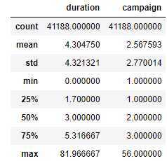
df[‘duration‘]=df[‘duration‘]/60
df[[‘duration‘,‘campaign‘]].describe()
观察通话时长和联络次数的分布情况:
p= plt.figure(figsize = (14,4))
r1 = p.add_subplot(1,2,1)
r2 = p.add_subplot(1,2,2)
r1.set_title(‘通话时长分布‘)
r1.hist(df[‘duration‘],50, edgecolor=‘black‘)
r2.set_title(‘通话时长与联络次数的关系‘) #为图片设置合适的标题
r2.hist(df[‘campaign‘],20,edgecolor=‘blue‘) #直方图2,方法与r1直方图一样,参考r1.hist,参数为campaign
plt.tight_layout()
plt.show()

图像分析:
从上述信息可以看出,客服与用户的联系是怎样一种情况?
观察可视化结果,回答以下问题:
# hue依据y变量的值对点进行不同着色
dur_cam = sns.lmplot(x=‘duration‘, y=‘campaign‘,data = df, hue = ‘y‘,fit_reg = False,markers=["o", "x"])
plt.axis([0,60,0,50])
plt.ylabel(‘联络次数‘)
plt.xlabel(‘通话时长(分钟)‘)
plt.title(‘通话时长和联系次数的关系‘)
plt.show()
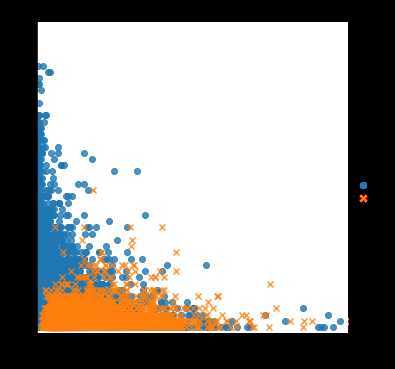
对于最终营销成功的案例来看,大部分的联系次数都在5次以下,而通话时长则从1~30分钟都有分布。从数据上看,通话次数的增加并不会对营销结果有什么帮助,更多的联络次数对应着更低的营销效果。
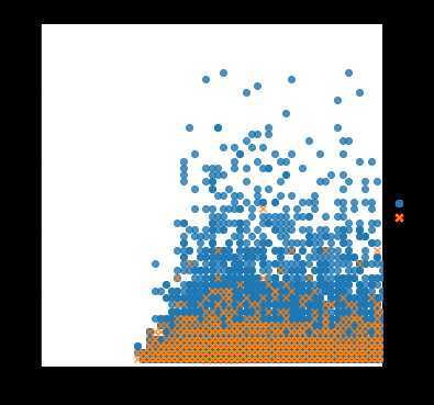
仿照上一个单元,可视化年龄、联系次数和营销成功率之间的关系。注意:将上例中的通话时长duration修改为年龄(age)即可。标题和xy轴提示文本需要做相应修改。
# hue依据y变量的值对点进行不同着色
dur_cam = sns.lmplot(x=‘age‘, y=‘campaign‘,data = df,hue = ‘y‘,fit_reg= False,markers=[‘o‘, ‘x‘])
plt.axis([0,60,0,50])
plt.ylabel(‘联络次数‘)
plt.xlabel(‘年龄‘)
plt.title(‘年龄和联系次数的关系‘)
plt.show()
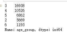
进一步的人群进行细分,看看不同年龄的人的营销情况。下面先将年龄分组:
def get_age_group(age):
    if age < 30:
        return 2
    elif age >60:
        return 6
    else:
        return age//10
df[‘age_group‘]=df[‘age‘].apply(lambda x: get_age_group(x))
df.age_group.value_counts()
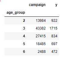
计算每个年龄段的联络次数以及营销成功的案例数,这使用.groupby依据age_group对‘campaign‘和‘y‘进行分组
ageGroupDF = df[[‘campaign‘,‘y‘]].groupby(df[‘age_group‘])
age_camp = ageGroupDF.sum()
age_camp
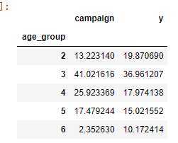
为了更加方便进行比较,将每个年龄段的联系总次数,转为各个年龄段的联系百分比。对y的处理也是同样
age_camp_pct = age_camp.apply(lambda x: x/x.sum() * 100)
age_camp_pct
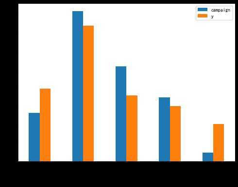
将不同年龄段的联系率和营销率可视化
plot_age = age_camp_pct.plot(kind = ‘bar‘,figsize=(8,6))
plt.xlabel(‘年龄段‘)
plt.ylabel(‘百分百‘)
plt.xticks(np.arange(5),(‘<30‘,‘30-39‘,‘40-49‘,‘50-59‘,‘>60‘))
plt.title
plt.show()
将上述的分析方式打包称为函数relationShow。relationShow(数据集, 营销行为, 营销结果,客户特征),依次快速可视化一批数据,发现针对不同特征的用户应该是否针对现有的营销行为做调整。
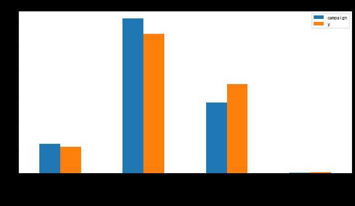
def relationShow(dataset, action, target, character):
    pct = dataset[[action,target]].groupby(dataset[character]).sum().apply(lambda x: x/x.sum() * 100)
    plot = pct.plot(kind = ‘bar‘,figsize=(12,6))
    plt.xlabel(character)
    plt.ylabel(‘百分比‘)
    plt.xticks(np.arange(len(pct.index)),pct.index)
    plt.title(action+"、"+character + "、" + "y")
    plt.show()
以job为例:从下图分析可知,后续在营销时,应该适当减少对蓝领的资源投入,增加对管理员、退休人员以及学生的资源投入。
relationShow(df, ‘campaign‘,‘y‘,‘marital‘)
可以运行供参考如何进行数据分析,不必写入实验报告
f = pd.crosstab(df[‘job‘],df[‘education‘])
plt.figure(figsize=(8, 6))
sns.heatmap(f, annot=True,cmap=‘RdYlGn‘,fmt="d",linewidths=0.2)
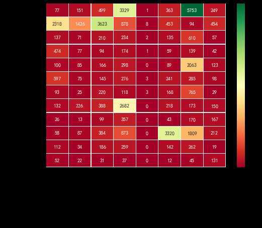
观察客户群体中,学历与工作的关系,帮助我们了解当时的葡萄牙社会。
管理者--大学和高中学历
蓝领学历以高中以下为主;
经理:大学学历
服务行业--高中
技术人员-- 专业学校
失业--各种学历都有,大学最多。
对于大学学历者:最可能的是管理者,然后是经理,再次是技术人员
专业学校:大部分进入了技术人员的行列
高中学历:管理者、服务业
初中和以下学历:大部分成为蓝领
以job为例:从下图分析可知,后续在营销时,应该适当减少对蓝领的资源投入,增加对管理员、退休人员以及学生的资源投入。
大数据实践(二):对葡萄牙银行数据集的特征之间的关联关系进行分析和探索,对于现有营销方案给出建议。
原文:https://www.cnblogs.com/Mangnolia/p/12749084.html